How Not to Overload a Slide With Text
Practical ways to cut text from your slides without losing meaning — covering hierarchy, pacing, and what to move to speaker notes instead.
Design tips, tutorials, product updates, and industry insights.

Tired of blank stares during your presentations? These 10 practical slide design rules help you keep attention without gimmicks or clutter.

Learn what separates pitch decks investors fund from ones that get ignored — structure, pacing, and the slides founders usually get wrong.
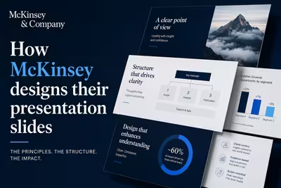
McKinsey's slide design isn't about polish — it's a structured argument system. Here's how the Pyramid Principle actually works in practice.
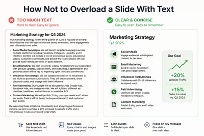
Practical ways to cut text from your slides without losing meaning — covering hierarchy, pacing, and what to move to speaker notes instead.

What Apple and NVIDIA's 2026 keynotes changed structurally — and which of those choices are actually worth borrowing for your next deck.

A breakdown of the presentation decisions — structure, pacing, visuals — that turned a stalled ₴2M negotiation into a signed deal.

Learn how to structure a project case study that highlights real results, builds trust, and avoids the generic template trap.

A practical look at pitch deck templates for 2026, what makes them work, and what real-world decks from well-known startups can still teach founders today.

What actually separates polished corporate decks from average ones — structure, discipline, and restraint, not fancy templates.

Practical, no-budget ways to make slides look polished and professional — better typography, spacing, and color choices, not expensive tools or a design degree.

Most decks lose the room by slide ten. Here's what actually keeps an audience engaged from open to close, based on hundreds of builds.
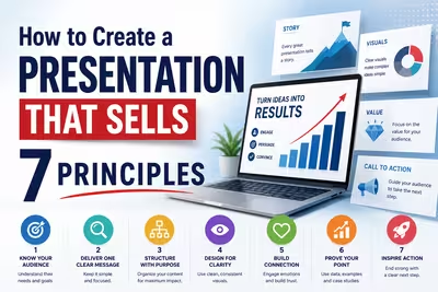
Learn seven practical principles for building presentations that persuade, from structure and visual hierarchy to timing and audience psychology.