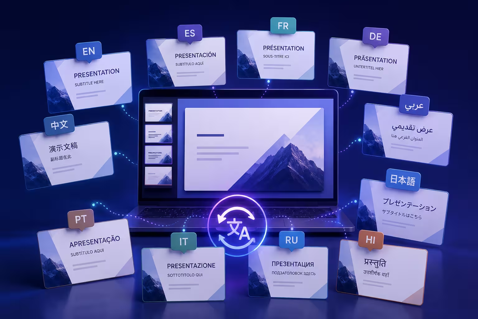
A colleague once sent me a 40-slide deck two hours before it needed to go out in German, French, and Japanese. The English version looked clean. The German version, once translated, had titles wrapping onto a third line, bullet text spilling past its box, and a stat callout that now read as two overlapping numbers. Nothing about the translation was wrong. The deck was just never built to survive one.
That's the part almost nobody explains when they talk about translating presentations quickly. The bottleneck usually isn't the translation itself — machine translation of slide text takes seconds now. The bottleneck is that most decks are built in a way that only works for the language they were written in.
Why Most Decks Aren't Actually Translation-Ready
Open ten random slide decks and you'll find text living in three different places: proper text placeholders, manually drawn text boxes stacked on top of shapes, and text baked directly into images — a labeled diagram exported as a PNG, an infographic built once in a design tool and dropped in as a flat picture. The first kind translates cleanly. The other two don't, and there's no tool that fixes that after the fact.
A label burned into a raster image can't be edited by a translator, an AI tool, or anyone else without rebuilding the graphic from scratch — in every target language. If your deck has twelve of those across forty slides, you haven't budgeted a translation project, you've budgeted twelve small redesign projects, times however many languages you need.
The Space Problem Nobody Budgets For
Here's the part that catches people off guard even after they've fixed the image problem: translated text is rarely the same length as the original, and it's almost never shorter. Language-services firm Eriksen Translations reports that English copy translated into Spanish or French typically runs 20 to 25 percent longer, while German can expand by as much as 35 percent — a title that fits on one line in English can wrap onto three lines in German before you've changed a single design choice.
This is where a text box that was "just barely" sized right for English becomes a real problem. If your title placeholder has zero slack — no extra vertical room, no auto-shrink behavior, text locked at a fixed size — a 30 percent length increase doesn't get absorbed, it overflows or gets clipped depending on your software's settings. I'd rather build every text container with deliberate breathing room from the start than retrofit forty slides later once the German version reveals every tight fit.
Build the English Master Like It's Already Multilingual
The fix isn't a translation trick — it's a structural one, and it happens before you write a single word of the deck. Keep every piece of on-slide text inside an actual text placeholder or text box, never flattened into an image. Standardize your title and body containers across the whole deck using the slide master, rather than eyeballing box sizes slide by slide — inconsistent containers mean inconsistent overflow problems once translated.
If you're starting from a blank file, working from a library of structured PowerPoint templates gets you most of this discipline for free — placeholders that already anticipate longer captions, consistent spacing across layouts, and typography that isn't fighting for every last pixel. You still have to check your own content against it, but you're not starting from zero.
One thing worth doing before translation even starts: run your densest, wordiest slide — the one with the longest bullet, not the shortest — through a mental "what if this is 35 percent longer" test. If that slide survives, most of the deck will too. If it doesn't, you've found your redesign priority before a translator or an AI tool ever touches the file.
Where AI Translation Tools Actually Save the Ten-Minute Version — and Where They Don't
Once the structure is sound, the mechanical part genuinely is fast now. Tools built into modern presentation software, along with dedicated AI translation add-ins, can run through every text frame in a deck and return a translated version in minutes rather than the days a manual translation workflow used to take. For a straightforward internal update deck, that's often good enough to ship as-is.
Where it gets more complicated is anything client-facing, regulated, or high-stakes. Machine translation is strong at literal accuracy and weak at register — it can turn a confident, slightly informal English pitch into something stiffly formal in Japanese, or miss that an idiom in the English deck doesn't carry any meaning translated word-for-word into Arabic. I wouldn't ship a translated pitch deck straight from an automated pass without at least a native-speaker skim, even though the automated pass is the right way to get 90 percent of the way there. Save the human review time for the slides that actually carry persuasion — the opener, the ask, the close — and let the automated pass stand for the reference-heavy middle slides.
Numbers, Dates, and Symbols Don't Translate — They Localize
Text is the obvious problem. The quieter one is everything that looks like it doesn't need translating at all. A date written as 03/04/2026 means March 4th in the US and April 3rd almost everywhere else. A number formatted with a comma as a decimal separator reads as a completely different value in parts of Europe than it does in English-speaking markets. Currency symbols, measurement units, and even the reading direction of a slide change depending on the market — a left-to-right layout built for English needs real rework, not just translated labels, if one of your ten languages is Arabic or Hebrew.
Icons carry the same risk in miniature. A thumbs-up, a specific hand gesture, or a color used to signal "positive" in a chart can carry a different, sometimes negative, connotation in another culture. None of this shows up as an error in a translation tool, because nothing was mistranslated — it was just never localized in the first place. That distinction is worth keeping straight: translation changes the words, localization changes the assumptions underneath them.
Choosing a Base Template That Was Built for This
Some of this risk gets designed out before translation is even on the table, simply by picking a starting template with global use in mind rather than one built around a single market's conventions. It's worth thinking about this the same way you'd think about choosing a template for your industry — the right base isn't the one that looks best in your source language, it's the one whose layout logic still holds up once the content underneath it changes shape. Generous text containers, restrained use of image-embedded labels, and a typeface that renders cleanly across Latin, Cyrillic, and CJK character sets will save more time across ten languages than any translation shortcut will.
That last point matters more than it sounds like it should. Not every typeface has full glyph support for languages outside its original design scope — a font that looks sharp in English can silently fall back to a generic system font the moment it hits Japanese or Korean text, and few people notice until the deck is already in front of the audience it was built for. If you're picking typography with translation in mind, it's worth reviewing how font choices hold up under real conditions before you commit to one across an entire ten-language rollout.
The deck that goes out in ten languages "in minutes" isn't the one translated by the fastest tool. It's the one that was never going to break in the first place, no matter which language landed on it. Build that version once, and the translation step actually becomes the easy part everyone hoped it would be.
Comments (0)