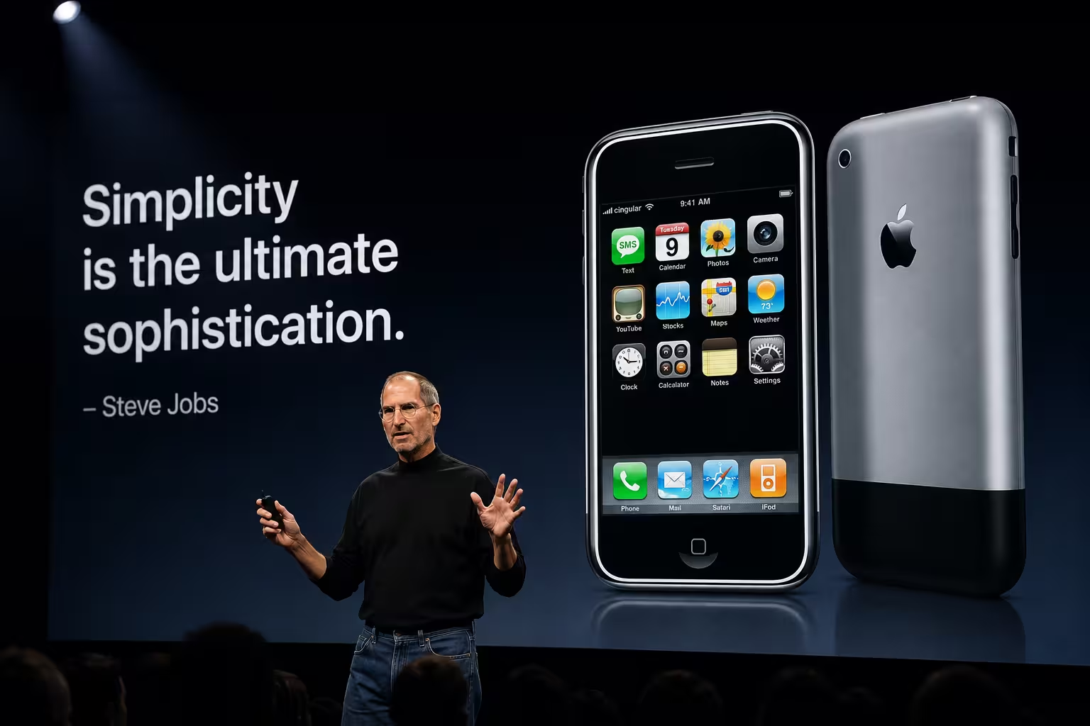
Somewhere in the first ninety seconds of the January 2007 Macworld keynote, a room full of journalists started laughing at a slide that hadn't shown them anything yet. Steve Jobs said Apple was introducing three products: a widescreen iPod, a phone, an internet device. He repeated the list. He repeated it again, faster, until someone in the crowd understood before he finished the sentence. Then he said it wasn't three devices. It was one.
Most breakdowns of that keynote skip straight to "the slides were simple" and move on. That's true, but it's also the least interesting thing happening on stage. The slides were simple because the argument was doing the heavy lifting somewhere else entirely — and that's the part worth taking apart.
The reveal that isn't really about the slide
Picture the slide itself: three icons, an iPod, a phone, a "?" — the last spot filled with the internet-communicator line before it clicks that this is one device. On its own, as a static image, it's not remarkable. Plenty of decks have a three-icon slide. What made this one land was the fifteen seconds of spoken repetition before it appeared, building an assumption the audience could then have overturned in front of them.
That's a timing decision, not a design decision. The slide existed to receive a punchline the room had already half-written in their heads. Strip out the verbal setup and show that same slide cold, and it's forgettable. This is the part that's easy to miss when someone tries to reverse-engineer "the Jobs style" purely from screenshots — the image and the pacing were built together, and neither one does much alone.
One number, no clutter — except that's not free
The slides that follow are almost aggressively empty. A slide that just says "2007." A slide that just says "Thank you." Guy Kawasaki, who worked at Apple as a product evangelist, has pointed out that the average conference slide is estimated to carry around 40 words — reporting from Inc.com's Carmine Gallo column — while Jobs was regularly putting up single words or a lone number and letting the room sit with it.
Here's the part that gets left out of most "less is more" summaries: a nearly blank slide only works if the speaker is carrying 100% of the meaning out loud. Forbes has described this as something close to a three-second rule Jobs seemed to follow, where a slide had to register almost instantly rather than ask the audience to read while listening. The trade-off most decks hit is that this only holds up with real rehearsal — an underprepared speaker standing in front of a one-word slide has nothing to fall back on, no bullet points to glance at, nothing to reread. Minimal slides raise the cost of a bad delivery. They don't lower it.
Repeating a line until it becomes the headline
Jobs didn't just say "we're reinventing the phone" once. He circled back to some version of that phrase across the opening minutes — before the reveal, during it, and again once the room had reacted. According to Gallo's account of the keynote, this wasn't improvised enthusiasm; the phrase had already been placed in Apple's press materials ahead of the event, and the stage repetition was there to cement it as the one sentence people would carry out of the room.
Try that same move in a normal internal deck and it can just as easily read as stalling — saying the takeaway three times because you're not confident it landed the first time. The difference isn't the repetition itself, it's whether each repeat adds a beat: first as a promise, then as a demonstration, then as a confirmed fact once the audience has seen proof. Repetition that doesn't escalate is just noise with better posture.
The parts that don't transfer
This is where most "learn from Steve Jobs" advice quietly stops being honest. Jobs had a room that already wanted to be surprised, a product nobody outside Apple had seen, and years of stage command built up before this specific keynote. A near-blank slide works when the speaker has that kind of earned attention. It works very differently in a Tuesday-morning budget review where nobody in the room is expecting a plot twist.
Consulting decks solve for the opposite problem — an audience that isn't primed for drama, so the argument has to be visible on the slide itself, not just delivered live. Neither approach is more correct; they're built for different rooms. And when other keynotes get compared to Jobs' style years later, the format that usually gets borrowed is the confidence, not the structural discipline underneath it — which is exactly backwards if you actually want the technique to hold up without his stage presence behind it.
What's actually worth stealing
Not the font size. Not the black turtleneck. The transferable piece is smaller and less photogenic: decide the one sentence a slide needs to prove before you touch the layout, and only let the slide carry what the spoken line can't. If a slide is doing work your voice should be doing, it's probably too busy. If your voice is repeating a line without adding anything new each time, that's the tell that the argument isn't finished — not that you need a punchier slide.
Next time you're staring at a slide with too much on it, the more useful question isn't "how do I make this look like Jobs' deck." It's the one that room in 2007 was quietly answering before a single slide went up: what's the one thing you want people repeating back to someone else tomorrow?
Comments (0)