Why "Apple-Style" Presentations Already Look Dated?
The look that once made a deck feel exceptional is now the thing making decks feel exactly like everyone else's.
Design tips, tutorials, product updates, and industry insights.
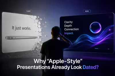
The look that once made a deck feel exceptional is now the thing making decks feel exactly like everyone else's.

Most decks get built once, presented once, and then quietly disappear into a folder nobody searches — here's why.
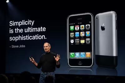
The 2007 iPhone keynote gets quoted constantly for its simplicity — but the slides weren't actually the thing doing the work.

Airbnb had a 360-page prospectus full of numbers — so why did its roadshow deck spend most of its runtime on people, not spreadsheets?
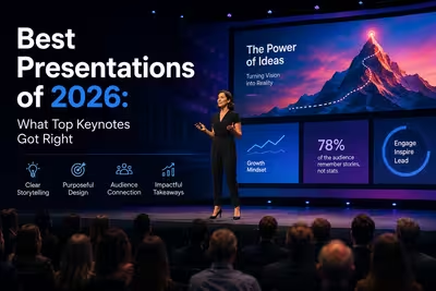
What Apple and NVIDIA's 2026 keynotes changed structurally — and which of those choices are actually worth borrowing for your next deck.

A breakdown of the presentation decisions — structure, pacing, visuals — that turned a stalled ₴2M negotiation into a signed deal.
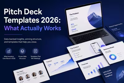
A practical look at pitch deck templates for 2026, what makes them work, and what real-world decks from well-known startups can still teach founders today.

What actually separates polished corporate decks from average ones — structure, discipline, and restraint, not fancy templates.
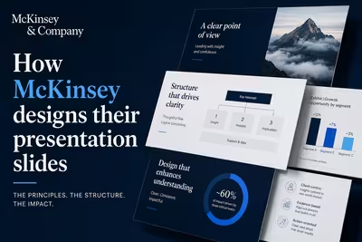
McKinsey's slide design isn't about polish — it's a structured argument system. Here's how the Pyramid Principle actually works in practice.