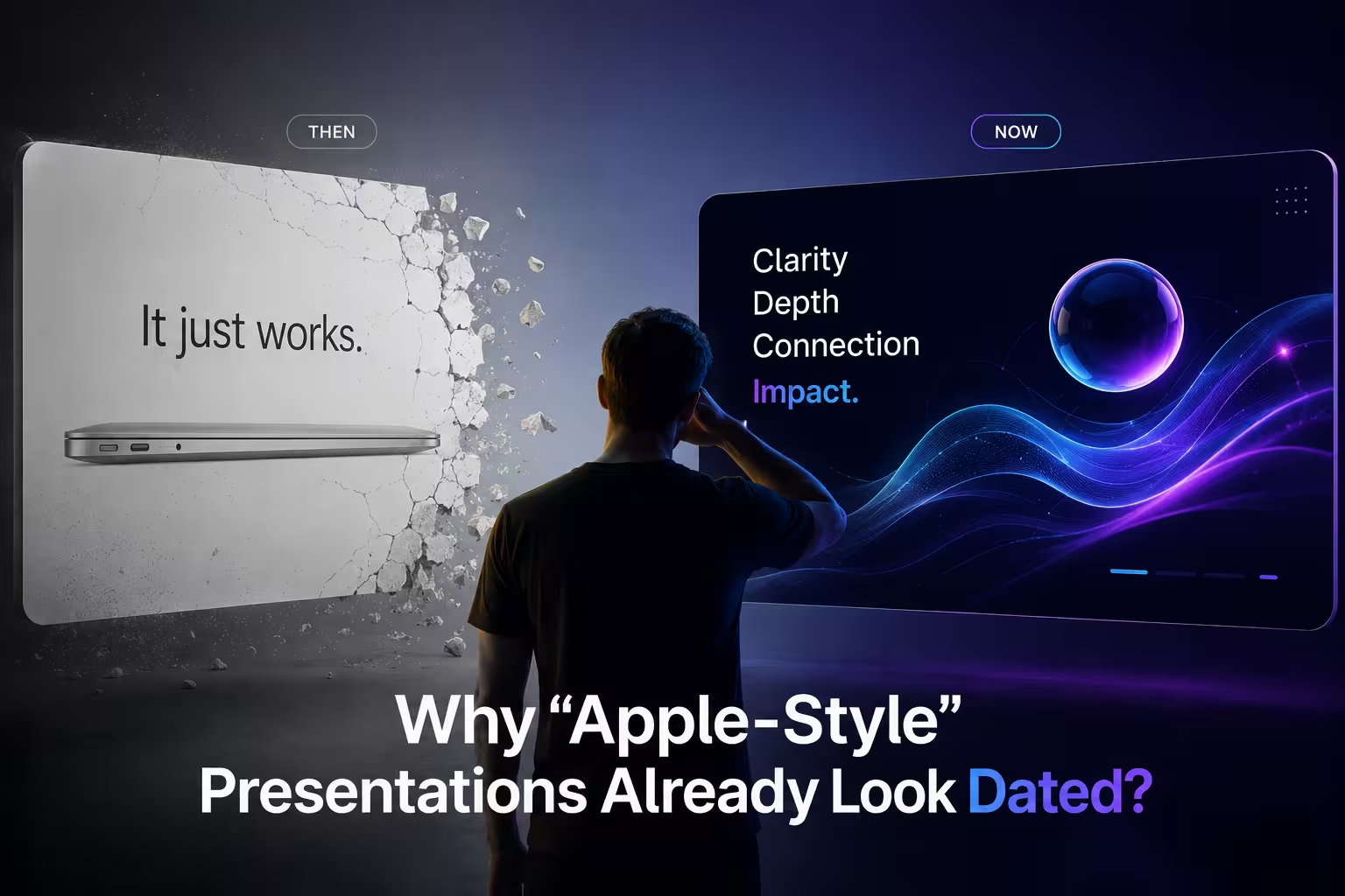
Sit through four investor pitches in a row and you'll start noticing the pattern before the second slide finishes loading: one oversized word in a heavy sans-serif, a scattering of rounded rectangles holding a metric here, a quote there, acres of white space between them. Somewhere around pitch three, a strange thing happens — the deck that was clearly trying to look like an Apple keynote stops registering as confident and starts registering as familiar. Not in a good way. In the way a font you've seen on forty other slides this month is familiar.
That's the part nobody selling "Apple-style" templates wants to say out loud: the look was never really about minimalism. It was about scarcity. And scarcity is the one ingredient a template can't sell you.
The look was built for one stage, not forty slide decks
The visual language people mean when they say "Apple-style" — a single idea per slide, type large enough to read from the back row, almost nothing else on the screen — was designed for a specific communication problem: one speaker, one huge display, an audience that can't ask questions, and a product story that needs to land in the six seconds before the next slide. Every design decision in that format assumes those constraints. The white space isn't restraint for its own sake; it's compensation for the fact that there's no handout, no follow-up email with details, no second chance to explain the chart.
Drop that same format into a 34-slide sales deck that a rep has to talk through on a shared screen, with a prospect who wants to see the pricing table and the integration list, and the constraints that justified the style are gone — but the style stays, because it's the one that's in the template. One line per slide starts reading as evasive rather than confident. The audience isn't in a dark auditorium watching a product launch; they're in a Tuesday afternoon call wondering when you'll get to the roadmap.
The sameness problem is bigger than the Apple look, but the Apple look is accelerating it
A Global PowerPoint Study run by GfK on behalf of Made in Office (the makers of the empower add-in) surveyed over a thousand office workers and found that close to half of the presentations produced inside a typical company don't actually follow that company's own design guidelines — despite the vast majority of respondents saying design consistency matters to them. The gap isn't a taste problem. It's what happens when nobody owns the decision, so people default to whatever template opened fastest.
That's the mechanism worth sitting with, because "Apple-style" has become one of the fastest templates to reach for. Several presentation-trend roundups published this year — the kind template marketplaces put out to sell you on next year's look — trace the bento-grid layout directly back to Apple's product pages and keynote decks, then recommend it as the layout for 2026, regardless of whether the presenter is launching a phone or reporting Q3 churn. When an aesthetic that was originally chosen for its rarity becomes the recommended default across an entire industry of template shops, the thing that made it feel premium is the first casualty. I've reviewed decks that were clearly trying to look expensive and instead looked like they'd been assembled by the same designer as every competitor's — which is exactly the mechanism behind decks looking generically corporate in the first place, just wearing a newer coat of paint.
Where it still genuinely earns its place
None of this means the format is wrong — it means it's been asked to do a job it was never built for. There's a narrow, real set of situations where the Apple-derived approach is still the right call: a product launch with one hero feature to announce, an investor update where the entire message fits in a single sentence, an internal all-hands slide meant to be remembered rather than referenced later. In those cases the audience genuinely benefits from being handed one idea at a time with nothing to compete for their attention.
Where it breaks down is anywhere the content itself has more than one shape. A comparison of three vendors, a project timeline with dependencies, a financial model with assumptions someone in the room needs to interrogate — none of that compresses honestly into a single oversized word and a rounded rectangle. Forcing it there doesn't make the content simpler. It just moves the complexity into the appendix, or worse, into the seventeen slides that follow the pretty one, undoing the whole point of the format.
The bento grid specifically has a hierarchy problem hiding under a tidiness problem
Bento grids look organized, which is exactly why they get used as a substitute for actually deciding what matters most on a slide. Divide a slide into modular boxes and every box looks equally important by construction — same border radius, same padding, same visual weight — even when the content inside absolutely isn't equally important. A hero metric and a supporting caveat end up occupying containers of roughly the same visual authority, and the audience has to do the ranking work the layout should have done for them.
The fix isn't abandoning modular layouts. It's sizing the modules to the actual importance of what's inside them, the same way a well-built dashboard gives the number that matters a bigger tile than the footnote next to it. That's a slower, more deliberate process than dropping content into a pre-built bento template, which is precisely why so few decks bother — real visual hierarchy is a decision about what gets read first, not a decoration applied afterward, and a grid of equal boxes answers that question by accident at best.
What actually replaces "Apple-style" isn't going back to bullet points
The instinct after noticing a trend is tired is to swing hard the other way — back to dense text slides, on the theory that at least nobody will mistake it for a trend. That's the wrong lesson. The Apple-derived instincts worth keeping are the good ones underneath the aesthetic: one message per slide where the content genuinely allows it, type big enough to actually read, restraint about what doesn't need to be on screen. What's worth dropping is treating the specific visual packaging — the exact grid, the exact type scale, the exact amount of white space — as a universal answer regardless of what the content is.
In practice that means auditing a deck slide by slide against the content's actual shape rather than a downloaded aesthetic, which is a more useful exercise than most teams give it credit for — it's usually the same sprawl problem that makes most inherited template libraries worth thinning out in the first place, just showing up one trend cycle later.
Next time a deck comes back from a designer or a template pass looking unmistakably like a keynote screenshot, it's worth asking a blunter question than "does this look good": would this layout still be the right call if nobody could tell it was inspired by anything at all?
Comments (0)