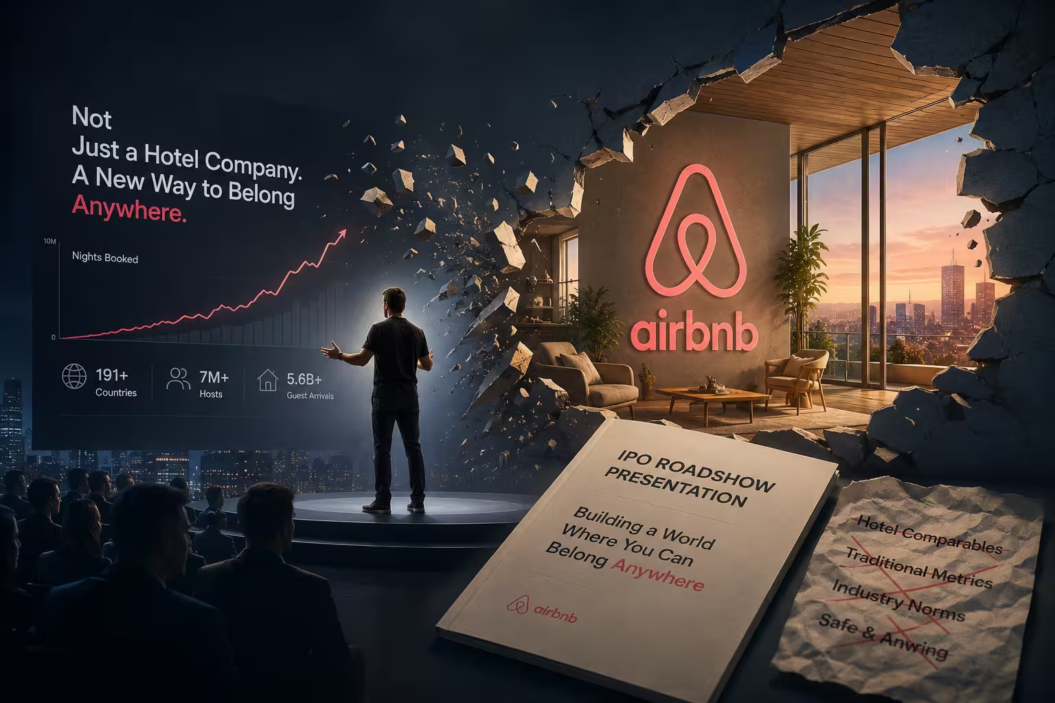
Most IPO roadshow decks read like a defense exhibit. Slide after slide of TAM projections, cohort retention curves, unit economics — the presenter's job is basically to survive the Q&A that follows. So when Airbnb's founders sat down in front of a camera in December 2020 and spent the better part of thirty minutes talking about hosts, guests, and an apartment in San Francisco, the reaction from people who watch roadshows for a living was almost suspicious. Where were the numbers?
They were there. Just not where anyone expected them, and not in the volume anyone expected either.
A Presentation Almost Entirely Missing Its Own Case
Coverage of the roadshow at the time was blunt about what was — and wasn't — in it. The nearly 29-minute presentation leaned heavily on warm host-and-guest imagery and personal stories, while offering comparatively little new strategic or financial substance beyond what was already in the registration statement. One write-up went further, calling it high on optics and light on the kind of hard reveal investors are trained to expect from a roadshow.
That reads like a criticism. In my experience reviewing decks that are trying to do too much at once, it's closer to a design decision that most teams don't have the discipline — or the confidence — to make. Airbnb didn't skip the financial case because it didn't have one. It skipped it because the roadshow deck wasn't where that case lived.
The Prospectus Did the Arguing. The Deck Did Something Else.
The S-1 filing that accompanied the presentation ran past 360 pages, packed with the kind of detailed financial analysis a roadshow slide simply can't hold. That's the detail most retellings of this story skip past too quickly: Airbnb wasn't choosing narrative over evidence. It was routing the evidence to the document built to carry it, and leaving the presentation free to do the one thing a document can't — make an unfamiliar business model feel obvious in real time.
This is where it stops being "storytelling beats data" advice you've read a hundred times, and starts being a specific structural choice: the deck and the prospectus were never trying to win the same argument. Most founders building a deck don't have a 360-page backup document, so this exact split doesn't transfer directly — but the underlying principle does. Decide which document is proving what, before you decide what goes on a slide.
One Number Per Slide, On Purpose
Rather than crowding slides with charts and multiple data points, the presenters surfaced one or two statistics per slide and kept the overall slide count restrained, which made each individual figure easier to remember. Growth from two hosts to millions, guest arrivals in the hundreds of millions, host earnings in the tens of billions — each number got room to be the only thing on the screen.
This isn't the generic "avoid clutter" advice dressed up. Most roadshow decks are internally pressured toward density, because every business unit wants its metric represented and every banker wants a defensible number visible somewhere. The discipline here was resisting that pressure specifically in a context — an IPO roadshow — where the instinct to over-include is structurally strongest. That's the harder version of "less is more," and it's the version worth stealing.
Why the Origin Story Wasn't Just Warm-Up Filler
The presentation opened with Brian Chesky recounting how he and Joe Gebbia needed to cover rent in their San Francisco apartment back in 2007 — the founding story investors have heard some version of before. On its own, that's unremarkable; plenty of pitch decks open with an origin story because someone once said investors respond to founder passion.
What made this one function differently was timing. This wasn't a Series A deck trying to prove a founder's conviction to a room of eight people. It was a company going public in the middle of a pandemic that had gutted global travel, trying to convince public-market investors that a business built on strangers opening their homes to strangers still had a durable future. The origin story wasn't there to build affinity — it was the first data point in an argument about resilience: this business survived being started with nothing, which implicitly primes the audience to believe it can survive a temporary collapse in travel demand too. Cut from that context, the same slide would just be sentiment.
Compare This to How a Consulting-Style Deck Would Handle the Same Facts
It's worth holding this up against the opposite tradition — the structured-argument style you'd see from a strategy consulting firm, where every slide title states a claim and the whole deck reads as a single logical chain from situation to conclusion. That approach exists for good reason; the pyramid-principle structure behind how McKinsey designs its decks is built precisely to survive skeptical, detail-oriented scrutiny, which is exactly what a roadshow deck theoretically needs to do.
Airbnb's presentation isn't that. Its complication is real: a company with a business model as complex as Airbnb's, or one investors don't already have direct personal experience with, generally cannot get away with skipping the argument-based structure the way Airbnb did. Airbnb could lean on emotional testimony because most people in the room had already stayed in, or at least heard of, an Airbnb. That familiarity did work the argument would otherwise have to do. A B2B infrastructure company going public wouldn't have that shortcut available, and copying the format without the underlying familiarity would likely just look thin.
Restraint as the Actual Differentiator
Strip away the emotional footage and what's left is a deck that mostly followed the same restraint principles you'd want in any well-built presentation: one idea holding each slide, numbers used sparingly enough to be memorable rather than exhaustive, and a refusal to let every stakeholder's pet metric onto the screen. The same discipline shows up in most rules for keeping slides from boring an audience — the difference is how much harder that discipline is to hold onto when the stakes, and the pressure to prove everything at once, are this high.
That's also the part competitors' roadshows most often got wrong, not the visual polish. A deck with five different chart styles and a stat on every slide doesn't fail because it looks unpolished — it fails because none of the individual numbers get to land. Airbnb's deck had fewer things to remember, which is exactly why more of it stuck.
The Trade-Off Nobody Should Skip Past
None of this means an emotion-first roadshow deck is simply the better format. The same restraint that made Airbnb's numbers memorable also meant analysts got less new material to model against — which is precisely the gap that drew early criticism. For a company routing its detailed case through a separate document investors are expected to read in full, that gap is closeable. For a founder whose entire case has to live inside the deck itself, that same gap is a real risk, not a stylistic choice.
The lesson isn't "make your investor deck more emotional." It's narrower than that: know exactly which document in your fundraising process is supposed to carry the proof, and stop asking every other document to carry it too. Airbnb's roadshow worked because it knew it didn't have to argue — it only had to remind everyone why they already believed the argument, at the exact moment doubt was highest.
Comments (0)