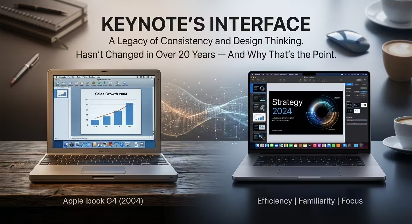
Pull up a screenshot of Keynote 1.0 from its original 2003 review next to Keynote as it looks right now, and the first thing that's odd isn't how much has changed. It's how little has. A slide navigator on the left. A canvas in the middle. Some kind of formatting panel on the right. Swap out the window chrome and a user from 2003 could sit down at a 2026 Mac and know exactly where everything lives.
That's strange, because almost nothing else in software works this way. Microsoft has redesigned PowerPoint's interface repeatedly since Keynote launched — a new toolbar system in 2007, a flatter visual language in 2013, a unified cross-platform look in 2016, and another redesign effort layered on top of that since. Apple, meanwhile, left the bones of its presentation app alone for over two decades. This isn't a case of "old software that nobody bothered to update" — Keynote gets real updates constantly. It's a case of a company deciding, apparently on purpose, that the one thing it wouldn't touch was where things sit.
What actually hasn't changed (and what has)
It's worth being precise here, because "Apple never changes anything" is the kind of lazy claim that falls apart the second someone checks it. Plenty has changed inside Keynote. Dark mode arrived. Collaboration got rebuilt from scratch. The Inspector — originally a set of separate floating windows you had to summon one at a time — eventually got folded into a single sidebar built into the main window, which is a real interface change, not a cosmetic one.
What didn't move is the underlying spatial grammar: thumbnails of your slides on the left, your current slide in the center, your settings for whatever's selected on the right. That three-part relationship was already the whole idea behind Keynote 1.0's window — a large central pane for the active slide, a resizable navigator for moving between slides, with detailed settings living in separate inspector panels. Every redesign since has rearranged the furniture inside that shape. None of them has rearranged the shape.
The contrast that makes this a choice, not an accident
Here's the comparison most "look how minimalist Apple is" articles skip, because it requires naming the other product by name and describing what actually happened to it. PowerPoint's Ribbon, introduced in 2007, didn't tweak the old menu-and-toolbar system — it replaced it outright, and by Microsoft's own account was designed to fix the exact problem of features getting buried under years of accumulated menus. Users who'd built a decade of muscle memory around File, Edit, View had to relearn where everything was.
That wasn't a one-time correction, either. PowerPoint's interface got a flatter visual treatment in 2013, a cross-platform unification pass in 2016, and — as of a few years later — Microsoft began piloting a simplified Ribbon across Office apps specifically because the original Ribbon had become the thing people complained about, the same way the old menus once were. Each of those redesigns had a defensible reason behind it. Stacked together, they show a company that treats the interface as something to periodically overhaul when it stops feeling current. Apple has had the exact same twenty-three years to make that call about Keynote, and every time, it didn't.
Why treating the layout as fixed is itself a design decision
I wouldn't call this restraint out of humility — it lines up with how Apple talks about interface work generally. Keynote's own origin story starts with Steve Jobs needing something for a single high-stakes presentation in 1998 and building outward from that one use case, rather than starting from a general-purpose spec sheet the way most office software does. A tool built backward from "does this help one presenter on one stage" doesn't accumulate the same pressure to modernize its chrome every few years the way a tool built for the widest possible business audience does — there's no committee asking for a refreshed look to compete on a feature comparison chart.
There's a longer pattern behind that instinct, too. An independent textual analysis of Apple's own Human Interface Guidelines — comparing the 1987 text-mode edition to the 1992 desktop edition — found that while the amount of design guidance roughly doubled, the core principles of consistency, user control, and familiar metaphors survived essentially untouched across that jump; what grew was the detail underneath them, not the foundation itself. Apple's 2025 decision to hand its top UI design role to Stephen Lemay, who had already spent over two decades inside the same design organization, reads less like a fresh-eyes hire and more like a bet that whoever sets the direction next should already know exactly which parts of the system are load-bearing and shouldn't move.
What this costs Apple — because it isn't free
None of this means the fixed-layout approach is simply correct and PowerPoint's repeated redesigns are simply wrong. Holding a structure still for two decades has a real downside: new capabilities that don't fit the original three-pane logic cleanly have to get squeezed in somewhere, rather than justifying a rethink of the whole window. Collaboration, AI-assisted authoring, and richer animation tooling all landed inside a shape designed in 2003 for a single presenter working alone — and it shows in smaller ways, like how deeply nested some newer settings are, compared to how flat the original Inspector categories were.
Microsoft's redesigns, for all the relearning they cost users, also gave PowerPoint room to reorganize around genuinely new categories of feature instead of bolting them onto an old frame. A stable interface isn't automatically the more user-friendly choice — it's the choice that trades short-term familiarity for long-term inertia, and which side of that trade is worth it depends on how often the underlying tool actually needs to grow into something structurally different, not just visually refreshed.
What's actually portable from this, if you're not building software
The lesson here isn't "make your slides look like Keynote's chrome." It's a smaller, more useful idea: interface stability and visual minimalism are two separate decisions that happen to show up together in Apple's case, and it's worth not confusing them. Minimalism as a look is a style choice that can help or hurt depending on what the audience needs to do with the content afterward — but structural stability, the thing this article is actually about, is a different bet: it's a wager that the cost of relearning where things live outweighs the benefit of looking current. For a presentation template you'll reuse across dozens of decks, or a report format your team touches every quarter, that's often the more valuable property to protect than whatever's trendy in slide design this year — a consistent template structure saves more real time over a year than a fresher-looking one you have to relearn each time you open it.
Next time a piece of software gets "redesigned" and you find yourself hunting for a button that used to be one click away, it's worth asking which trade Apple made with Keynote instead — and whether your own tools would be better served by the same restraint, or whether they've genuinely outgrown their frame.
Comments (0)