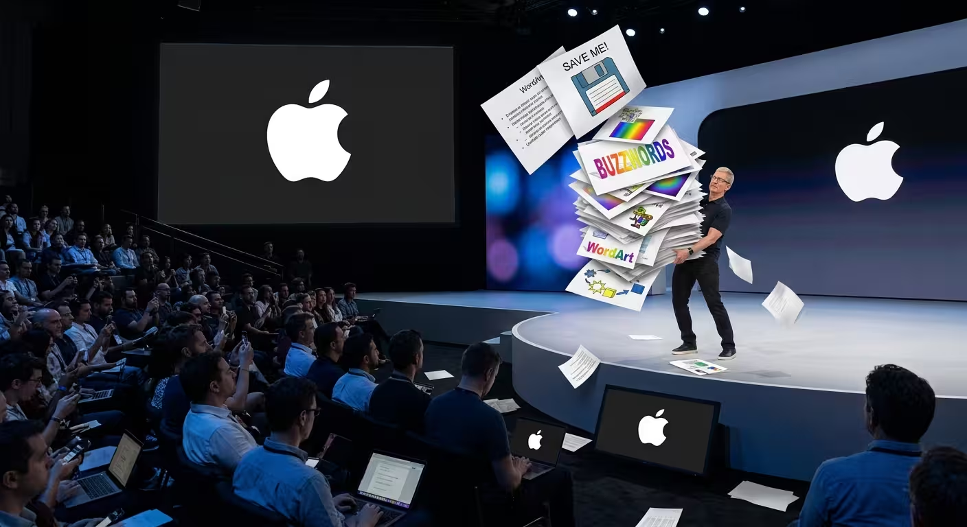
Watch five minutes of any Apple product launch and then open your own quarterly review deck, and the gap feels bigger than "they used a different app." It is a different app — Apple's on-stage decks are built in Keynote, not PowerPoint — but that fact gets repeated so often that it's started to stand in for the actual explanation. It isn't one. Plenty of Keynote decks look exactly like bad PowerPoint decks, just in a different font.
So this isn't really about software. It's about what Apple's stage presentations do that has almost nothing to do with which program is open when the slide gets built — and which of those things you can actually borrow, regardless of what you're presenting in on Monday morning.
The software choice has a specific, almost accidental origin
The tool itself has a stranger backstory than "Apple made their own app because they could." When Steve Jobs returned to Apple in 1998, he needed something for that year's Macworld keynote and reportedly considered Microsoft's software little more than a crude tool even in skilled hands — and it also meant running Windows, which he wasn't interested in doing. His workaround for that first keynote was reportedly built around QuickTime Player, and that stopgap became the technical seed for what Apple's engineers later formalized into a custom application built specifically for his presentations. It wasn't originally meant for public release. By early 2001 that internal tool had matured enough to present the first iPod to the world, and it went on public sale as Keynote 1.0 in 2003, positioned directly against PowerPoint.
That origin matters for one reason: Keynote wasn't designed as a general-purpose product first and a stage tool second. It was built backward from one specific, extremely high-stakes use case — a single presenter, on a single stage, with total control over hardware and lighting. Most presentation software is built the other way around, optimized for the widest possible range of business use cases first. That difference in starting point still shows up in small ways, like how easily Keynote handles full-bleed imagery and video without fighting the layout — but it's a minor technical edge, not the headline reason the keynotes look different.
What actually changes when the deck only has to survive one room
A typical corporate deck has to work in three incompatible contexts: read live on a screen, skimmed later as a standalone document, and forwarded to someone who wasn't in the room. Apple's stage decks only have to do the first job. Nobody's expected to open the keynote slides afterward and understand the announcement from the file alone — the announcement lives in the video, the press release, and the product pages, not the slide deck.
That single-context freedom is what actually licenses the minimalism, more than any design philosophy does. A slide that's just a product photo and a price works on a stage with someone narrating it. The same slide, emailed to a stakeholder who missed the meeting, communicates nothing. This is the trade a lot of "just copy Apple's minimalism" advice skips over: you're not allowed to strip a deck down that far unless you've already decided the deck will never have to stand alone. Whether that trade is worth making depends entirely on the job the deck has to do after the room empties out — a pitch deck someone reopens during diligence, or a report a colleague reads without you, doesn't get the same permission to go this sparse.
The unglamorous part nobody screenshots
The part of Apple's on-stage presentations that's hardest to copy has nothing to do with slides at all. Carmine Gallo, who built an entire book around watching Jobs' keynote footage frame by frame, describes a presenter who rehearsed for hours across many days ahead of a single event, obsessing over slide timing, lighting cues, and even where a demo prop sat on the table. Multiple accounts of the production describe presentations broken into roughly ten-minute segments — a product demo, a guest speaker, a video — specifically so no single stretch of stage time asked too much of the audience's attention at once.
I wouldn't recommend trying to replicate that segmenting trick without first accepting what it costs: it only works if the content has already been over-prepared, because a ten-minute segment with a shaky transition is more noticeable, not less, than one buried inside a longer continuous talk. A sparse deck is the visible symptom of a heavily rehearsed presentation, not a shortcut to becoming one.
The visual grammar is doing more cognitive work than it looks like
Presentation Zen's breakdown of the 2007 iPhone launch is worth more than the usual "look how clean the slides are" observation. In one roughly 70-second stretch, the visuals on screen changed nine separate times across just three slides — mostly through simple builds on a single positioning chart rather than new slides entirely. That pacing lines up with research on cognitive load: audiences process a narrated idea faster when the visual reinforces one point at a time instead of presenting several at once for the eye to sort through unassisted.
Nancy Duarte's later analysis of that same keynote made a related point about structure rather than visuals: the talk repeatedly set up "here's the current, frustrating status quo" before revealing the product as the resolution, a contrast pattern she's found across historically persuasive speeches generally, not just product launches. None of that requires Keynote specifically — it requires deciding, before you open any software, which single idea each screen exists to reinforce.
The stage-lighting side of this matters too, and it's less about taste than physics. A restrained, high-contrast palette isn't just a design preference on a stage that large — brightness contrast is what still reads correctly from the back row of a keynote hall, long after subtler color distinctions have washed out under stage lighting or a projector that's seen better days. And because keynote content is built to be seen on a screen that dwarfs a laptop, not just a boardroom TV, the same discipline that governs what still holds up once a slide leaves a laptop screen and goes up on something enormous applies here with the volume turned up — margins, contrast, and legibility get tested by a much bigger, much less forgiving canvas.
Where this doesn't actually apply
None of this is an argument that PowerPoint is the problem, and Apple's own internal teams almost certainly build plenty of ordinary working decks in it for budget reviews, supplier meetings, and engineering updates that nobody films. The stage aesthetic is a narrow, purpose-built style for a narrow job: one presenter, one room, one message, backed by an unreasonable amount of rehearsal. Most presentations aren't that — they're reference material, internal updates, or documents meant to be understood without a narrator in the room, and forcing that content into six-word slides just moves the missing information into someone's inbox afterward, unexplained.
What is portable, regardless of the app in the title bar, is the discipline behind it: deciding what a slide has to do before deciding how sparse it's allowed to be, and treating rehearsal as part of the design process rather than something that happens after the deck is "done." A template built around one-idea-per-slide layouts and high-contrast masters gets you the visual grammar in either PowerPoint or Keynote — it just doesn't rehearse the talk for you.
The next time a slide looks underdressed compared to an Apple keynote, it's worth asking which is actually missing — the software, or the forty hours of practice that happened before anyone saw the slide at all.
Comments (0)