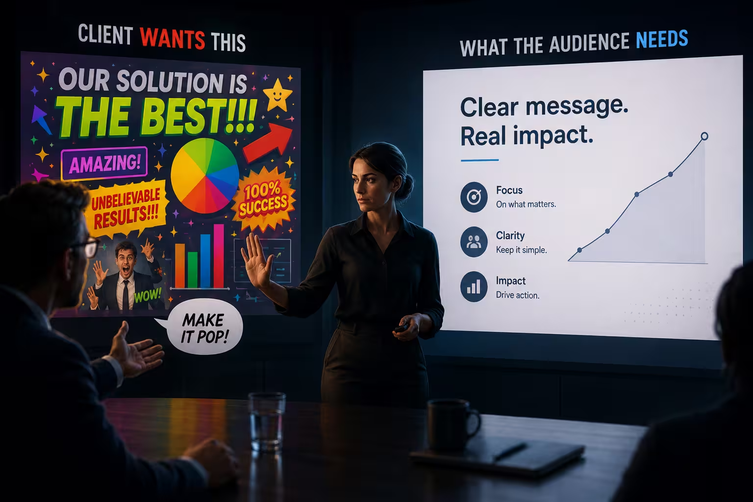
A client once asked me to make a slide "pop more." I asked what that meant. He said he'd know it when he saw it. Three rounds later, the slide had a gradient background, a drop shadow on every icon, and a headline in a font he'd found on his son's laptop. It popped. It also made the audience stop trusting the numbers on it, because a chart that shouts doesn't read as a chart that's been checked.
That's the part nobody says out loud in this business: agreeing with the client isn't the same as serving them. Sometimes it's the fastest way to hand them a worse result with their own signature on it.
The client is an expert in their business. That's not the same as slide expertise.
A CFO knows exactly which number matters most in that board deck. A founder knows precisely which competitor keeps them up at night. That knowledge is real and non-negotiable — you build the deck around it, not despite it. But somewhere between "here's what matters" and "here's how it should look," the client's authority quietly runs out, and a lot of designers keep deferring to it anyway because arguing with the person paying the invoice feels risky.
The mistake isn't listening to the client. It's failing to notice the moment the conversation shifted from strategy, where they're the expert, to layout and hierarchy, where you are.
Most "I don't like it" feedback isn't feedback at all
According to the BetterIdeas Global Report from BetterBriefs, only a small fraction of marketers and agencies say creative work is consistently judged against clearly defined criteria — the vast majority admit personal opinion plays a heavy role in what gets approved, regardless of the original brief. That tracks with what happens in a slide review: someone reacts to a color, a font, a photo, and the reaction gets phrased as a design note even though it's really just a mood.
I've learned to ask one question before touching anything: is this about what the slide communicates, or about how it made someone feel for three seconds while scrolling past it on a laptop? "This chart doesn't show the trend clearly" is feedback. "Can we make this more exciting" is a mood, dressed up as a brief. Both deserve a response. Only one of them should change the design.
Where "the client is always right" actually breaks down
It breaks down specifically on the things a client has no way to evaluate from where they're sitting: how a slide reads from the back row of a real conference hall, whether a font substitution will silently wreck the layout on someone else's laptop, whether five colors of "brand-approved" accent shades will hold together as a system across sixty slides instead of five. This is usually the same instinct that produces a generically "corporate" deck in the first place — every individual choice defended by someone in the room, none of them evaluated against how the whole thing performs together.
Here's the part that complicates the easy version of this argument, though: sometimes the client's gut reaction is catching something real that they just can't articulate. If three stakeholders independently flinch at the same slide, that's data, even if none of them can say why. The skill isn't ignoring reactions — it's telling apart "this specific person doesn't personally like blue" from "everyone in this review keeps stumbling on slide 14," which usually means slide 14 has an actual structural problem the room is reacting to without naming it.
Saying yes to the wrong note is its own kind of failure
I used to think caving on a note I disagreed with was the safe, professional choice — deliver what's asked, protect the relationship, move on. What it actually does is transfer the risk of a bad decision from the person who's paid to make good design decisions to the person who isn't. When that slide goes flat in the actual meeting, nobody remembers "the client insisted." They remember the deck didn't land.
I wouldn't recommend digging in on every disagreement — pick the ones that matter. A client wanting a different shade of the same blue is not the hill. A client wanting to cram a four-line takeaway and a stacked bar chart and a logo wall onto one slide is exactly the hill, because that slide will fail regardless of who approved it, and some slides genuinely deserve to be cut rather than negotiated with.
How to disagree without turning the meeting into a fight
The move that's worked best for me isn't "no." It's "show, don't tell": build the version they asked for and the version you'd recommend, side by side, and let the room react to two real options instead of arguing over a hypothetical. This works because it reframes the conversation away from taste — where the client will always have equal footing — and toward outcome, where the reasoning behind hierarchy and structure actually has something to stand on. A slide that answers "what should the eye land on first" tends to win that comparison on its own, without you having to argue for it directly.
One thing people overlook: framing the pushback as a question, not a correction, changes how it lands. "What's the one number you want someone to remember from this slide if they forget everything else?" gets you further than "this slide has too much on it," even though you're pointing at the same problem. The client keeps their authority over the content. You keep your authority over whether the content is legible.
When the client really is right, and you should just say so
None of this is a license to treat every note as a battle to win. Clients catch real problems constantly — a stat that's out of date, a slide that misrepresents how their product actually works, a tone that's wrong for the room they're walking into. That feedback should move fast and without ego, because it's exactly the kind of knowledge you don't have and they do.
The line, in the end, isn't about who's more senior in the meeting. It's about which side of the slide the feedback is actually touching — the truth of what's being said, or the way it's being shown. Guard the second one like it's your job, because it is.
Comments (0)