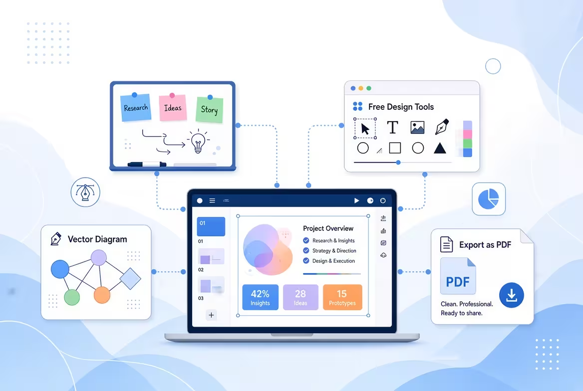
You do not actually need PowerPoint or Google Slides to build a good presentation. The harder part is deciding what the presentation should do, how its ideas should progress, and which visual system will carry that message without forcing you to design every slide from zero.
For many projects, the most efficient workflow is to build the content structure first, choose the production format second, and apply a ready-made design system third. That approach lets you work in Keynote, a browser-based presentation tool, a PDF workflow, or even a web-based format without starting with a blank canvas.
Start With the Presentation, Not the Software
The most common mistake is to replace one slide editor with another and keep exactly the same working method. You open a blank document, create a title slide, start moving text boxes around, and only later discover that the presentation has no clear progression.
Instead, begin with a short presentation brief. You only need a few decisions:
- Who is going to see the presentation?
- What do they need to understand, decide, or remember?
- What is the single main argument or message?
- What evidence, examples, numbers, or visuals support that message?
- How will the presentation actually be delivered?
That last question matters more than it first appears. A presentation for a live meeting can use speaker narration and progressive reveals. A PDF sent by email has to communicate much more independently. A browser-based presentation can use interaction. A Keynote presentation can take advantage of Apple's presentation environment.
So before choosing a tool, decide what the finished presentation needs to be.
Build the Story as Plain Text
Once the purpose is clear, resist the temptation to design. Write the presentation as a sequence of statements instead.
A useful outline might look like this:
- Problem — what is happening?
- Context — why does it matter?
- Evidence — what proves or explains it?
- Interpretation — what should the audience understand from the evidence?
- Recommendation — what should happen next?
- Action — what decision or response is required?
This is not a mandatory six-slide formula. A short product update might need four sections; a research presentation might need fifteen. The point is to establish the logic before visual decisions begin.
I often recommend writing each slide as a sentence rather than a topic. “Market trends” tells the designer almost nothing. “The market is growing, but our addressable segment is becoming more concentrated” gives the eventual slide a job.
Only after those statements are in the right order should you decide whether a slide needs a chart, diagram, comparison, timeline, image, or almost no visual treatment at all.
Choose a Format That Fits the Way You Will Present
Without PowerPoint or Google Slides, you still have several ways to produce the final presentation. The important distinction is that these are not interchangeable merely because they all display slides.
Keynote
Keynote is a natural option if you work on Apple devices and want a conventional slide-based presentation without PowerPoint or Google Slides. It gives you a familiar canvas while keeping the production environment separate from Microsoft's software.
It is particularly useful when the presentation will be delivered live and you need control over transitions, animation, typography, and the final visual composition.
Browser-based presentation tools
A browser-based tool can be useful when collaboration, accessibility, or working across different computers matters more than owning a traditional presentation file.
The trade-off is that you should test the final presentation in the environment where it will actually be delivered. A design that looks correct in the editor is not automatically guaranteed to behave identically after export, embedding, or presentation on another device.
PDF is often the simplest choice when the presentation is primarily being distributed rather than performed. It fixes the visual layout and removes many of the compatibility variables associated with editable presentation files.
But a PDF changes the job of the slide. If the presenter will not be there to explain it, each page has to carry more of the narrative on its own.
Web or interactive formats
For presentations intended to be explored rather than watched linearly, a webpage or interactive presentation can make more sense than a traditional slide deck. This works particularly well for product explainers, portfolios, educational material, and presentations where the audience needs to move between sections.
The important thing is not to choose a fashionable format. Choose the format that matches the audience's behavior.
Do Not Design Every Slide From Scratch
This is where ready-made presentation designs can change the workflow significantly.
Starting from a blank canvas means solving several problems simultaneously: typography, spacing, composition, color relationships, visual rhythm, diagrams, title treatments, and content placement. None of those decisions is inherently difficult, but repeating them across an entire deck consumes attention that could be spent improving the actual argument.
A template gives you a visual system before you start. You can then concentrate on adapting that system to your content instead of inventing a new layout for every page.
ImagineLayout's Keynote templates are particularly relevant when the goal is to avoid both PowerPoint and Google Slides. The collection provides ready-made Keynote designs across different presentation subjects and visual styles, giving you a starting point for the design layer rather than requiring you to construct it from an empty file. The site also maintains a separate PowerPoint template collection for projects where a PPTX deliverable is eventually required.
The key is to treat the template as a design system, not as the presentation itself.
How to Use a Ready-Made Design Without Making the Deck Look Generic
There is a subtle difference between using a template and filling in a template.
In the first approach, the design supplies the visual grammar while your content determines the actual composition. In the second, you try to squeeze every idea into whatever placeholder happens to be available.
Use this process instead:
- Select the visual direction. Choose a design whose typography, proportions, image treatment, and overall tone fit the audience.
- Map your existing outline onto the available layouts. Do not force every section into the same slide structure.
- Replace the sample content completely. Treat placeholder text as structural guidance, not copy to imitate.
- Keep only layouts that serve your story. A template may contain more visual variations than your presentation needs.
- Adapt the system globally where possible. Establish the type scale, colors, and recurring visual rules before making dozens of local adjustments.
- Break the template when the message requires it. A strong design system should support an unusual slide when the content genuinely needs one.
That last step is easy to overlook. If the most important slide in your presentation requires a completely different composition, forcing it into a three-column template can make the message weaker simply because the template is convenient.
Use the design to reduce decisions, not to eliminate judgment.
Turn One Template Into a Complete Presentation System
A useful template should not be thought of as a collection of attractive individual slides. Think of it as a set of reusable visual states.
For example, you may need one visual state for an opening claim, another for evidence, another for a comparison, another for a process, and another for a final decision. The presentation becomes easier to build when you deliberately assign each type of content to an appropriate visual state.
This also creates rhythm.
A deck in which every slide uses the same two-column arrangement becomes visually predictable. A deck in which every slide uses a completely different design becomes difficult to follow. The useful middle ground is a limited set of recurring layouts with enough variation to signal changes in the type of information.
This is one reason a good ready-made design can save more time than simply providing attractive graphics. It gives you a starting vocabulary for different kinds of information.
ImagineLayout organizes its presentation resources into dedicated collections such as templates, diagrams, charts, maps, and other visual assets, which can be useful when a presentation needs something more specific than a standard content slide.
Separate Content Editing From Visual Editing
One of the easiest ways to lose time is to change the message and the design at the same time.
Suppose a paragraph is too long. If you rewrite it while simultaneously adjusting its font size, moving the image, changing the spacing, and resizing the container, every content change becomes a design task.
Keep the passes separate:
- Pass one: fix the argument and sequence.
- Pass two: reduce each slide to the information it actually needs.
- Pass three: choose the visual form for that information.
- Pass four: apply the design system consistently.
- Pass five: test the presentation in its final delivery environment.
This becomes especially valuable when using a template. You can make substantial changes to the story without repeatedly rebuilding the visual treatment around unfinished content.
Test the Presentation Outside the Editor
A presentation is not finished when every slide looks good on your screen. It is finished when it survives the conditions under which somebody else will experience it.
Run the deck from beginning to end without editing anything. Look for moments where the audience would need information that appears only on the previous slide. Check whether a chart can be understood quickly enough. Watch for titles that become ambiguous when several slides are viewed consecutively.
Then test the actual delivery format.
If you are presenting from Keynote, rehearse in Keynote. If you are sending a PDF, open the exported PDF rather than the source file. If the presentation is browser-based, test it in the browser and on the device that will be connected to the display.
And if you know that somebody may eventually ask for an editable PowerPoint file, test that conversion before the final deadline rather than treating export as an afterthought. Format conversion can change fonts, spacing, grouped objects, animations, or other visual details.
The Efficient Workflow Is Not About Avoiding Slides
Building a presentation without PowerPoint or Google Slides does not mean abandoning the slide format. It means removing the assumption that the software must come first.
A more reliable sequence is:
Purpose → audience → outline → visual requirements → production format → ready-made design system → content adaptation → rehearsal → final export.
That order also explains why templates are most useful before you start obsessing over individual slides. The right template does not give you the story. It removes a large part of the visual construction work so you can spend more attention on the story.
If you are using Keynote, starting with a ready-made design from ImagineLayout's Keynote collection can turn the visual stage into an adaptation task instead of a blank-page design task. Choose the layouts that match your content, replace the placeholders with your own material, adjust the visual system to your brand, and remove anything that does not serve the narrative.
The result is still a presentation — but the tool becomes secondary. The structure and the visual system do the real work.
Comments (0)