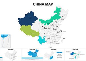
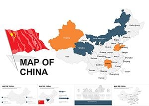
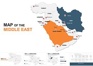
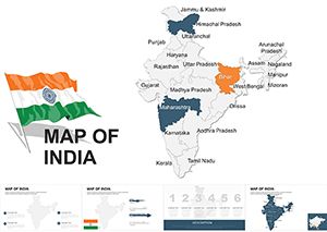
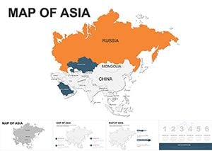
These Keynote templates supply vector-based maps of Asia countries ready for data overlays and narrative builds. They serve strategists, educators, travel planners, and analysts who must show market expansion or geopolitical context without spending hours tracing borders.
Picture an international business development manager preparing the Q2 expansion review for the board. The latest GDP figures are ready but aligning country shapes on a blank slide would push the deadline. The template already positions each nation with consistent zoom and label placement.
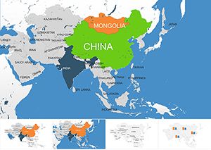
The design keeps map hierarchy clear so audiences follow the story from macro region to specific country metrics.
The primary question is how quickly you can add your own data layers. Each map slide includes grouped vector shapes for countries plus separate text layers for labels. Click any country to change fill color or add data callouts; the underlying paths stay intact for future updates.
This hesitation is common with map work. Because the templates use native Keynote vector objects, they remain sharp at any zoom level or projector resolution. No pixelation occurs even when you enlarge a single country for detailed callouts.
Before you insert numbers, select related countries and group them in the arrange panel. Apply a single build animation so the entire region appears together. This keeps the narrative rhythm consistent across the deck even when different team members contribute slides.
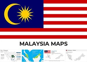
A market entry consultant presents Southeast Asia opportunities to a manufacturing client. The Malaysia map template already highlights growth corridors; she adds investment figures and the board sees the targeted zones instantly.
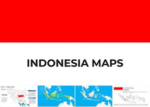
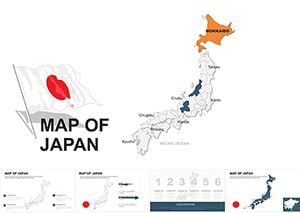
An educator teaching Asian geography uses the Indonesia archipelagic file. Island groups are pre-grouped; students follow the lesson without waiting for the presenter to draw boundaries.
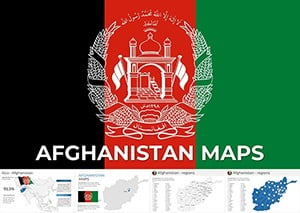
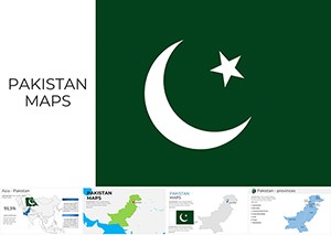
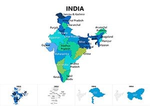
A real-estate developer mapping South Asia expansion opens the Pakistan template. Province overlays accept population data; the investor deck communicates scale without extra drawing time.
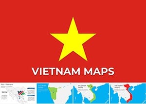
A logistics planner comparing shipping routes across Vietnam and Thailand uses the respective map files side by side. Port icons are already placed; the comparison slide is ready after pasting route distances.
You must trace accurate borders, set consistent label sizes, and match color scales for every country. Those steps multiply across a ten-country comparison deck. The lost hours come out of the time you should spend analyzing trade data or risk factors.
Use the inspector panel to lock aspect ratio when scaling a map group; this prevents accidental distortion of country shapes. For PDF export choose the vector quality setting so lines and labels remain crisp when clients zoom in on shared files.
The maps contain only editable vectors and data placeholders, no decorative compasses or unnecessary legends. You control every label and color without fighting locked background layers.
If your work shifts to financial data charts, our analysis Keynote templates follow the same editing logic. Construction-related visuals are in the construction PowerPoint templates. For rural business outreach the agriculture brochure templates use comparable placeholder systems.
Download the country map that matches your region and open it in Keynote.
Yes, every country outline is a native vector shape. You can change fill colors, stroke weights, and labels directly in the format panel. If you are on an older Keynote version some grouping behaviors may differ slightly; update to the current release for the smoothest experience.
Yes, each template includes separate text boxes positioned for standard country labels. Duplicate and drag any callout to a new location; the vector map underneath remains unchanged. For numeric data simply type percentages or GDP figures; the font style matches the rest of the slide automatically.
The commercial license permits use in any number of client-facing decks and exported PDFs. You may not resell or distribute the original .key files. Team members can collaborate on the same project file under the single license.
Duplicate the slide, delete surrounding countries, then export that slide only via File → Export → PDF. Choose vector quality and 300 dpi. The resulting file keeps crisp lines and labels because Keynote renders native shapes, not raster images.
Each template ships with the current political boundaries already grouped. You can ungroup and hide or recolor disputed areas if your presentation requires a different emphasis. Geographic relief layers are not included; the focus remains on clean data overlays.
Copyright © 2009-2026 ImagineLayout All rights reserved.