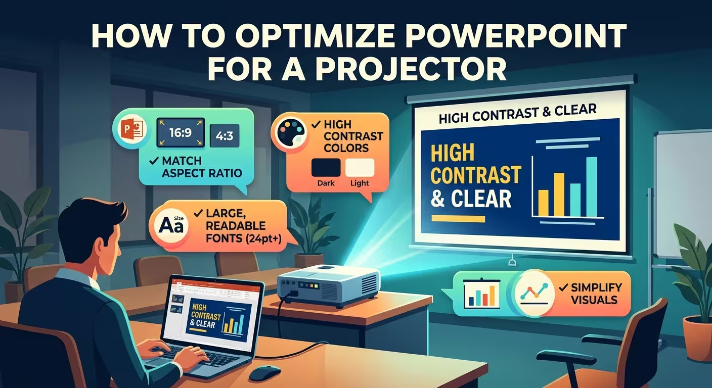
A PowerPoint slide can look perfect on a laptop and fail the moment it reaches a projector. Text that seemed comfortably sized becomes difficult to read, dark colors lose separation, and content close to the edge can disappear.
If you are preparing a presentation for a classroom, conference room, auditorium, or client meeting, how to optimize PowerPoint for a projector is less about adding special effects and more about designing for the weakest part of the display chain. The projector, connection, room lighting, screen, and presentation computer all influence what the audience actually sees.
Start With the Screen You Are Actually Going to Use
The first decision is not your font or color palette. It is the shape and resolution of the display.
For most modern presentations, 16:9 is the sensible starting point. Microsoft identifies widescreen 16:9 as the default for new PowerPoint presentations and recommends it as the better choice for presentations when using the widescreen format.
That does not mean you should blindly use 16:9 for every projector. Older conference equipment, classroom systems, or unusual installations may still be configured around 4:3. If the projector or room display is 4:3, a widescreen deck can introduce unused areas or scaling that changes how the slide fills the screen.
Before designing the deck, find out:
- Whether the room uses a 16:9 or 4:3 display.
- What resolution the presentation computer and projector will use.
- Whether the projector is ceiling-mounted, portable, or connected through another display system.
- Whether the room can be tested before the presentation.
PowerPoint lets you choose Standard (4:3), Widescreen (16:9), or a custom slide size from Design → Slide Size.
The important point is to make this decision before the deck is finished. Changing the aspect ratio late in the process can force PowerPoint to scale your content, potentially changing its fit and proportions.
Design for the Projector's Weakest Moment
A laptop screen gives you an unusually forgiving viewing environment. It is close, bright, sharp, and usually viewed under controlled lighting. A projector does not give you those advantages.
Imagine a hypothetical presentation where the screen looks excellent on the designer's monitor. The room is then partially lit, the projector has modest brightness, and people are sitting several rows away. A thin gray label beside a chart may still technically be visible, but it no longer performs its job.
This is why projector optimization should be based on functional visibility, not how attractive the slide looks at 100% zoom on your computer.
Microsoft recommends choosing fonts that can be read from a distance, avoiding very thin or decorative typefaces, and generally avoiding text smaller than 18 pt, with larger sizes potentially needed in a large room.
In practice, I would go further for important presentation content: if a number, label, or instruction is necessary for understanding the slide, test it from the back of the room rather than deciding its size from the editing screen.
Protect the Edges of Your Slides
One of the easiest projector problems to overlook is also one of the most embarrassing: content that technically exists on the slide but is partially cut off on the screen.
Microsoft specifically warns that some projectors can crop the edges of slides.
Do not treat the outermost pixels of a PowerPoint slide as guaranteed display space. Keep essential information comfortably inside the edges:
- slide titles;
- chart labels;
- page numbers;
- logos that must remain visible;
- key figures and callouts;
- navigation elements.
This matters particularly for presentation templates with strong edge-to-edge compositions. A background image can safely run beyond the visible area because cropping it slightly may not matter. A percentage label positioned at the same edge is a different story.
A useful production rule is to distinguish between decorative content and information-bearing content. Let decorative elements reach the edges when appropriate; keep information-bearing elements farther inside.
Build Contrast for Projection, Not for Your Monitor
A projector can change the visual relationship between colors. A combination that feels subtle and sophisticated on a high-quality monitor may become muddy once projected onto a screen.
Microsoft recommends high contrast between the slide background and text and also advises checking colors on the actual projection screen before presenting.
The important distinction is that contrast is not only about text versus background. It also applies to:
- adjacent chart series;
- thin lines in diagrams;
- small labels;
- icons placed over photography;
- subtle borders;
- highlight colors used to distinguish one data point from another.
If a slide depends on a very small difference between two colors, assume projection will make that difference less reliable.
For example, a hypothetical financial chart might use dark blue, medium blue, and blue-gray bars because they look elegant on a monitor. On a projector, the latter two may become difficult to distinguish. A stronger solution is not necessarily to make every color brighter; it is to give the most important series a clearly different visual signal through color, position, labeling, or shape.
Make Charts Survive the Back Row
Charts often reveal projector problems before any other element does. The overall graph may remain visible while its labels, legends, and small annotations disappear.
When preparing a chart for projection, ask one practical question: Could someone sitting far away understand the main comparison without reading every label?
If the answer is no, redesign the chart rather than simply enlarging the entire slide.
- Make the primary comparison visually obvious.
- Remove secondary labels that do not affect the spoken argument.
- Increase the size of essential numbers and category names.
- Use direct labels when a distant legend would require constant visual back-and-forth.
- Separate dense data into multiple slides when the audience needs to inspect individual values.
This is where a presentation template can save time, provided its layouts are designed with enough room for readable labels rather than merely looking impressive in a preview. For example, ImagineLayout's Professional Pie Charts PowerPoint Template provides editable chart layouts; the useful starting point for projector work is the structure, but labels and chart detail should still be sized for the actual room.
I would not recommend trying to make one dense chart readable from every distance. If the audience needs to compare ten categories and read exact values, splitting the information across slides is often more effective than shrinking everything until it technically fits.
Check Images, Gradients, and Fine Detail
Photography usually survives projection better than tiny interface-like details, but images can still create problems when they contain important information.
Look carefully at:
- small text embedded inside screenshots;
- thin lines in technical diagrams;
- low-contrast annotations;
- subtle gradients behind text;
- dark photographic areas used as text backgrounds.
If a screenshot is essential, do not assume that displaying the complete interface is automatically useful. Crop it to the area the audience actually needs to understand and enlarge that area. A projector turns small interface elements into an especially expensive use of screen space.
The same principle applies to decorative gradients. PowerPoint performance guidance notes that large gradients and transparent objects can also affect presentation performance, particularly in more demanding files.
For projector presentations containing animation or video, test the actual playback path as well. A slide that looks correct as a static image can behave differently once the presentation computer has to render multiple effects and media elements.
Match PowerPoint to the Presentation Computer
A common mistake is to optimize the slides while ignoring the computer that will actually deliver them.
Microsoft recommends verifying that the projector's resolution matches the computer used to create or deliver the presentation because mismatched resolutions can cause cropping or other display problems. :contentReference[oaicite:9]{index=9}
Before the event, confirm the complete chain:
- PowerPoint file;
- presentation computer;
- display output;
- adapter or cable;
- projector;
- screen.
This is also why I would avoid making last-minute edits on an unfamiliar presentation computer. Font availability, PowerPoint versions, display settings, media files, and installed software can all change the result.
If you are using Presenter View, test that configuration as well. PowerPoint supports displaying the presentation on one monitor while keeping speaker notes on another, but the computer must support the required multiple-display setup.
Do the Final Test From the Audience Position
The most useful projector test is not performed while standing next to the laptop.
Put the presentation on the actual screen, walk toward the back of the room, and inspect the slides from approximately where the most distant audience members will sit.
Check three things on every important slide:
- Can I identify the main message immediately?
- Can I read the essential text without leaning forward?
- Can I distinguish the important colors, lines, and chart elements?
Then look specifically for failure points: cropped edges, weak contrast, tiny labels, unreadable screenshots, and visual elements that disappear when the room lights are on.
Do not wait until the presentation starts to discover that a color looks different on the projection screen. Microsoft explicitly recommends checking colors on the projection screen before the actual presentation.
If you have time for only one rehearsal, make it a room rehearsal rather than another session of staring at the deck on your monitor.
A Practical Projector-Ready PowerPoint Checklist
Before sending the deck to the presentation computer, run through this short check:
- Aspect ratio: Does the slide size match the room's display?
- Resolution: Does the computer output match the projector configuration?
- Margins: Are essential elements safely away from the edges?
- Typography: Can important text be read from the back of the room?
- Contrast: Do text, charts, and diagrams remain distinct under projection?
- Charts: Are labels and key comparisons readable without relying on tiny legends?
- Images: Do screenshots and detailed visuals still communicate their purpose at distance?
- Media: Do videos and animations play correctly on the actual presentation computer?
- Colors: Have important slides been checked on the actual projector?
- Backup: Is the final presentation file available in a second location?
A useful starting point for building a projector-friendly deck is a properly structured 16:9 presentation system rather than retrofitting an old layout at the end. ImagineLayout's 16:9 PowerPoint template layouts, for example, provide editable slide structures that can be adapted before you begin filling them with dense content.
And if the presentation relies heavily on diagrams or data, a dedicated visual structure can be more useful than repeatedly rebuilding charts from scratch. ImagineLayout's Physics of Optical Materials and Devices PowerPoint templates are one example of a 16:9 presentation format that can be adapted to technical material.
The key is to stop treating the projector as the last step in the workflow. Your audience does not see the PowerPoint file, the laptop display, or the carefully calibrated monitor. They see the image that survives the entire chain between your slide and the screen.
Optimize that final image, and many of the “PowerPoint problems” people discover five minutes before presenting disappear before they ever reach the room.
Comments (0)