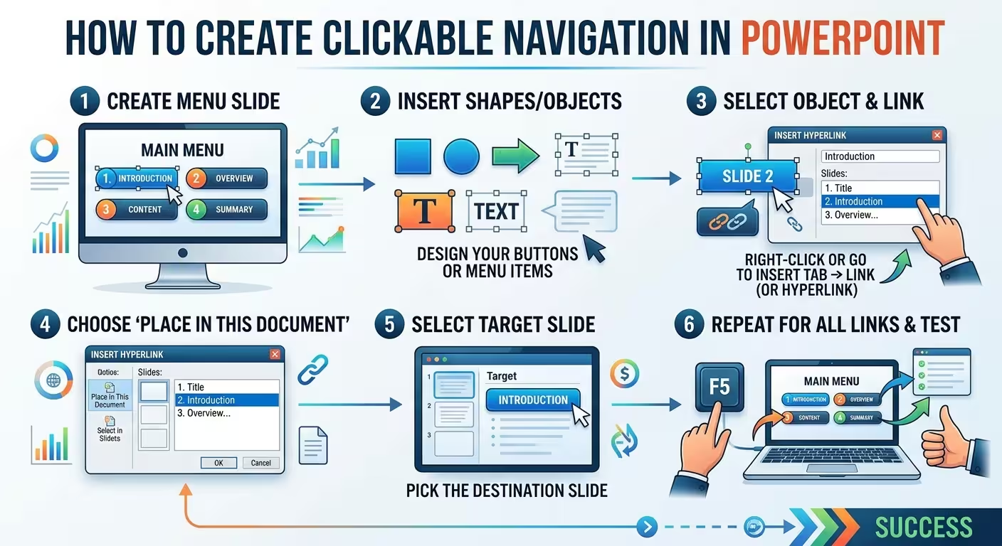
A PowerPoint presentation can contain perfectly good slides and still become frustrating the moment someone asks, “Can we jump to the financial section?” That is where clickable navigation changes the job: instead of moving through slides only in sequence, you can build a presentation that behaves more like a simple interface.
This guide explains how to create clickable navigation in PowerPoint using hyperlinks, Action Buttons, and Zoom. More importantly, it shows how to structure the navigation so that it remains understandable and maintainable when the presentation grows.
Start with the navigation structure, not the buttons
The first mistake is usually visual. Someone creates a polished menu slide, adds four or five attractive cards, and only afterward decides where those cards should lead.
Reverse that order.
Before designing the menu, identify the destinations your audience or presenter actually needs. For example, a 25-slide business presentation might contain:
- Overview — slides 2–5
- Market — slides 6–10
- Strategy — slides 11–17
- Financials — slides 18–23
- Appendix — slides 24–25
The menu is then a visual representation of that structure. It is not simply a decorative table of contents.
This distinction becomes particularly useful when the presentation is delivered interactively. A presenter may follow the normal sequence during the main talk, then jump directly from the overview to financials when a question requires it.
Think of the deck as having two structures:
- Content structure: what information appears in the presentation.
- Navigation structure: how someone moves between that information.
They overlap, but they are not necessarily identical. A 10-slide presentation may need almost no navigation. A 60-slide training deck may need several navigation levels even if the underlying content is still linear.
Choose the right way to make slides clickable
PowerPoint gives you several ways to create clickable navigation, but they solve slightly different problems.
Use hyperlinks for straightforward navigation
If you simply need a shape, image, or piece of text to open another slide, a standard hyperlink is usually the cleanest solution.
Select the object, choose Insert > Link, select the option for a place in the current presentation, and choose the destination slide. Microsoft supports linking text, shapes, and pictures to a specific slide in the same presentation.
This method is particularly useful for:
- Clickable agendas
- Section menus
- “See details” buttons
- Diagram elements that open supporting slides
- Simple Home and Back controls
The advantage is predictability. There is little extra machinery between the object and its destination.
Use Action Buttons when navigation itself is the control
Action Buttons are useful when the presentation needs explicit commands such as Home, Next, Previous, or Back. PowerPoint can assign actions to shapes that navigate to particular slides or perform other supported actions during the presentation.
For example, a small house icon can consistently return the presenter to the main menu.
The important part is not the built-in button shape. You can use your own visual design. The useful feature is the action assigned to the object.
Use Zoom when the menu should become a visual map
PowerPoint Zoom is better suited to presentations where the navigation itself is part of the visual experience. Microsoft supports Summary Zoom, Section Zoom, and Slide Zoom in supported desktop versions of PowerPoint.
Imagine a presentation whose main navigation slide contains five visual destinations:
- Market
- Product
- Customers
- Strategy
- Financials
With Zoom, these can behave as visual entry points rather than ordinary text links. Depending on the Zoom configuration, you can also return to the navigation slide after visiting a section.
The trade-off is important: Zoom can make a structured presentation feel more like an interface, but ordinary hyperlinks are often easier to maintain when the navigation requirements are simple.
Build a clickable PowerPoint menu
Once the destinations are defined, the basic implementation is surprisingly simple.
Create a dedicated navigation slide near the beginning of the presentation. It could be a conventional agenda, a grid of cards, a diagram, or a visual dashboard.
For each navigation element:
- Select the text, shape, or image.
- Choose Insert > Link.
- Select the destination inside the current presentation.
- Choose the target slide.
- Test the link in Slide Show mode.
PowerPoint automatically maintains slide destinations, so you do not need to manually calculate slide numbers when creating a standard link. Microsoft documents the process as linking an object to a specific slide within the presentation.
One practical design decision matters here: make the clickable area larger than the visible label whenever possible.
If a menu item says “Financials” inside a large card, linking the entire card is more forgiving than linking only the word itself. This is especially useful when the presentation will be operated from a touchscreen, presentation remote, or from a distance.
Give the audience a way back
A navigation system is incomplete if it only provides an entrance.
Suppose the presenter clicks Strategy, moves through six slides, and then receives a question about the financial model. If returning requires repeatedly pressing Back, the menu has solved only half of the problem.
A better structure is:
- Main Menu → major sections
- Section Menu → individual topics or subsections
- Content Slides → detailed information
- Back → previous navigation level
- Home → main menu
For a short presentation, putting Home and Back controls on every slide may be unnecessary. For a long training deck, sales presentation, product demo, or presentation that will be used in different sequences, the additional navigation can save substantial manual searching.
The key is consistency. If a house icon means Home on one slide, it should not suddenly mean “previous section” somewhere else.
A small persistent navigation element can work better than a large button that competes with the actual content. The reader should understand the control when needed without making the presentation look like a software toolbar.
If you want to see the underlying idea applied to a complete menu structure, see How to Create an Interactive Menu in PowerPoint.
Separate primary navigation from secondary links
One subtle problem appears when every clickable object looks identical.
Imagine a slide containing a Home button, a link to the next section, three supporting charts, and a “source” link. If all six objects use the same visual treatment, the user has no clear indication of which links control the presentation and which links reveal supporting material.
Use a small visual vocabulary instead:
- Primary navigation: Home, Back, section names.
- Section navigation: links between major presentation areas.
- Content links: supporting charts, details, examples, or references.
- External links: websites or files outside the presentation.
This is particularly useful in presentations that are reused. A consultant might use the same deck with different clients and skip different sections. A training presentation might be delivered in different orders. A product demo might require jumping from a feature overview directly to a technical slide.
The navigation system should make those alternative paths intentional rather than accidental.
Design the clickable elements as part of the presentation system
Clickable navigation does not require a special “interactive” visual style.
In fact, navigation often works better when it is integrated into the existing presentation design. The important distinction is not whether a button looks flashy. It is whether the user can understand what it does and what will happen after the click.
For example, a business presentation may use restrained cards and section labels. Those same cards can become navigation controls without changing the visual language of the deck.
This is one reason editable presentation templates can be useful during the design stage: they provide established slide structures that can be adapted before the interactive layer is added. For example, ImagineLayout's Business Center PowerPoint templates provide editable business layouts that can serve as a visual starting point for structured presentations.
For reporting-heavy decks, a structure such as Business Reference PowerPoint template can also be useful when the presentation contains multiple information categories that need clear visual separation.
The important point is that a template does not create the navigation for you. It can reduce the amount of layout work, but the navigation architecture still needs to be planned separately.
Test the presentation like software
This is the part that is easy to skip because the presentation already looks finished.
Do not test only whether the main menu buttons work. Test the paths a real presenter might take.
- Open every main menu destination.
- Check the Home control from every section where it appears.
- Test Back controls at different points in the presentation.
- Jump between sections in an unexpected order.
- Start the presentation from the beginning and test the complete path.
- Start from a middle slide and test whether navigation still behaves correctly.
- Move or add slides and retest the affected navigation.
- Check that clickable objects do not accidentally advance the presentation.
Microsoft specifically recommends testing hyperlinks in Slide Show mode.
There is a useful reason to treat this as a separate testing phase: the visual appearance of a slide does not tell you whether its interaction is correct.
A navigation map can help with larger presentations. It does not need to appear in the final deck. Simply record something like:
- Menu → Overview → slide 2
- Menu → Market → slide 7
- Menu → Strategy → slide 14
- Menu → Financials → slide 22
- All section slides → Home → slide 1
When the deck reaches dozens of slides, this small piece of documentation can make troubleshooting much faster.
When should you use hyperlinks, Action Buttons, or Zoom?
There is no single method that is correct for every presentation.
- Choose hyperlinks when you need simple, predictable links between slides.
- Choose Action Buttons when you need explicit controls such as Home, Back, Next, or Previous.
- Choose Zoom when the presentation has clearly defined sections and you want the navigation to function as a visual overview.
For a compact 8–10 slide deck, a sophisticated navigation architecture can create more maintenance than value. For a long training presentation, sales deck, interactive demo, or self-guided presentation, the opposite can be true.
The deciding question is therefore not “Which PowerPoint feature is newest?” It is “How many different paths does this presentation genuinely need?”
Clickable navigation is useful when the presentation needs more than one path
A linear presentation assumes that slide 1 leads to slide 2, slide 2 leads to slide 3, and so on. That model works perfectly well when the audience should experience the information in one fixed sequence.
Clickable navigation becomes valuable when the presentation has multiple legitimate paths.
A sales deck may need to move from an overview directly to pricing. A training deck may need to revisit a previous module. A product presentation may need to answer a technical question before returning to the main story.
In those situations, the hyperlink itself is not the important part. The real design task is creating a navigation system that lets the presenter change direction without losing the structure of the presentation.
Start with the destinations, build the simplest navigation model that supports them, give important sections a reliable way back, and then test every path in Slide Show mode. Once those pieces work, the visual styling becomes much easier—and the presentation behaves like a designed experience rather than a stack of slides.
Comments (0)