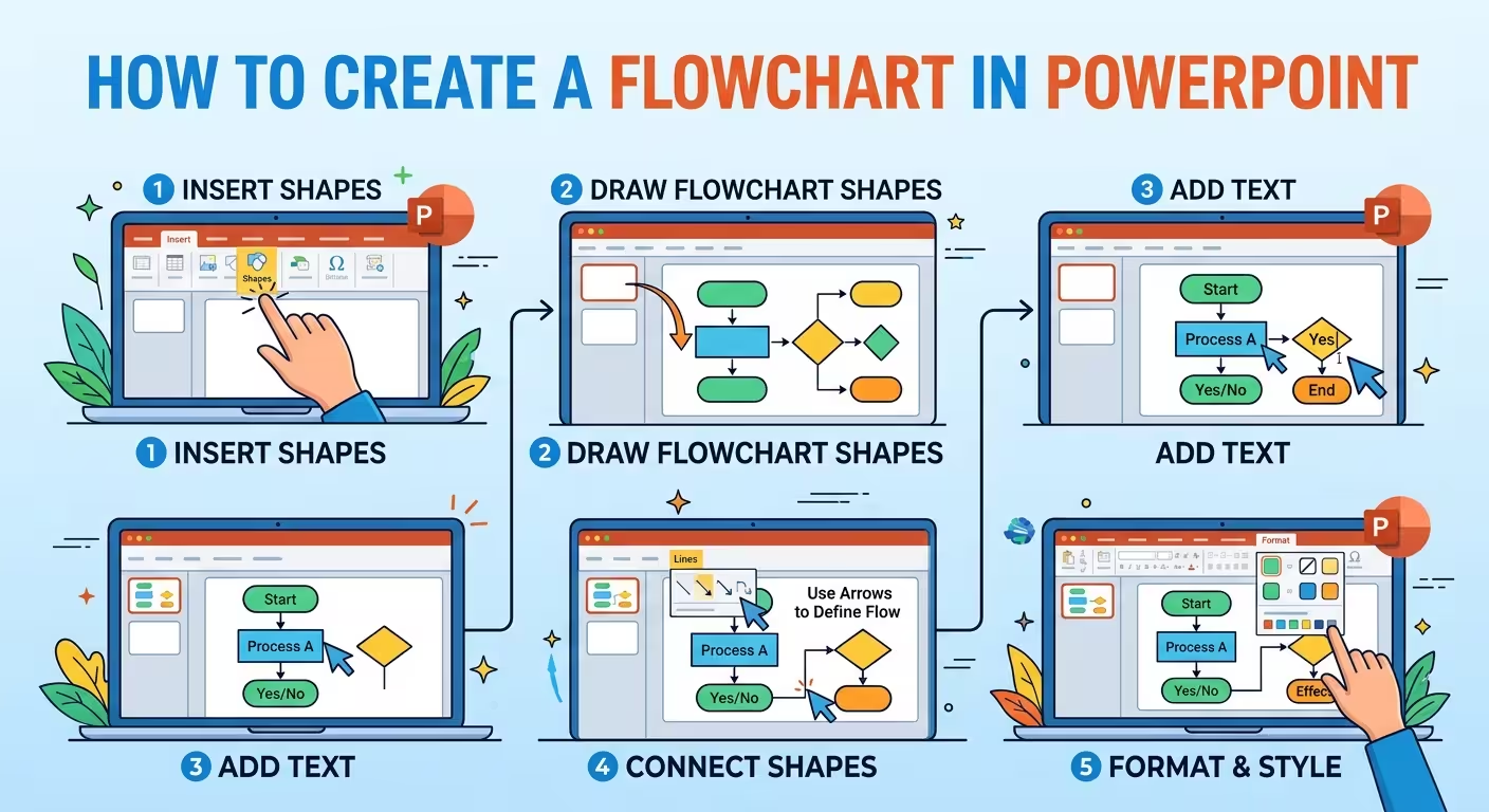
A flowchart can look perfectly organized and still be difficult to follow. The problem is usually not the colors, fonts, or shapes — it is that the visual structure does not match the logic of the process.
If you need to create a flowchart in PowerPoint, this guide shows two practical ways to build one: start with SmartArt when the process is relatively simple, or use individual shapes and connectors when you need precise control. The goal is not simply to get boxes onto a slide, but to make the sequence, decisions, and outcomes immediately understandable.
Start With the Process, Not the PowerPoint Shapes
Before opening the Insert menu, write the process as a short sequence of actions. If you cannot describe the process clearly in plain language, the flowchart will usually become a collection of boxes rather than an explanation.
For example, a hypothetical approval process might be:
- Request submitted
- Request reviewed
- Is the request complete?
- If yes, approve the request
- If no, return it for revision
Notice that the third step is different from the others. It is a decision, not an ordinary action. That distinction should affect the shape and the connections you use on the slide.
A useful planning test is to mark every step as one of three things:
- Action: something a person, team, or system does.
- Decision: a condition that creates two or more possible paths.
- Outcome: the result reached after the process or branch.
This simple classification prevents one of the most common flowchart problems: treating every box as if it carries the same meaning.
Choose Between SmartArt and Individual Shapes
PowerPoint gives you more than one way to build a process diagram, and choosing the wrong one can create unnecessary editing work later.
SmartArt is useful when the process is short, mostly sequential, and unlikely to change dramatically. It gives you predefined layouts and automatically manages much of the arrangement. For a simple three-to-six-step process, this can be considerably faster than drawing every element manually.
Go to Insert → SmartArt → Process, select a layout, and replace the placeholder text with your own steps.
SmartArt becomes less convenient when your process contains several decision branches, unusual connector paths, different shape types, or carefully controlled positioning. At that point, individual PowerPoint shapes generally give you more control.
The practical rule is simple:
- Use SmartArt when the structure is conventional and speed matters.
- Use Shapes + Connectors when the structure itself needs to be designed.
- Use a pre-designed diagram when the process is complex and the visual composition would otherwise take significant manual work.
Microsoft also allows SmartArt graphics to be converted into individual shapes, which can be useful when you want to start with a predefined structure and then customize it more extensively.
How to Create a Flowchart With SmartArt
For a straightforward process, SmartArt is the fastest starting point.
Open your presentation and create a blank slide or use a layout with enough space for the diagram. Then select:
Insert → SmartArt → Process
Choose a layout that matches the direction of your process. A horizontal process works well when the sequence needs to read from left to right. A vertical arrangement can work better when the slide has limited horizontal space.
Enter the process steps in the SmartArt text pane. Keep each step short enough that the diagram remains readable at presentation distance.
For example:
- Collect request
- Review details
- Check eligibility
- Approve
- Notify requester
At this stage, resist the temptation to add descriptions to every box. If an explanation is essential, consider adding a short secondary label rather than turning each step into a paragraph.
Microsoft's SmartArt system can add or remove shapes as the structure changes, which makes it convenient during the early editing stage.
How to Build a More Flexible Flowchart With Shapes
There is a point where SmartArt starts fighting the process instead of helping it. This usually happens when the diagram contains multiple branches or when several paths need to reconnect.
For these diagrams, create the structure manually.
Go to Insert → Shapes and use a consistent set of shapes for the different logical roles in your process. A typical flowchart might use:
- Rounded rectangles for starting or ending points.
- Rectangles for actions or process steps.
- Diamonds for decisions.
- Arrows or connectors for movement between stages.
The important part is not following a particular decorative style. It is maintaining the same visual meaning throughout the diagram.
If a diamond means "decision" in one part of the slide, do not use another diamond simply because it looks attractive somewhere else.
When connecting shapes, use PowerPoint's connector tools rather than drawing ordinary lines between objects. Connectors are designed to remain attached when you move the shapes, which becomes particularly important during revisions.
A good construction sequence is:
- Place the start and end points.
- Place the major actions between them.
- Add decision points.
- Connect the main path.
- Add branch paths.
- Reposition shapes to remove unnecessary crossings.
- Only then apply colors, typography, icons, and other visual styling.
This order matters. Styling a diagram before its geometry is settled often creates extra work because every structural change forces another round of visual adjustments.
Design Decision Branches So They Can Be Read Quickly
A decision diamond is only useful if the audience can understand what happens after it.
Suppose a slide contains a diamond labeled "Approved?". The outgoing connectors should make the alternatives explicit:
- Yes → Continue to the next stage.
- No → Return to the correction or review stage.
Do not make the audience infer which arrow means yes or no. Label the branches directly when the meaning is not obvious.
There is another useful test: follow every connector with your finger from start to finish. If you have to cross another connector, jump backward, or guess which line belongs to which box, the audience will probably have the same problem.
For processes with many branches, consider separating the primary path from secondary paths visually. The main route can receive the strongest visual emphasis, while exception routes use a quieter treatment. This is especially helpful in operational or approval diagrams where the normal path represents most cases and exceptions are important but less frequent.
Make a Flowchart Look Like Part of the Presentation
A technically correct flowchart can still look disconnected from the rest of a deck. This often happens when the diagram is copied from a different source and retains its own colors, typography, and visual language.
Instead, treat the flowchart as one component of the presentation's design system.
Match the diagram to the presentation's:
- primary and secondary colors;
- font family and hierarchy;
- corner radius and shape language;
- line weight;
- icon style;
- background treatment.
There is a practical exception to strict visual consistency: the most important path may need stronger contrast than ordinary content. If every box has identical emphasis, the audience has to determine the hierarchy from the connector structure alone.
For complex business processes, ready-made PowerPoint diagram assets can also provide a useful starting point. ImagineLayout's Element of Process PowerPoint Template includes multiple process-oriented diagram structures, while its Process Block Schemes PowerPoint Template focuses on editable blocks, arrows, and process relationships.
For broader business-process presentations, the Business Process Diagram PowerPoint Template can serve as a starting point when the flowchart is part of a larger business explanation rather than a standalone diagram.
Know When One Flowchart Is Too Much for One Slide
The hardest flowcharts are not necessarily the most complicated processes. They are the diagrams where the author tries to explain the entire process at the same visual level.
If a process contains a main sequence, several exceptions, multiple teams, and detailed rules, consider splitting it into levels.
For example:
- Slide 1: high-level process from request to completion.
- Slide 2: detailed approval branch.
- Slide 3: exception handling or escalation process.
This is often clearer than shrinking twenty or thirty nodes until the diagram technically fits on one slide but cannot be read comfortably.
Another option is a swimlane structure when responsibility matters as much as sequence. Instead of asking only "what happens next?", the slide can answer "who owns this step?" That distinction turns a simple process diagram into a useful operational map.
Animate the Flow Only When the Sequence Matters
Animation can help when you are explaining a process live and want the audience to follow one stage at a time. PowerPoint supports animation of SmartArt graphics and can reveal elements individually.
But animation should not be used to compensate for a confusing diagram.
If the audience needs animation to understand which connector belongs to which branch, simplify the static diagram first. Animation works best as a presentation aid: reveal the normal path, introduce the decision, then show the alternative route.
For a report that will be exported to PDF, printed, or viewed without the presenter, the static version still needs to communicate the complete logic.
A Practical Final Check Before Presenting
Before calling the flowchart finished, temporarily ignore its colors and decorative elements and test the logic.
- Can someone identify where the process starts?
- Can they follow the primary path without crossing connectors?
- Are decisions visually different from actions?
- Are branch outcomes labeled where necessary?
- Does every connector lead somewhere meaningful?
- Can the smallest text be read from the back of the room or in the presentation window?
- Does the diagram still make sense if the animations are removed?
If the answer to one of these questions is no, changing the color palette probably will not solve the problem. Change the structure first.
The best PowerPoint flowchart is rarely the one with the most sophisticated graphics. It is the one where the viewer can reconstruct the process correctly after looking at it for only a few seconds. Start with the logic, choose SmartArt or individual shapes according to that logic, build the connectors carefully, and only then give the diagram the visual treatment that makes it belong to the presentation.
Comments (0)