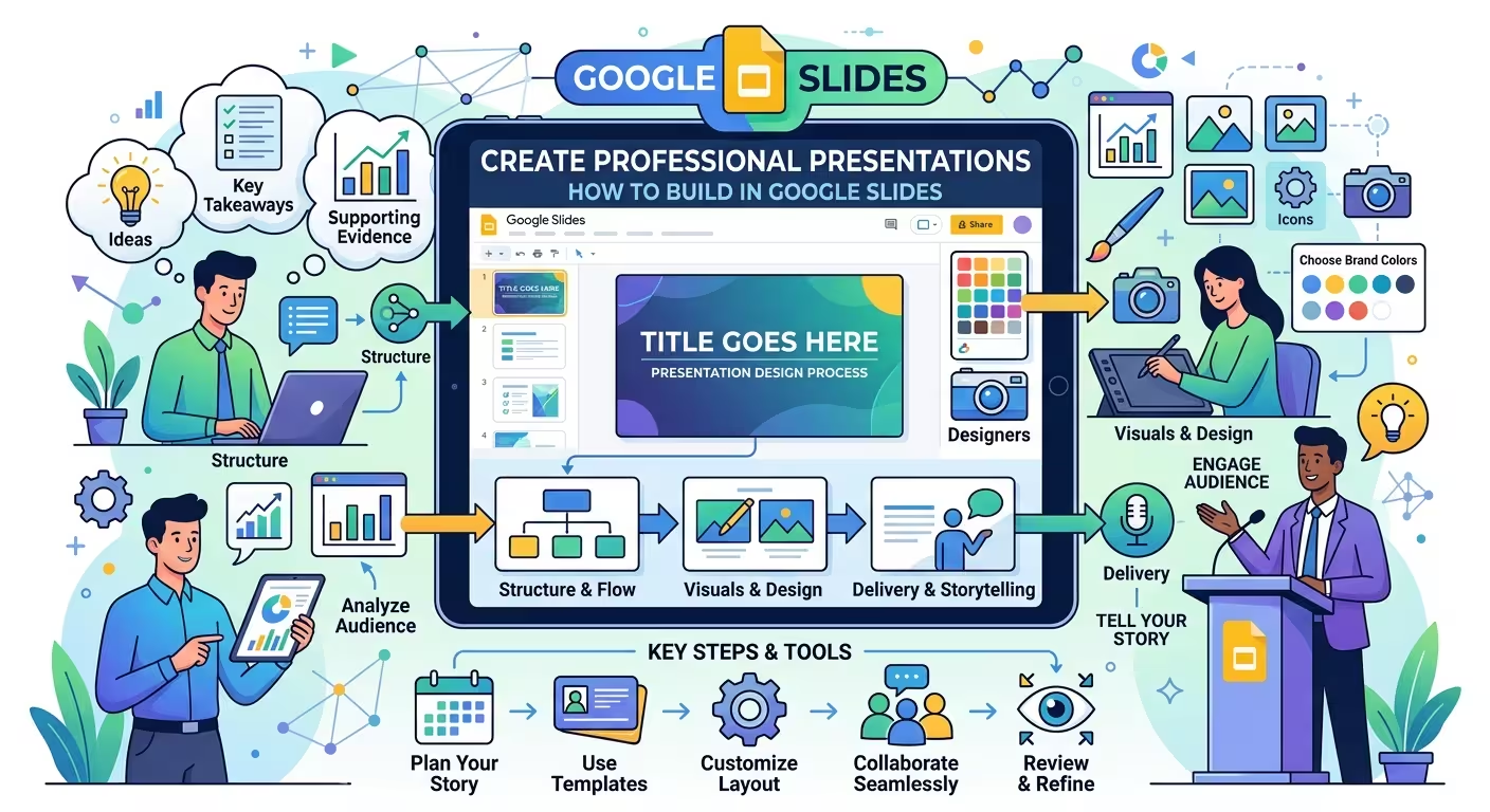
A Google Slides presentation can look polished and still feel unprofessional. The problem is usually not the software. It is that the deck was designed slide by slide before anyone decided what each slide needed to accomplish.
If you need to build a professional presentation in Google Slides, the better approach is to treat the file as a visual argument: define the message, give every slide a job, establish a design system, and only then start refining the individual pages. Google Slides gives you themes, layouts, templates, collaboration, speaker notes, and presentation controls, but those features do not decide what your audience should understand first.
Start with the argument, not the template
The fastest way to make a presentation look improvised is to open Google Slides and immediately start choosing layouts.
That feels productive because something appears on the screen. But you are making design decisions before you know what the presentation is supposed to prove.
Before opening the visual editor, write down three things:
- The audience: Who is looking at this, and what do they already know?
- The decision: What should they understand, approve, remember, or do after the presentation?
- The evidence: Which facts, examples, numbers, or comparisons actually support that decision?
Then turn those answers into a rough sequence. For example, a hypothetical business presentation might move from the current problem to its cause, then to the proposed solution, evidence that the solution addresses the problem, implementation steps, and the decision required from the audience.
That sequence is more valuable than the first visual theme you choose. A beautiful template cannot repair a presentation in which the audience has to guess why slide 7 exists.
One useful test is to describe every planned slide with a verb. A slide might need to frame, compare, explain, prove, prioritize, or decide. If you cannot give a slide a clear job, it may not belong in the deck.
Build a slide system before designing individual slides
Professional presentations rarely depend on every slide being visually identical. They depend on a limited system that can produce different kinds of slides without looking unrelated.
Google Slides separates themes from layouts: a theme can define the presentation's visual language, while layouts determine how content is arranged on individual slides.
The practical mistake is to treat a layout as a finished design rather than as a structural tool.
For a typical professional deck, define a small family of recurring slide types before filling the presentation:
- Opening slide: establishes the subject and sets the visual tone.
- Section slide: creates a clear change of subject or phase.
- Statement slide: gives one important idea enough room to be understood.
- Comparison slide: puts competing options or states into a controlled visual relationship.
- Data slide: gives a chart, metric, or table a clear interpretation.
- Process slide: explains sequence, dependencies, or stages.
- Closing slide: makes the required takeaway or next action explicit.
This is where templates can genuinely save time. Instead of inventing a new composition whenever the content changes, you can start with a proven structural pattern and adapt it to the information. ImagineLayout's Business Strategy Keynote Template, for example, is built around strategy-oriented visual structures that can be adapted after import into Google Slides.
The important distinction is that a template should reduce layout decisions, not replace editorial decisions. If the content does not fit a layout, change the layout. Do not distort the message simply because the template happens to have an empty box in that position.
Choose typography and color as a system
A professional deck usually becomes more convincing when its visual rules are decided early rather than adjusted independently on every slide.
Start with a small typographic hierarchy. You generally need a title style, a supporting text style, and perhaps one compact style for labels or annotations. The exact font matters less than the relationships between sizes, weights, and line lengths.
There is an important exception: a deck containing dense analytical material may need more typographic levels than a short executive presentation. The goal is not to minimize the number of styles at all costs. The goal is to make the difference between levels immediately predictable.
The same principle applies to color. Instead of choosing several attractive colors, assign each color a role.
- One dominant text and background system.
- One primary accent for important information.
- Optional secondary accents for meaningful categories.
- A neutral treatment for supporting or secondary information.
This becomes particularly important in charts. If every series receives a strong color, nothing is visually prioritized. A better approach is to let the chart remain relatively quiet and use emphasis only where the interpretation requires it.
Google Slides allows theme colors to be edited centrally, which makes this system easier to maintain than manually changing individual objects throughout a deck.
Design each slide around one visual decision
Here is where many otherwise competent presentations start to break down: the slide contains everything the author knows about the subject.
A professional slide does not need to contain one fact. It needs to make one relationship easy to understand.
Suppose you are presenting three strategic options. A conventional approach might place three text-heavy columns on the page. A stronger design asks what the audience actually needs to compare: cost, implementation difficulty, expected impact, risk, or another decision criterion.
Once that criterion is clear, the visual structure becomes easier to choose. The slide can make the comparison itself prominent while moving secondary explanation into smaller supporting text.
This distinction also changes how you handle charts. Do not begin with “Which chart should I use?” Begin with “What relationship should the audience see?”
- Use a trend when change over time matters.
- Use a comparison when relative magnitude matters.
- Use a composition when the parts of a whole matter.
- Use a process diagram when sequence or dependency matters.
The chart type is a consequence of the argument, not a decorative choice.
For more complex business diagrams, a prepared visual system can be useful because the difficult part is often not drawing the shapes but maintaining consistent spacing, labels, connectors, and hierarchy across several related slides. ImagineLayout's Business Solutions Keynote Diagrams Template is one example of this type of reusable structure.
Use layouts to control repetition without making the deck monotonous
Consistency does not mean every slide should look like a clone of the previous one.
If ten slides use exactly the same title position, image box, paragraph block, and footer, the audience eventually stops seeing structure. The repeated frame becomes visual noise.
A better system keeps certain elements stable while allowing the composition to change according to the content.
For example, your title treatment, typography, margins, and accent color can remain consistent while the body alternates between a large statement, a two-column comparison, a chart, a timeline, and a diagram.
This is one reason to establish a small set of layouts rather than manually constructing every page. Google Slides provides layouts specifically for arranging text and images, and its template system can supply reusable combinations of visual rules and slide structures.
The trade-off is important: too little variation makes the deck monotonous; too much variation makes it feel assembled from unrelated sources. Professional design sits between those extremes.
Edit the deck in two separate passes
One of the most useful workflow changes is to stop trying to solve content and visual polish simultaneously.
In the first pass, ignore whether the presentation looks beautiful. Check whether the story works.
- Can someone understand the purpose of the deck from the opening?
- Does every slide move the argument forward?
- Are important claims supported by evidence?
- Are there slides that repeat information without adding a new interpretation?
- Does the final section actually answer the question raised at the beginning?
Only after that should you do the visual pass.
During the second pass, look for problems that are invisible when you are focused on writing: inconsistent alignment, accidental changes in font size, weak contrast, awkward line breaks, uneven chart treatment, objects that almost—but not quite—align, and slides where the intended focal point is unclear.
This separation matters because content changes often destroy visual polish. If you perfect a chart before deciding whether the chart belongs in the argument, you may spend twenty minutes polishing something that gets deleted five minutes later.
Prepare the presentation for the room, not just the editor
A deck that looks excellent while you are zoomed in on your monitor still has to survive presentation conditions.
Check the slides at the approximate size and distance at which the audience will see them. Small labels that look perfectly readable while editing can become irrelevant when projected or viewed in a meeting window.
Then run the deck as a presentation rather than scrolling through it as a document. Google Slides provides a slideshow mode and a presenter view with speaker notes, so the delivery version can be checked separately from the editing environment.
Speaker notes are particularly useful when they contain information that helps you deliver the slide but would distract the audience if placed directly on it. The slide should carry the visual argument; the notes can carry prompts, transitions, definitions, or reminders for the presenter.
Also test the handoff between slides. A presentation can contain individually strong pages but still feel disjointed if the relationship between them is unclear. The end of one slide should naturally create the question or context that the next slide answers.
Use collaboration without turning the deck into a committee
Google Slides makes simultaneous editing and commenting practical, which is valuable when a presentation involves subject-matter experts, managers, analysts, or other contributors. Google describes Slides as supporting live co-editing, comments, sharing permissions, and revision history.
But collaboration introduces a design problem of its own: every contributor can add information, while nobody automatically owns the overall hierarchy.
Before asking several people to edit the deck, define what kind of feedback you want. “Please review this presentation” invites comments about everything from commas to personal color preferences.
Instead, separate review rounds by purpose:
- Content review: Is the information accurate and complete?
- Logic review: Does the sequence support the intended decision?
- Design review: Does the visual system communicate the hierarchy clearly?
- Delivery review: Can the presenter explain the deck naturally without reading the slides?
That division prevents a common failure mode: polishing a slide while its underlying message is still being debated.
A professional Google Slides workflow is mostly about decisions
The software is rarely the hardest part of building a professional presentation. The harder work happens before and between the clicks: deciding what matters, assigning each slide a job, choosing the right visual representation, and removing information that competes with the main point.
A practical workflow looks like this:
- Define the audience and the decision the presentation needs to support.
- Write the narrative before choosing detailed layouts.
- Assign a specific job to every slide.
- Establish typography, color, spacing, and recurring visual patterns.
- Build a small set of layouts that match the types of information in the deck.
- Design charts and diagrams around the relationship they need to communicate.
- Edit the content before spending time on visual polish.
- Run a separate visual-quality pass for consistency and hierarchy.
- Present the deck in slideshow mode and check it from the audience's perspective.
- Use collaboration deliberately, with different review rounds for content, logic, design, and delivery.
The most useful mindset shift is simple: Google Slides is the production environment, not the presentation strategy. Once the argument and visual system are clear, the software becomes much easier to use because each formatting decision has a reason behind it.
And that is usually the difference between a deck that merely looks finished and one that actually feels professional.
Comments (0)