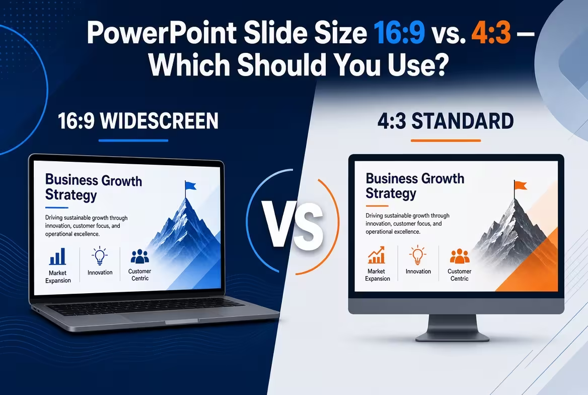
Most PowerPoint users never make an active decision about slide size. They open a new presentation, see 16:9, and start designing. That is usually fine — until the same deck has to become a printed handout, a dense financial report, a screen share, or something people read without the presenter.
So the real question in the PowerPoint slide size 16:9 vs 4:3 debate is not simply which format looks more modern. It is where the presentation will actually be consumed. Once that is clear, the choice becomes much easier.
16:9 is the default — but a default is not a design decision
PowerPoint currently uses 16:9 widescreen as the default size for new presentations. Microsoft also provides Standard 4:3 and custom dimensions through the Slide Size controls.
That default makes sense for a large part of modern presentation work. A widescreen slide matches the shape of many contemporary displays and gives a presentation a broad horizontal canvas for images, diagrams, timelines, and side-by-side comparisons.
But there is an important distinction between “PowerPoint starts here” and “this is the correct format for my presentation.”
If you are presenting a strategy deck on a modern display and the audience will mainly watch you talk through it, 16:9 is a natural starting point. If the deck is going to be printed, read independently, or filled with vertically stacked information, the decision becomes less obvious.
That is why I would choose the output first and the canvas second.
When 16:9 is the better fit
Imagine a typical conference-room presentation: the deck is displayed on a modern screen, the presenter controls the pace, and most slides contain a combination of headlines, visuals, diagrams, or a small amount of supporting data.
This is where 16:9 earns its reputation. Its horizontal shape works particularly well for visual storytelling because there is room to place elements beside one another rather than forcing everything into a narrow vertical stack.
Microsoft's current PowerPoint documentation defines the Widescreen option as 13.333 × 7.5 inches, while its On-screen Show 16:9 option uses 10 × 5.625 inches. Both have the same aspect ratio, but the Widescreen preset provides more physical slide surface in the PowerPoint document.
For most screen-based business presentations, 16:9 is therefore the sensible starting point.
It is particularly useful when the slide needs:
- a large image with text alongside it;
- a horizontal process or timeline;
- two or three related visual blocks;
- a chart with enough horizontal room for labels;
- a presentation layout designed primarily for screen delivery.
ImagineLayout's current library reflects this screen-first workflow: many of its PowerPoint products are explicitly built in 16:9, including its Timeline Process Diagrams and several current presentation templates.
The catch is that the extra width can tempt you to keep adding things horizontally. A 16:9 canvas gives you more room, but it does not automatically give you a better information structure.
4:3 becomes useful when the slide needs more vertical room
4:3 is often described as the “old” PowerPoint format, which makes it easy to dismiss. That is the wrong way to think about it.
A 4:3 slide is simply a different working canvas. Compared with 16:9, it gives up horizontal width in exchange for more relative height. That changes what fits comfortably on the page.
This matters when your slide is naturally vertical rather than horizontal.
Consider a dense operational slide with several rows of figures, a comparison table, or a sequence of vertically stacked categories. On a wide 16:9 canvas, the temptation is often to stretch the content sideways or reduce the font until everything fits. Neither solves the underlying layout problem.
A squarer canvas can make this type of information easier to organize without forcing every element into a long horizontal strip.
That does not mean 4:3 should replace 16:9 for every analytical presentation. It means the shape of the information should be part of the decision.
There is also a practical reason to consider it: print. A 16:9 slide has a very different relationship with a conventional sheet of paper than a 4:3 slide. Microsoft specifically notes that widescreen slides do not fit an 8.5 × 11-inch sheet without scaling.
If the final artifact is primarily a printed document, the screen-first assumption behind 16:9 may no longer be the right starting point.
The hidden question: will people watch the deck or read it?
This is the distinction I would make before choosing either format.
A presentation that is delivered live has a presenter supplying context. A document that is exported to PDF and emailed around has to explain itself without that voice.
Those are different communication jobs, even when the source PowerPoint file is identical.
If people will mostly watch the presentation, 16:9 usually gives you the more natural screen canvas.
If people will mostly read the presentation, you should think much more carefully about the destination. A slide that looks excellent for five seconds on a large display may become awkward when someone opens the PDF on a laptop, prints it, or studies a table in detail.
This is also where a deck's “second life” matters. A presentation may start as a live talk and later become:
- a PDF sent to stakeholders;
- a printed meeting handout;
- a report appendix;
- a document shared internally;
- a series of images for another platform.
If one of those secondary uses is actually the dominant use, choose the canvas with that destination in mind rather than designing for the original presentation scenario and repairing everything afterward.
What happens when you change 16:9 to 4:3 after designing?
This is where slide size stops being a cosmetic preference and becomes a production decision.
PowerPoint cannot use a different slide size for individual slides within the same presentation; changing the size affects the presentation as a whole. When the size changes, PowerPoint may ask whether to maximize the existing content or ensure that it fits inside the new dimensions.
Neither option is a substitute for reviewing the layout.
Maximize can make the existing elements larger, but objects may no longer fit. Ensure Fit keeps the content visible by scaling it down, but that can create a deck where typography and visual hierarchy suddenly feel too small.
There is another problem that is easy to underestimate: the original layout was designed around a particular geometry.
A title that sat comfortably above a chart in 16:9 may now compete with it for space. A wide image may need cropping. A timeline may become cramped. A diagram built around three horizontal columns may suddenly have much less room between them.
This is why I would not design ten or twenty slides in 16:9 and then casually switch the entire file to 4:3 because someone asks for a “standard version.” If both formats are genuinely required, it is usually better to decide that before the visual system is built.
Templates deserve the same caution. A layout containing editable vector shapes can behave very differently from one that relies heavily on fixed raster graphics when its proportions change. If a template is likely to be reused across formats, inspect how its major visual elements scale before committing to it.
For example, an editable diagram system can be much easier to adapt when the same presentation needs different proportions. ImagineLayout's editable PowerPoint timeline diagrams are built around reusable shapes and layouts rather than a single flattened image, which is the kind of construction worth looking for when flexibility matters.
What about printing, PDFs, and handouts?
Printing is where many “16:9 vs 4:3” recommendations become too simplistic.
If the presentation will only ever be projected or screen-shared, printing may not matter. But if the PDF will become a document people annotate or keep for reference, the physical page relationship matters much more.
A widescreen slide is considerably wider relative to its height than a conventional paper page. When it is placed onto paper, something has to give: the slide can be reduced, margins can become prominent, or the document can be reformatted.
That does not automatically make 4:3 the correct answer. A 4:3 presentation is still not the same thing as an A4 or Letter document. If the final deliverable is genuinely a report, designing directly for the intended paper size may be more appropriate than trying to make a presentation canvas behave like a page.
So use 4:3 when its proportions genuinely help the communication — not simply because you expect to print the slides.
For example, an analytical deck might use a squarer layout because its tables and vertically stacked comparisons benefit from the geometry. A presentation designed specifically as a handout may need an entirely different document structure.
A practical decision rule for choosing the slide size
If you are starting a new PowerPoint deck and nobody has given you a technical requirement, I would work through the destination rather than debating aspect ratios in isolation.
- Modern screen or projector, presenter-led deck: start with 16:9.
- Large visual storytelling or horizontal diagrams: 16:9 usually gives you more useful working width.
- Dense tables or vertically stacked information: test whether 4:3 gives the content better proportions before shrinking anything.
- Printed material is a major deliverable: consider the paper format before choosing a presentation format.
- The deck will be repurposed elsewhere: design around the most important destination, not simply PowerPoint's default.
- The client or venue specifies a format: follow that requirement before applying general rules.
The useful question is not “Which PowerPoint slide size is better?” It is “What will this particular slide have to do?”
That question also changes how you select templates. If you know the deck is going to be a 16:9 screen presentation, starting from a purpose-built widescreen template can remove unnecessary reconstruction work. For example, ImagineLayout's PowerPoint chart templates include layouts designed around a 16:9 canvas, which can be useful when the presentation depends heavily on charts and analytical graphics.
And if the presentation is going to be built around a particular visual system, make the aspect-ratio decision before you start filling the slides. The earlier the decision is made, the less likely you are to spend the final hours of the project repairing geometry instead of improving the message.
For most new, screen-first PowerPoint presentations, 16:9 is the sensible default. But 4:3 still has a legitimate job: situations where a squarer canvas better matches the information, the viewing environment, or the way the deck will be consumed.
The mistake is not choosing 4:3 instead of 16:9. The mistake is letting the default make the decision for you.
Comments (0)