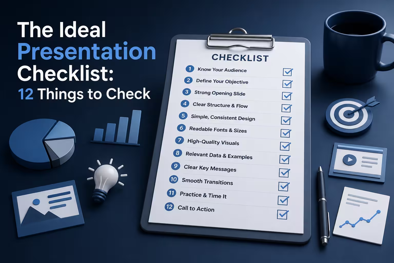
Most "presentation checklists" are the same twelve bullet points reshuffled: check your fonts, arrive early, have a backup file. None of that is wrong, exactly. It's just useless without knowing when each check matters and what specifically it's supposed to catch. A font check three days before doesn't do the same job as a font check five minutes before you present — one catches a wrong typeface, the other catches a font that isn't embedded and silently reverts to Calibri on a client's machine.
I've reviewed decks that failed at every one of these stages, so I've split the checklist by when the check actually needs to happen, not just what it covers.
Before you open a slide editor
The checks that matter most happen before any content exists, and they're the ones people skip because they feel like they're delaying "real" work.
- One sentence, one goal. Can you say what you want the audience to do or decide after this presentation, in one sentence? If it takes two sentences, you likely have two presentations stitched together, and the slide count will balloon trying to serve both.
- Know who's actually in the room. Not "executives" — the specific three or four people, and what each one is likely to push back on. A budget slide that satisfies a CFO reads as thin to an engineering lead, and vice versa. This shapes which slides you build, not just how you word them.
- Decide the format constraint early. Live in-room, remote screen-share, or "sent as a leave-behind to be read without you." These are three different documents wearing the same file extension. A leave-behind needs more on-slide text than a talk you're narrating; a remote deck needs bigger margins because screen-share compression eats edge detail.
While you're building the deck
This is where structure checks belong — not visual polish yet, because polishing a slide you later cut is wasted effort.
- Every slide earns its place. Ask of each slide: if I deleted this, would the argument still hold? If yes, cut it or fold it into another slide. This catches "context slides" that exist because the presenter wanted to feel thorough, not because the audience needs them.
- Data slides have a stated takeaway, not just a chart. If your title is "Q3 Results" and the chart requires the audience to derive the point themselves, you've outsourced your argument to them. I wouldn't recommend leaving the interpretation as an exercise — put the conclusion in the headline and let the chart back it up.
- Diagrams are drawn to be read at a glance, not decoded. A process diagram with nine boxes and cross-crossing arrows works fine when you're the one who built it and already knows the flow — it stops working the moment someone unfamiliar looks at it for four seconds. If you're building flow or hierarchy visuals from scratch each time, a structured diagram template at least enforces a readable layout as a starting point.
Visual consistency — the day before, not the day of
Do this the day before, not the morning of, because fixing inconsistent visuals under time pressure is how new inconsistencies get introduced.
- One typeface family, two weights maximum. Not "check your fonts look nice" — literally count how many distinct fonts are in the deck. Copy-pasted slides from other decks are the usual culprit; they bring their old formatting with them even when the text looks fine at a glance.
- Color used for meaning, not decoration. If red means "over budget" on slide 4, it shouldn't also be the brand accent color highlighting a neutral statistic on slide 9. Audiences pattern-match color fast; inconsistent use makes them second-guess a chart that was actually fine.
- Every image is at native resolution or larger, never stretched up. A logo pulled from a website favicon and blown up to fill a title slide is one of the most common last-minute visual failures, and it's invisible on a laptop screen but obvious on a projector. If you're assembling a deck from a template base, a themed Keynote theme or PowerPoint theme at least keeps image placeholders at consistent, tested dimensions.
Technical checks — night before
These are boring, and that's exactly why they get skipped. They're also the checks most likely to cause a visible failure in front of the room.
- Fonts embedded, not just installed on your machine. If you're presenting from a different device than you built on — someone else's laptop, a conference room PC — an unembedded custom font silently substitutes, and text reflows or overflows its box. Export a PDF version as backup specifically because PDFs flatten fonts.
- Video and audio files tested on the actual playback device. Embedded video that plays fine in edit mode sometimes fails to play in presenter mode because of a codec mismatch — this is a real, common failure, not a rare edge case. Test in the exact mode you'll present in, not the edit view.
- File opens clean on a machine you don't control. Send it to a colleague, or open it on a different computer. This catches missing fonts, broken links, and linked-not-embedded images that show up as gray boxes.
Minutes before you present
Short list on purpose — anything longer than this and you're doing day-before work with day-before time pressure.
- Slide count matches your actual speaking time, checked against a real run-through, not an estimate. A 20-slide deck at "roughly a minute a slide" reads fine on paper and runs 34 minutes in practice once you account for questions mid-flow.
- Presenter notes are visible only to you, confirmed on the actual display setup, not assumed. Dual-monitor mode fails silently more often than people expect, especially over HDMI switchers in shared meeting rooms.
None of this replaces having something worth saying — a checklist can't fix a weak argument, and I'd be skeptical of any presentation advice that implies otherwise. What it does is stop a solid argument from getting undercut by a font substitution or a chart nobody can read from the back row. If you're rebuilding your visual system from scratch each time, starting from a consistent base — even just browsing what's available in presentation template features — saves the polish pass for content instead of formatting.
Comments (0)