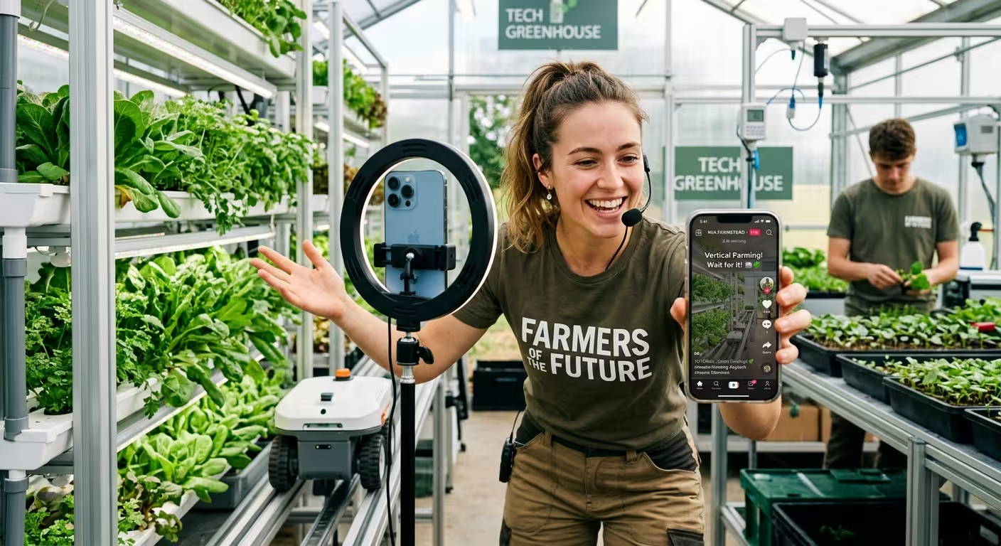
A farmer with a ring light and a smartphone can get half a million views explaining how a combine header works. A well-funded agtech company can spend three weeks on a boardroom deck about the same technology and put half the room to sleep. Same industry, same information, wildly different reception. Something in the middle is broken, and it's usually not the farming.
I've sat through both kinds of presentations — the ones built for a room of investors or extension staff, and the loose, almost accidental storytelling that shows up on a farmer's TikTok. The gap isn't production quality. It's what each format assumes the audience already believes. Most agricultural presentations are still built for a viewer who trusts the industry by default. That viewer barely exists anymore among people under 30.
The trust problem you're actually designing around
A University of Minnesota poll found that only 17 percent of Gen Z respondents said they strongly trust information about where their food comes from and how it's produced — noticeably lower than the trust levels reported by older generations. That's not a communication-style problem you fix with better fonts. It's the actual starting condition of the room, and it should change what the first three slides of any farming presentation are trying to do.
Most decks open with scale: acreage, yield, "feeding the world" framing. That's the wrong opener for a skeptical audience — it reads as a claim before any evidence. One thing people overlook is that trust-building slides need to come before the achievement slides, not after them. Show the process first, in enough granular detail that it can't be mistaken for marketing copy, and let the scale numbers land once the audience already believes what they're looking at is real.
Borrow the specificity, not the platform
The instinct after watching enough FarmTok is to try to make a slide deck "feel like TikTok" — fast cuts, casual captions, maybe a trending sound reference nobody in the room will get. I wouldn't recommend that. What actually works on those videos isn't the format, it's the specificity: a farmer explaining exactly why they're spraying at 6 a.m. instead of noon, not a general statement about "modern farming practices."
That specificity translates fine into a traditional slide, and it's the part worth stealing. Replace one generic "state-of-the-art operation" slide with one concrete operational decision, explained the way you'd explain it to a curious neighbor rather than a compliance officer. If you're presenting a working farm's story — recipes, sourcing, the actual path from field to plate — a menu-style layout does more work than a bullet list; food-themed presentation layouts are built for exactly that kind of ingredient-to-outcome narrative.
Seasons are already a story structure — most decks throw it away
Here's a structural point that gets skipped constantly: farming is one of the few industries whose operations already run on a repeating narrative arc. Plant, grow, manage risk, harvest, sell, plan again. Most presentations flatten that into a static org chart or a single "our process" slide with five boxes and no sense of time passing.
Treating it instead as a cycle — visually, not just conceptually — does two things at once. It matches how the audience already understands a growing season, and it gives you a natural place to show where technology or a new practice slots into an existing rhythm rather than replacing it wholesale, which is usually the actual pitch. A cycle chart layout handles this better than a linear timeline, because it doesn't imply the process ends — which, on a working farm, it doesn't.
The aesthetic trap: too polished reads as fake
This is the complication most style guides skip. Clean, minimal, heavily branded slides are the standard advice for "modern" presentations — and for a Gen Z audience specifically, that same polish can work against you. A slide that looks like it came from a stock photo library reads as the opposite of authentic, even when the underlying claim is completely accurate.
The fix isn't to abandon design quality; it's to let texture back in. Real light, real weather, real dirt on a real piece of equipment. A background built around actual outdoor imagery — muted greens, natural light, a bit of visible grain — tends to read as more credible to a skeptical viewer than a flat corporate palette, and a nature-toned template is a decent shortcut if you're not shooting your own field photography for every deck. The trade-off is real, though: this only works if the rest of the content backs it up. Texture without specificity just looks like a different kind of marketing.
Pacing matters more than most people budget for it
Short-form video trained an entire generation to expect the point of a scene within the first two seconds. That doesn't mean cramming a 40-slide deck into ten. What it does mean, in my experience, is that the first line of every section needs to do more work than it used to — no more "next, let's talk about our sustainability initiatives" as an opener. Lead with the specific detail, and let the general point follow it, not precede it.
That's a rewriting exercise more than a redesign, and it's the cheapest change on this list. Go through your current deck and flag every section that opens with a topic label instead of a fact, a number, or a scene. Those are the slides losing the room first — well before anyone gets to the actual agricultural content.
None of this replaces good farming or good data. It just means the audience most likely to decide whether either one matters is the same audience least inclined to take your word for it first. Worth asking, before the next deck goes out: does slide one earn belief, or does it assume it?
Comments (0)