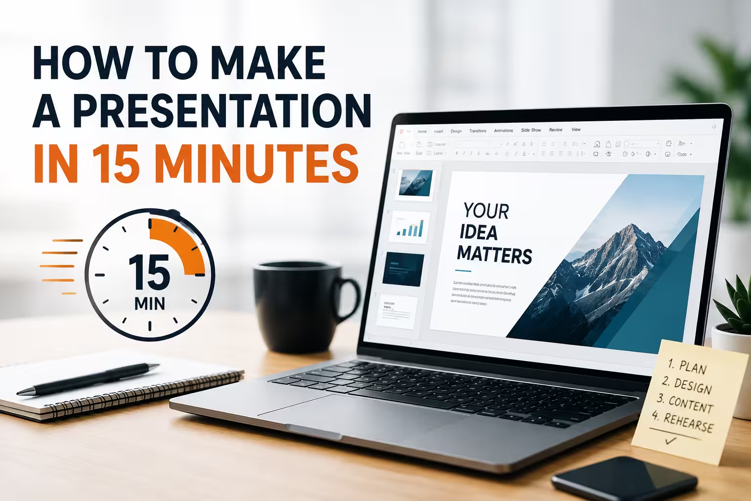
<p>Fifteen minutes isn't a design challenge. It's a triage exercise. I've built decks under this exact clock more times than I'd like to admit — usually because someone said "can you just throw something together" forty-five minutes before a call. The presentations that come out looking fine share one thing: the person building them stopped trying to be creative and started following a sequence.</p>
<p>Here's the sequence, with actual time allocations, because "just be efficient" isn't a plan.</p>
<h2>Minute 0-2: Decide what you're NOT doing</h2>
<p>Before opening any software, cut three things from your mental list: custom illustrations, a color palette you build from scratch, and original data visualization. None of these are achievable in 15 minutes at a quality bar anyone will respect, so don't attempt a rushed version of them — a half-finished custom chart looks worse than a plain bulleted list. Decide right now that you're assembling, not designing.</p>
<p>This is where starting from an existing structure earns its keep. If you already have a library of <a href="https://imaginelayout.com/powerpoint-templates/">PowerPoint templates</a> sorted by category, grab one that roughly matches your topic instead of a blank deck. The point isn't the visual style — it's that someone already solved slide hierarchy, spacing, and font pairing for you. That's most of the design work gone before you've typed a word.</p>
<h2>Minute 2-6: Write the outline as slide titles, not bullets</h2>
<p>One thing people overlook under time pressure: they open the slide software and start typing content directly into placeholder boxes, slide by slide, in order. That's slower than it feels, because you keep stopping to figure out what comes next while a blinking cursor sits in front of you.</p>
<p>Instead, type your slide titles into one text box, top to bottom, like a table of contents. Five to eight lines, no more. Something like:</p>
<ul>
<li>Problem / context</li>
<li>What we tried</li>
<li>What worked</li>
<li>What it costs / takes</li>
<li>Next step</li>
</ul>
<p>This structure works for almost any status update, pitch, or recap — it's not clever, but it's fast and nobody in the room is grading you on narrative originality. Then paste each title into its own slide. You now have a skeleton, and skeletons are what let you move fast without freezing on "what should slide 4 even be."</p>
<h2>Minute 6-11: Fill content, don't research it</h2>
<p>This is where most 15-minute decks actually die. Not from bad design — from someone stopping to look up a stat, double-check a number, or dig for the "right" phrase. If a fact isn't already in your head or in a document you can copy from in five seconds, don't chase it. Write a placeholder in brackets like <strong>[confirm Q3 number]</strong> and keep moving. You can fix one bracket in the last two minutes; you can't recover from spending six minutes down a research rabbit hole.</p>
<p>Keep text per slide to roughly one sentence or three short bullets. This isn't the "less is more" cliché — it's a practical constraint: at this pace, dense text usually means you copy-pasted from an email or doc, and pasted paragraphs read as exactly that on a slide. Short lines are also just faster to type under pressure.</p>
<p>If a slide needs a chart or diagram and you don't have real data to visualize, don't fake one. A wrong or invented chart is worse than no chart — say the number in text instead, or leave it for the next version. Where you do have real numbers and a few extra minutes, a pre-built chart layout saves you from formatting axes and legends from zero; browsing existing <a href="https://imaginelayout.com/templates-features/">presentation design templates</a> for a diagram slide that already fits your data shape (comparison, timeline, breakdown) is quicker than building one in native chart tools under a clock.</p>
<h2>Minute 11-13: One visual pass, not a design pass</h2>
<p>Don't try to fix the whole deck's visual consistency in two minutes — you can't, and attempting it eats your remaining time without a real payoff. Instead do exactly three things: check that fonts are consistent slide to slide (a copy-paste from a doc usually drags in a different font), make sure nothing overflows the slide edge, and confirm images or logos aren't stretched. That's it. Anything beyond those three checks is polish you don't have time to buy.</p>
<p>If you started from an existing template and swapped it onto a deck you'd already begun elsewhere, this is also the moment layout mismatches show up — text boxes that don't match the new master's positioning, for instance. If that happens and you're not sure how the application step works in your specific tool, it's worth a quick look at how <a href="https://imaginelayout.com/faq/">applying a design template to an existing presentation</a> actually works rather than fighting it manually slide by slide.</p>
<h2>Minute 13-15: Read it once, out loud, in your head</h2>
<p>Not proofreading in the traditional sense — you don't have time to catch every typo. What you're checking is whether the slide order tells a story if someone flips through without you talking. If slide 3 doesn't make sense without slide 2's context, that's the kind of gap that actually matters in a rushed deck; a missing comma doesn't.</p>
<p>I wouldn't recommend skipping this step even when the clock is at zero. A deck that's slightly late but makes sense beats one that's on time and confusing — in my experience, the two extra minutes people spend here are the difference between "good enough" and "did you even look at this before sending it."</p>
<p>None of this produces your best work. It produces a deck that holds up in the room, which is a different and more achievable goal when the constraint is 15 minutes instead of a review cycle.</p>
Comments (0)