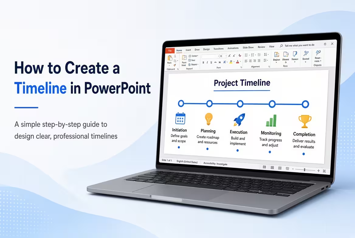
A timeline can look simple: a line, a few dates, and some milestones. The difficult part is deciding what deserves a place on that line and how much information each milestone can carry. A crowded timeline quickly becomes harder to understand than a simple list.
This guide explains how to create a timeline in PowerPoint, from defining the sequence to choosing between SmartArt, shapes, and a ready-made timeline layout. The goal is not simply to draw a line, but to make the passage of time immediately understandable to your audience.
Start With the Story Your Timeline Needs to Tell
Before opening PowerPoint, write down the events you actually need to show. A useful timeline normally has a clear beginning, a sequence of meaningful events, and an endpoint or current status.
For example, a product launch might contain only the milestones that affect the audience's understanding of progress:
- Initial planning
- Product development
- Testing
- Launch preparation
- Market launch
You do not need every internal task on the slide. If twenty small activities are required to explain five major phases, the timeline is probably being asked to do the work of a project schedule rather than a presentation visual.
This distinction matters because a presentation timeline is primarily a communication tool. It should help the audience understand sequence and milestones without forcing them to read a project-management database.
Choose the Right Timeline Structure in PowerPoint
The familiar horizontal timeline works well when the main message is chronological progression from left to right. But it is not the only useful structure.
PowerPoint timelines can also use vertical sequences, phase-based layouts, or more visual milestone arrangements. ImagineLayout's timeline collection includes horizontal and other timeline structures, including layouts built around milestone markers and connectors.
Explore the Timeline PowerPoint Charts collection if you want editable examples before building your slide from scratch.
A practical rule is to choose the direction based on the information rather than decoration:
- Horizontal: useful for straightforward chronological progression.
- Vertical: useful when event descriptions need more horizontal space.
- Phase-based: useful when several milestones belong to larger project stages.
- Radial or circular: useful when the sequence has a repeating or cyclical character rather than a simple start-to-finish story.
ImagineLayout's editable timeline process collection illustrates several of these approaches, including horizontal flows, vertical stacks, and circular variants.
Build a Basic Timeline With PowerPoint Shapes
If you want complete control over the design, shapes are often the most flexible starting point.
Begin with a straight line across the slide. Add small circles, squares, or other markers at the positions where your major milestones occur. Then place the date and description near each marker.
The basic construction looks like this:
- Create the main timeline line.
- Add one marker for each important milestone.
- Place the date close to the marker.
- Add a short title for the event.
- Add supporting text only when it helps explain the milestone.
- Use connectors when labels need to sit away from the timeline.
The last point is easy to overlook. When several milestone descriptions compete for the same horizontal space, moving the labels outside the main diagram and connecting them with thin lines can make the sequence easier to follow.
ImagineLayout's timeline layouts use milestone markers, phase segments, and connectors specifically to organize chronological information along a visual axis.
Use SmartArt When Speed Matters More Than Custom Layout
For a quick timeline, PowerPoint's SmartArt tools can provide a useful starting point. They are especially convenient when the content is simple and the number of milestones is limited.
Open PowerPoint and look under Insert → SmartArt. From the available process-oriented layouts, choose a structure that represents a sequence. Enter your milestones and dates, then adjust the colors and formatting.
SmartArt is convenient, but there is a trade-off: once the timeline becomes more specific, you may spend more time fighting the default layout than designing the slide yourself.
For a presentation with only four or five milestones, that trade-off may not matter. For a complex project roadmap with uneven text lengths, dependencies, or several phases, manually editable shapes or a dedicated timeline layout usually provide more control.
Make Milestones Readable Without Overloading the Slide
A timeline has a built-in constraint: events must occupy positions along a limited visual path. The problem appears when every milestone receives the same amount of text.
Instead, decide what information belongs at each level.
- Primary level: the date or phase.
- Secondary level: the milestone name.
- Optional level: one short explanation or result.
For example, instead of writing a complete project update under a milestone, use:
June 2026 — Prototype Complete
Testing version approved for the next development phase.
This structure lets the audience scan the dates first and read the supporting details only when needed.
One useful test is to temporarily hide the descriptions. If the dates and milestone titles still communicate the overall story, the timeline has a strong structure. If the slide becomes meaningless, too much of the story may be buried in supporting text.
Use Color to Explain Phases, Not Just to Decorate
Color becomes much more useful when it represents a consistent meaning. For example, one color can identify completed phases, another can indicate the current phase, and a neutral treatment can represent future work.
Do not give every milestone a different color simply because PowerPoint makes it easy. If color changes from marker to marker without a defined meaning, the audience has to decode the palette instead of reading the timeline.
For larger presentations, using the PowerPoint Slide Master can also make global color changes easier. Editable ImagineLayout timeline files use theme-based customization so that the visual treatment can be adjusted across layouts rather than edited element by element.
If you are preparing several related slides, this approach becomes particularly useful because the timeline can inherit the same presentation theme as the rest of the deck.
Know When a Timeline Is Not the Right Visualization
A timeline is excellent for showing when things happen. It becomes less effective when the audience also needs to understand detailed task duration, dependencies, resource allocation, or overlapping work.
That is where a Gantt-style chart may be more appropriate.
For example, a simple timeline might show:
Planning → Development → Testing → Launch
A Gantt-style visualization can additionally show how long each phase lasts and which activities overlap.
ImagineLayout also provides dedicated Gantt timeline layouts for presentations where task bars, dependencies, and milestone markers need to be shown together. See the Gantt Timeline PowerPoint Charts.
The important distinction is simple: use a timeline when chronological storytelling is the priority; use a Gantt-style chart when scheduling detail is part of the message.
Start From a Template When the Structure Is Already Known
Building a timeline from individual PowerPoint shapes gives you control, but it also means manually aligning markers, labels, connectors, and spacing. If the presentation already has a defined visual style, a prepared template can reduce that setup work.
ImagineLayout's timeline resources include editable PowerPoint files with milestone markers, connectors, text placeholders, and multiple layout variations. The site's free Timeline PowerPoint Charts collection, for example, contains editable timeline layouts designed around chronological sequences.
Browse editable timeline process diagrams when your presentation needs more than one timeline structure.
The advantage is not simply visual polish. A prepared layout gives you a tested spatial structure, so you can spend more time deciding what the milestones mean and less time nudging shapes into alignment.
The best PowerPoint timeline is rarely the one with the most design elements. It is the one where the audience can answer three questions almost immediately: where did we start, where are we now, and what happens next?
Comments (0)