Most pitch decks fail before the first slide even loads. Not because the product is weak or the numbers are bad, but because the deck was built backward — starting with what the presenter wants to say instead of what the audience needs to hear.
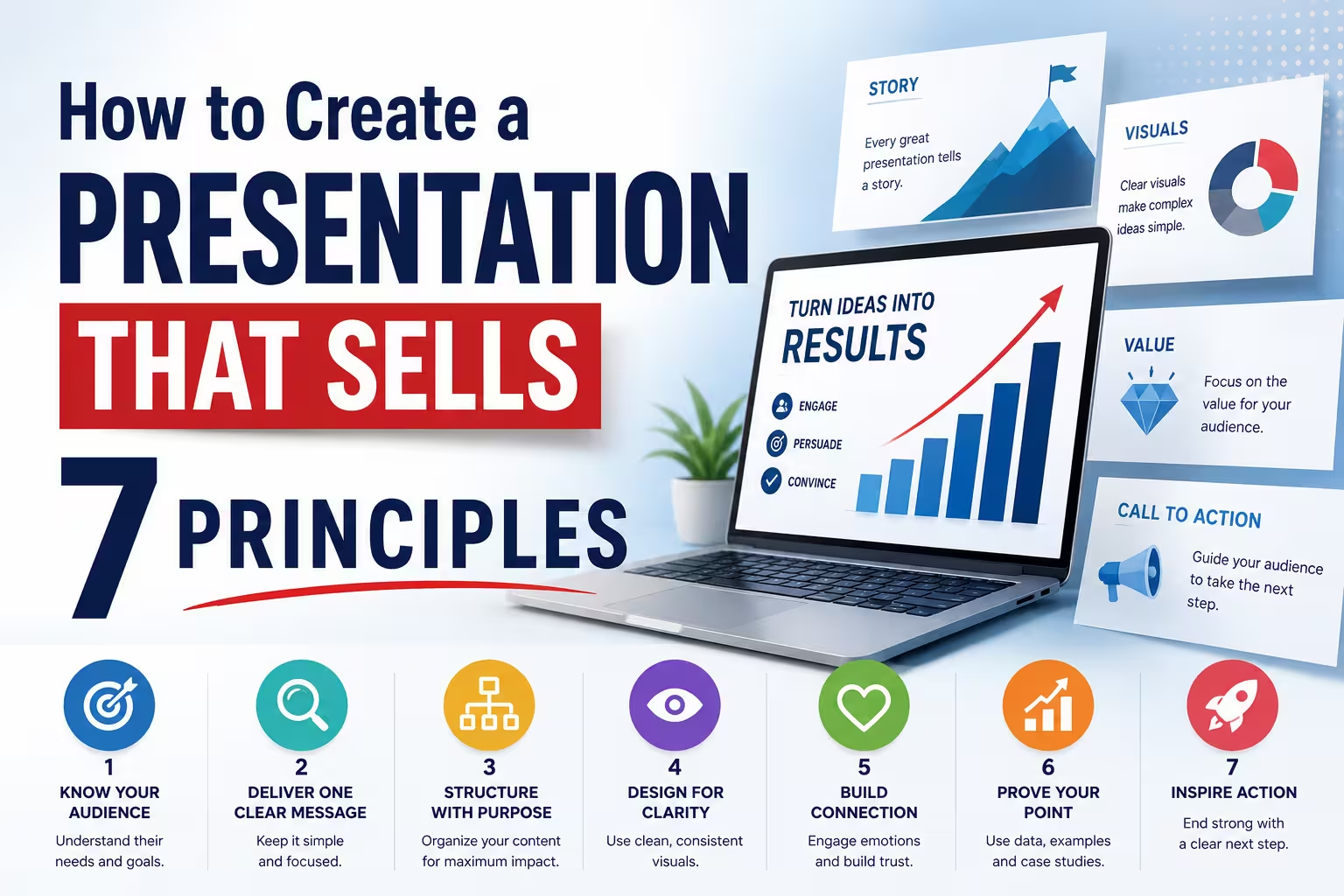
I've worked on presentations for pitches, product launches, and internal budget approvals, and the pattern repeats: teams spend three weeks polishing slide 14 and ten minutes deciding what slide 1 should even accomplish. A "selling" presentation isn't about being persuasive in a manipulative sense — it's about removing every reason for the audience to disengage before you get to your ask. Here are seven principles that consistently separate decks that close deals from decks that just get politely thanked.
1. Start With the Decision You Want, Not the Story You Want to Tell
Before opening any design tool, write down the single decision you want the audience to make after the last slide. Approve the budget. Sign the contract. Take the meeting. Everything in the deck should serve that decision — and anything that doesn't should be cut or moved to an appendix.
This sounds obvious, but in practice most decks are organized around the company's internal narrative (who we are, what we built, our journey) rather than the audience's decision path. If you're pitching investors, they don't need your origin story on slide 2 — they need to know why now, why this market, and why you.
2. One Idea Per Slide, Ruthlessly Enforced
I often notice decks where a single slide tries to carry three separate arguments — market size, competitive advantage, and pricing model, all crammed onto one busy layout. The audience's brain has to do the editing work you should have done yourself.
A slide that tries to say everything usually ends up saying nothing memorable. If you find yourself justifying a slide with "well, it's related," that's usually a sign it needs to be split. This isn't about minimalism for its own sake — dense slides can work for reference material distributed after a meeting — but for a live, sold presentation, one idea per slide keeps attention where you want it.
3. Visual Hierarchy Does the Persuading Before You Speak
In the first three seconds someone looks at a slide, their eyes go somewhere — usually the largest or highest-contrast element. If that element isn't your key point, you've already lost part of the room's attention to a chart title or a stock photo.
Practical hierarchy tools that hold up across most tools people actually use (PowerPoint, Keynote, Google Slides):
- Size and weight contrast between the headline claim and supporting detail
- Consistent alignment so the eye doesn't have to re-orient slide to slide
- One accent color reserved only for the thing you want noticed
I wouldn't recommend relying on animation to create hierarchy — it's fragile across devices and often disabled entirely in screen-share settings.
4. Data Needs a Point of View, Not Just Accuracy
A chart that's technically correct but has no argument attached is a missed opportunity. If you're showing growth, don't just plot the line — annotate the inflection point and say what caused it. If you're showing a comparison, decide in advance which side of the comparison you want the eye drawn to, and design for that.
To be clear, this is about framing accurate data persuasively, not about inventing numbers or dressing up a weak result. If the data doesn't support the point you want to make, the fix is in the business, not in the chart.
5. Design for the Room You're Actually In
A deck presented live with a speaker talking through it can carry far less on-slide text than a deck meant to be read standalone and forwarded internally (sometimes called a "leave-behind"). Trying to make one file serve both purposes is one of the more common mistakes I see — it usually results in a deck that's too text-heavy to present well and too sparse to be understood without the presenter.
If both formats are genuinely needed, it's worth building two versions: a lean, visual one for the live pitch, and a denser, self-explanatory one for follow-up. It's more upfront work, but it avoids the awkward moment of reading dense bullet points out loud to a room.
6. Timing Is a Design Constraint, Not an Afterthought
A 20-minute pitch and a 45-minute board update need fundamentally different slide counts and pacing, yet many decks are built without any reference to how long the presenter actually has. As a rough starting point, one slide per 60–90 seconds of speaking time tends to keep pacing natural — though this varies a lot depending on how data-dense the slide is and how much the presenter talks around it.
Build in a natural pause point roughly two-thirds through, before your ask. Audiences absorb information less well right at the end of a talk, so the strongest close often isn't the very last thing you show — it's the ask stated clearly a beat before you wrap up, with a simple closing slide reinforcing it.
7. End With the Ask, Not a Summary Slide
A generic "thank you" or "summary" slide at the end wastes the moment when the audience is most primed to respond. If the goal of the deck is to sell — a product, an idea, a budget — the last slide should restate the specific decision you're asking for, along with what happens next if they say yes.
This is a small change that a lot of teams overlook, and it costs nothing to implement. It also forces some honesty earlier in the deck: if you can't clearly state the ask on the last slide, that's usually a sign the earlier structure hasn't been building toward one.
None of these principles require expensive design software or a background in visual design — they require deciding, before you build anything, exactly what you want the audience to do next. The decks that consistently work aren't the most beautiful ones in the room; they're the ones built around a single, clear decision from the very first slide.
What's the one slide in your current deck that you'd cut first if you were being honest about whether it serves the ask?
Comments (0)