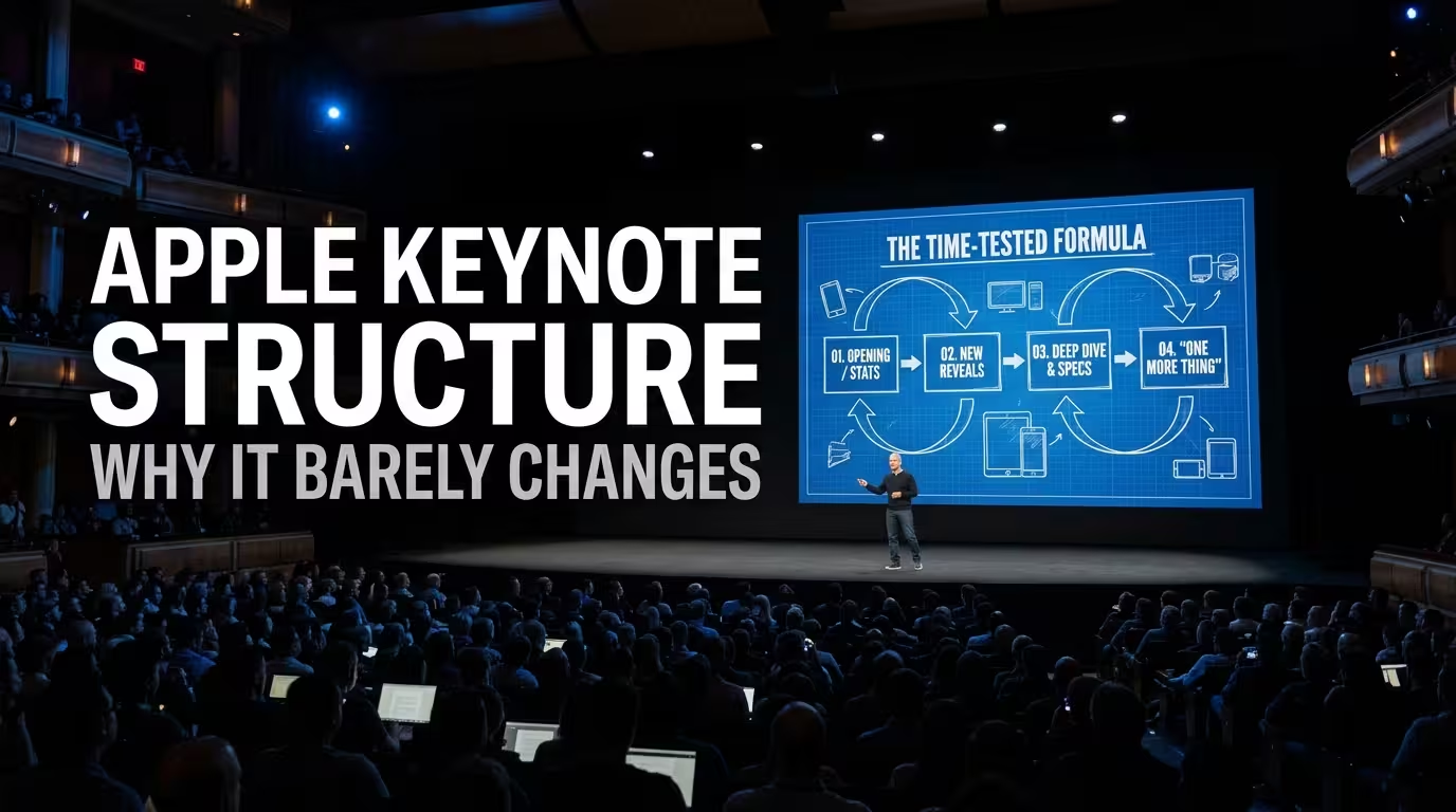
Apple Doesn't Reinvent the Keynote. It Reuses the Architecture.
Watch enough Apple events and something strange starts to happen: you stop noticing the structure because you already know where the presentation is going.
A new product appears. Someone establishes why it matters. A few capabilities are revealed. The camera cuts to a polished demonstration. Technical details follow. The product gets positioned against what came before. Then Apple moves to the next part of the story.
The products change. The presenters change. The visual language evolves. The structure is remarkably stable.
That is not a lack of creativity. It is one of the reasons the keynote works.
Apple has effectively turned the product launch into a familiar narrative interface. The audience already understands how to use it. That means Apple doesn't have to spend attention teaching people how the presentation works; it can spend that attention making the new product feel important.
The Familiar Structure Is Doing More Work Than the Slides
One of the easiest mistakes when studying Apple keynotes is to focus on screenshots.
The black backgrounds, enormous product photography, giant typography and carefully timed animations are recognizable. But they are not the real system.
The deeper pattern is closer to a sequence of narrative jobs:
- Establish the moment. This is not an ordinary presentation; something significant is happening.
- Frame the problem or opportunity. The audience needs a reason to care before it gets a list of specifications.
- Introduce the product or feature. The object becomes the protagonist.
- Reveal the important capabilities. Information arrives in controlled layers rather than as one technical dump.
- Demonstrate the change. The audience sees what the feature actually does.
- Translate features into consequences. Faster, smaller, smarter, more capable — the specification becomes a benefit.
- Move forward. The previous reveal has done its job, so attention transfers to the next product or idea.
This resembles the basic three-part presentation logic discussed in presentation structure using the rule of three: an opening establishes why the audience should care, the body carries the substance, and the close creates a destination rather than merely repeating what was already said.
Apple simply operates that logic at a much larger scale.
Why Apple Keeps Repeating the Same Narrative Moves
Repetition normally sounds like a weakness in presentation design. If the audience has seen the same sequence before, shouldn't you change it?
Not necessarily.
For Apple, familiarity reduces cognitive friction. The audience doesn't need to learn a new presentation grammar every September. They can concentrate on the differences inside the familiar structure.
That distinction matters.
Imagine if every Apple event deliberately changed its narrative architecture. One year the company opened with specifications. The next year it began with a customer story. The following year it presented every product simultaneously and explained them at the end.
That might look innovative from a presentation-design perspective. It would also force the audience to spend attention understanding the presentation itself.
Apple generally spends that attention elsewhere.
The stable structure becomes a container for novelty.
This is similar to what makes a strong presentation framework useful: the framework should reduce decisions that don't need to be made again. The content inside the framework can then receive more attention.
The Product Reveal Is Usually a Controlled Release of Information
Apple rarely treats a product as a single piece of information.
Instead, the audience receives it in stages.
First comes the category or promise. Then the product. Then the defining capability. Then the demonstration. Then the technical explanation that makes the capability credible.
That sequencing is important because each stage answers a different question.
- What is this?
- Why should I care?
- What changed?
- Can I see it?
- How does it work?
- Why is it better than before?
If all six answers appear on one slide, the audience has to process them simultaneously. Apple tends to separate them.
This is one reason the slides can look unusually sparse without necessarily being simplistic.
The presentation is distributing information across time rather than forcing everything into a single visual frame.
ImagineLayout's breakdown of the original iPhone keynote makes this especially clear. The famous "three products" sequence worked not because the slide itself was complicated, but because Jobs used spoken repetition to establish an expectation before overturning it. The visual was timed to receive the reveal.
That is a structural decision before it is a design decision.
Apple's "Simple Slides" Are Not Actually Simple
A nearly empty Apple slide looks easy to copy.
That is precisely why it is so often copied badly.
A slide with one word or one number appears to contain almost no design work. But the missing information has not disappeared. It has moved into the speaker's voice, timing, product demonstration and sequencing.
ImagineLayout's analysis of Jobs' iPhone keynote points to the same trade-off: minimal slides can work when the speaker is carrying the meaning verbally, but that also raises the cost of weak delivery. :contentReference[oaicite:3]{index=3}
In other words, Apple's visual minimalism is not an escape from presentation design. It is a commitment to a different distribution of responsibility.
The slide says less.
The presentation says more.
That is a crucial difference.
If you remove the speaker and the pacing from the system, copying the visual style alone produces a deck that can feel empty rather than elegant.
The Structure Changes When the Content Requires It
There is an important qualification to the idea that Apple "never changes" its keynote structure.
Apple does change it.
WWDC is a good example. The 2026 keynote shifted away from the previous platform-by-platform sequence toward a broader grouping of platform improvements. That was a meaningful structural change, not simply a visual refresh.
But even here, the deeper logic remains recognizable: establish the event, create context, introduce meaningful changes, demonstrate them, and keep moving through a controlled sequence of reveals.
This distinction is useful for presentation designers.
A good structure should be stable at the level of logic, not necessarily at the level of slide order.
You can change the chapters without changing the grammar.
That is probably closer to what Apple actually does.
The Real Apple Lesson Is Not "Make Your Slides Minimal"
If you copy only Apple's visual surface, you get a black background, oversized typography and enormous product images.
If you copy the underlying system, you get something much more useful.
Before designing the slides, decide what the audience needs to understand first, what needs to be revealed later, and where the demonstration should happen.
Then assign each slide a specific role in that sequence.
This connects with another principle visible in professional presentation work: strong decks are often structured before they are designed. The logic is tested first; the visual language comes later.
That changes how you evaluate an Apple-style presentation.
Don't ask:
"How can I make my slides look like Apple?"
Ask:
"What information should the audience receive now — and what should they only understand after the next reveal?"
That question gets much closer to the mechanism behind the keynote.
Why This Structure Survives for So Long
Apple's keynote structure survives because it solves a recurring communication problem: how do you introduce something unfamiliar without making the audience work unnecessarily hard to understand it?
The answer is not endless novelty.
It is controlled familiarity.
The audience knows the rhythm. Apple changes the substance.
That is why a keynote can feel familiar and exciting at the same time.
And there is a broader presentation-design lesson here. Designers sometimes assume that a successful deck needs a new visual concept for every project. In practice, the strongest systems often do the opposite: they establish a recognizable structure and reserve variation for the moments where variation actually carries meaning.
Apple's keynote is therefore less interesting as a collection of beautiful slides than as a repeatable communication machine.
The products are new.
The story architecture is familiar.
And that is exactly the point.
Comments (0)