<p>I've watched a lot of presentations fall apart in the last five minutes before doors open — not because the content was weak, but because something small got skipped under deadline pressure. A font that didn't render the same on the client's laptop. A chart nobody tested at arm's length from the back row. The same slide title copy-pasted eleven times. None of these are dramatic failures. They're just habits that don't survive contact with a real room, a real projector, or a real client review cycle.</p>
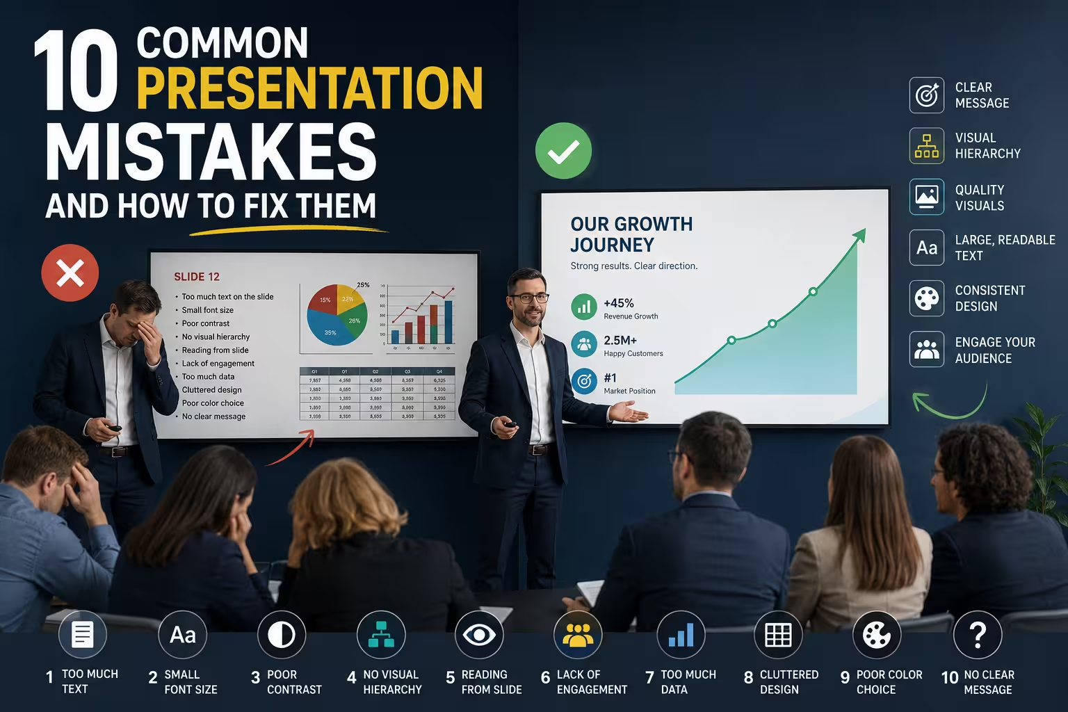
<p>Here are ten of them, grouped by where they actually happen: while you're writing content, while you're designing slides, and while you're getting ready to present.</p>
<h2>Content and structure mistakes</h2>
<h3>Trying to cover everything instead of proving one thing</h3>
<p>Most decks I'm asked to fix don't have a text problem — they have a thesis problem. The author tried to include every finding, every option, every caveat, so no single slide is doing clear work. I wouldn't recommend cutting content just for the sake of "simplicity" — cut it because each remaining slide should answer one specific question the audience is asking at that point. If you can't say in one sentence what a slide is proving, it usually doesn't survive the next draft.</p>
<h3>Writing slides that double as the speaker's script</h3>
<p>This is different from the usual "too much text" complaint. The real issue is dual-purpose slides: designed to be read silently by someone skimming the deck later, and also read aloud by the presenter live. Those are two different documents. In my experience, the fix isn't fewer words — it's separating the two: a lean visual deck for the room, and a one-page leave-behind or speaker notes doc for anyone reviewing it afterward. Trying to make one file serve both jobs is what produces walls of text.</p>
<h3>Assuming the audience arrives with your context</h3>
<p>Internal teams reuse decks across audiences constantly — the same pitch goes to an investor, then a new hire, then a partner, with zero changes to the framing. One thing people overlook is that a slide that made sense with three sentences of spoken intro attached makes no sense as a standalone artifact forwarded by email. If a deck will travel without you in the room, it needs slightly more on-slide context than the version you'll actually present live.</p>
<h2>Visual design mistakes</h2>
<h3>Trusting fonts to render the same everywhere</h3>
<p>This one is almost entirely avoidable and almost never avoided. A deck built on a designer's machine with a licensed or downloaded font opens on the client's laptop with a substitute font, and suddenly line breaks shift, text overflows boxes, and alignment that took an hour to get right is gone. Embedding fonts where the software allows it, or sticking to a short list of fonts you know are preinstalled on both Mac and Windows, solves this before it becomes a last-minute scramble. If you're working from a purchased template, checking the font list against what's actually installed on the presenting machine takes two minutes and saves the whole layout.</p>
<h3>Designing charts for the screen you're looking at, not the one they'll see</h3>
<p>A chart that looks clean on a 27-inch monitor at reading distance can be unreadable from row fifteen in a conference room, or shrunk into a thumbnail in a recorded webinar. I'd sharpen the usual "keep charts simple" advice like this: simplicity matters less than legibility at the actual viewing distance and resolution the deck will be shown at. A dense chart projected large in a small room can work fine; a "clean" three-color chart with 8pt labels fails completely on a shared Zoom screen.</p>
<h3>Rebuilding the same layout logic from scratch every time</h3>
<p>Inconsistent spacing, mismatched icon styles, and slide-to-slide drift in margins usually aren't a taste problem — they're a process problem. Every slide got built as its own object instead of as an instance of a shared system. Starting from a structured base, whether that's your own master layout or a set of <a href="https://imaginelayout.com/templates-features/">presentation design templates</a> with predefined margins and placeholders, removes a lot of this drift because the spacing decisions are already made before you start filling in content.</p>
<h2>Preparation and delivery mistakes</h2>
<h3>Never testing on the actual presenting hardware</h3>
<p>The deck that looks perfect on your laptop can shift completely on the conference room projector — different aspect ratio, different color calibration, animations that don't play the same way on an older version of the software. If there's one habit worth adopting without exception, it's opening the final file on the actual machine and screen it will be shown on, not a similar one.</p>
<h3>No fallback if the tech fails</h3>
<p>Wi-Fi drops, HDMI adapters go missing, embedded video won't play on the venue's system. A PDF export as backup, or slides duplicated onto a USB drive, isn't paranoia — it's the difference between a five-minute delay and a presentation that doesn't happen. I wouldn't build a deck with embedded video or live data pulls for a high-stakes room without also having a static fallback version ready.</p>
<h3>Rehearsing content but never rehearsing timing</h3>
<p>Knowing what you'll say on each slide is not the same as knowing how long it takes to say it. Decks routinely run long because the speaker rehearsed the material in their head, silently, which is always faster than saying it out loud in front of people. A single timed run-through, out loud, catches this in a way that reading through slide notes never does.</p>
<h3>Treating brand mismatch as a formatting problem</h3>
<p>Sometimes a deck looks "off" not because of any individual slide but because the visual language doesn't match how the company actually presents itself elsewhere — wrong color weight, generic stock imagery, a layout style that reads as a different industry entirely. That's usually not something a font swap fixes; it's a design-direction problem, which is why some teams route brand-critical decks through a <a href="https://imaginelayout.com/custom-design-services/">custom presentation design service</a> rather than trying to force a generic template into a specific brand identity under deadline.</p>
<p>Most of these mistakes share a root cause: they're invisible on the machine where the deck gets built, and only show up in the room where it gets shown. Building in a check — on the real hardware, out loud, at actual viewing distance — before the day of the presentation catches nearly all of them.</p>
Comments (0)