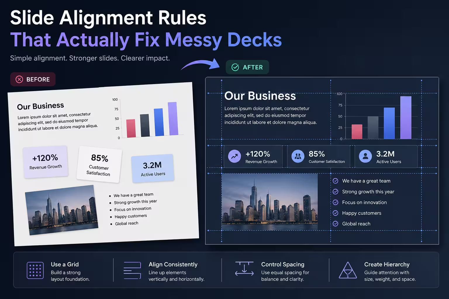
I've opened enough client decks to know the pattern before I even scroll past slide two: text boxes that are almost lined up, icons that are close-but-not-quite the same size, a logo sitting 4 pixels off from where its neighbor sits on the next slide. Nobody put it there on purpose. It just drifted, one "quick edit" at a time.
Alignment is the cheapest fix in slide design and the one people skip most often, mostly because it's invisible when done right and only visible when it's wrong. Here's how I approach it when I'm cleaning up a deck or building one from scratch.
Start With a Grid, Even a Rough One
You don't need a 12-column magazine grid for a business presentation. But you do need something consistent—a set of vertical and horizontal guides that every element on every slide respects. In PowerPoint or Google slides, this can be as simple as three vertical guides (left margin, center, right margin) and two horizontal ones (header baseline, content top).
One thing people overlook: the grid should be decided before content goes in, not reverse-engineered after 40 slides are already built. Retrofitting alignment onto a finished deck takes longer than building it right the first time.
Snap to Edges, Not to Eyes
Most slide software has smart guides that appear when objects are close to aligned—use them. Eyeballing alignment across a full-screen projector or a shared screen in a video call is a different experience than looking at a laptop preview at 100% zoom. What looks "close enough" on your monitor can look crooked on a conference room screen.
A practical habit: after placing an object, use the alignment panel (align left, align center, distribute horizontally, etc.) rather than dragging until it "looks right." It's slower for a single slide, faster across an entire deck, and it removes the guesswork.
Group Before You Align
If a slide has a heading, a subheading, and a bullet list that all need to move together later, group them before you start aligning against other elements. I wouldn't recommend aligning individual pieces of a group one at a time—it's how decks end up with a heading that's centered but a subheading that's a few pixels left of center underneath it. Group first, align the group, then fine-tune internal spacing if needed.
Respect the Optical Center, Not the Mathematical One
This one trips up a lot of people who are otherwise careful. The mathematical center of a slide and the optical center are not the same thing—text, especially bold or all-caps text, tends to look slightly low when it's placed at true vertical center, because the eye reads more weight from the top of letterforms. Designers often nudge a centered headline up by a small amount so it feels balanced rather than technically centered.
This is a judgment call, not a rule you can automate, which is exactly why it's worth training your eye on it rather than trusting the alignment tool blindly for every case.
Keep Consistent Margins Across the Whole Deck
Nothing announces "assembled by three different people" like a deck where slide 4 has a wider left margin than slide 5. Decide on a margin (say, consistent spacing from each edge) and stick to it slide after slide, including on section dividers and title slides, which people often treat as exceptions for no good reason.
If you're building templates or master slides, this is where locking placeholder positions pays off—new slides inherit the margin instead of each contributor guessing.
Align Related Elements to Each Other, Not Just to the Slide
A common mistake: aligning an icon to the slide edge but not to the text block sitting next to it. The icon might be perfectly placed relative to the canvas and still look wrong because it's not vertically centered against the text it's paired with. Alignment isn't only about the slide boundaries—it's about the relationships between elements that are meant to be read as a unit.
When I'm reviewing a deck, I look at pairs first: icon-to-label, image-to-caption, chart-to-title. If those relationships are off, the slide feels unsettled even if the overall composition looks fine at a glance.
Watch for Drift Across Duplicated Slides
Duplicating a slide and swapping content is efficient, but it's also how misalignment quietly spreads. An image gets resized on slide 7, and now it's a few pixels taller than the identical layout on slide 12. Before finalizing a deck, it's worth a pass where you flip through slides that share a layout back-to-back—problems that are invisible one slide at a time become obvious side by side.
Alignment won't save a deck with a weak argument or bad content, but it will quietly undermine a strong one if it's sloppy. Next time you're reviewing a presentation before sending it out, try covering the text and just looking at the shapes and spacing. If something feels off before you've even read a word, that's usually alignment asking for a second pass.
Comments (0)