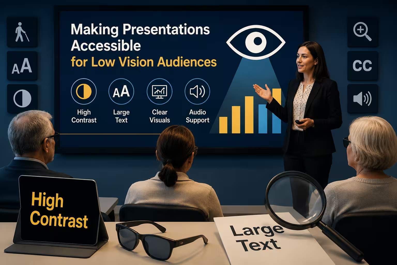
I once sat in on a rehearsal where the presenter had built a genuinely beautiful deck — soft gradients, thin gray text on a white background, tiny captions under every chart. It looked great on the designer's monitor. It was almost unreadable for one of the stakeholders in the room, who had low vision and quietly struggled through the entire meeting without saying a word. Nobody noticed until afterward.
That's usually how accessibility gaps show up: not as a complaint, but as silence. The person either muddles through or checks out, and you never find out which.
Vision impairment covers a wide range — low vision, color blindness, blindness, light sensitivity, age-related decline. A deck that works for all of them isn't a special "accessible version" bolted on at the end. It's mostly the same deck, built with a few different defaults from the start.
Contrast Is the Foundation, Not a Nice-to-Have
Low contrast is the single most common accessibility failure I see in decks, full stop. Light gray text on white, pastel-on-pastel color schemes, thin fonts over busy photo backgrounds — all of it looks "clean" and "modern" and all of it is genuinely hard to read for a large chunk of any audience, not just people with diagnosed vision conditions.
The Web Content Accessibility Guidelines (WCAG) define contrast ratio thresholds for text against its background, and while those numbers were written for web content, they translate directly to slides. In practice, dark text on a light background (or the reverse) with strong tonal separation is the safest default. If you're not sure whether a combination passes, there are free contrast-checking tools you can run a screenshot through before you ship a deck.
One thing people overlook: contrast problems get worse, not better, once a deck is projected in a bright room or viewed on a phone screen with glare. What looks fine in your dim editing environment can fall apart in the actual room.
Don't Let Color Carry the Meaning Alone
Red-green color blindness affects a meaningful percentage of men in any given audience — common estimates put it around 1 in 12. If your chart legend says "red means over budget, green means under budget" and that's the only signal, a chunk of your room simply won't get it.
The fix is simple and doesn't require redesigning your palette: pair color with a second cue. Add icons, patterns, direct labels, or position (arrows up/down) alongside the color. A bar chart where the "problem" bars also have a bold outline or a small warning icon communicates the same thing without relying on color perception that not everyone shares.
Typography and Layout Choices That Actually Help
- Set body text no smaller than about 24pt in most standard slide formats — smaller reliably becomes a squint-and-guess exercise from the back of a room.
- Choose fonts with clear, simple letterforms. Highly stylized or condensed fonts save space but cost legibility, and that trade rarely favors the audience.
- Keep line spacing generous. Cramped text blocks are harder to track for anyone with low vision, and honestly for most sighted readers too.
- Avoid putting critical information only inside dense infographics or intricate diagrams with no accompanying text summary. If a chart carries the main point of a slide, say that point out loud in words as well.
I wouldn't recommend chasing pixel-perfect minimalism at the expense of legibility. A slightly "busier" slide that's actually readable beats a gorgeous one that half the room can't parse.
Structure for Screen Readers, Even If You Think Nobody Uses One
If your deck gets shared afterward as a file — and most decks do — some recipients may rely on screen reader software to go through it. Screen readers depend on structure: proper title placeholders, a logical reading order, and alt text on images and charts.
A few habits that make a real difference:
- Use your presentation software's actual title and content placeholders instead of floating text boxes dropped anywhere on the slide. Screen readers read placeholders in a defined order; floating text boxes often get read in an unpredictable or nonsensical sequence.
- Add alt text to every meaningful image, chart, and diagram. Describe what the visual communicates, not just what it literally shows — "Revenue grew steadily quarter over quarter, with a dip in Q3" is more useful than "chart with bars."
- Skip decorative images from the reading order where your software allows it, so screen readers don't waste the listener's attention on visual filler.
- Give each slide a genuine, unique title. "Slide 14" or a blank title field tells a screen reader user nothing about what they're about to hear.
None of this requires special software. It's mostly about using the built-in structure your presentation tool already gives you, instead of treating slides as a blank canvas.
Delivery Matters as Much as Design
A perfectly accessible file can still fail in the room if the presenter doesn't adjust their delivery. If you're describing a graph, say what it shows in words — don't just point and say "as you can see here." For a live or recorded presentation, narrate the content of key visuals rather than assuming everyone is reading along.
This is also just good presenting practice generally. Audiences retain spoken explanation better than a silent gesture at a chart, regardless of anyone's vision.
Sending Materials Afterward
If you distribute the deck as a follow-up, consider also offering it in a format that plays nicely with assistive technology — a properly tagged PDF or the native file rather than a flattened image-based export. Flattening slides into images strips out all the text structure a screen reader depends on, which quietly undoes a lot of the accessibility work you put in earlier.
None of these changes are dramatic. Bump the contrast, don't rely on color alone, use real placeholders instead of loose text boxes, write alt text, and say out loud what your charts show. Individually they're small adjustments. Together, they're the difference between a presentation that works for everyone in the room and one that quietly loses a few people without anyone mentioning it.
Next time you're finishing a deck, try this: open it, close your eyes for a second, then imagine viewing it at 20% less contrast than you're used to. Would it still make sense?
Comments (0)