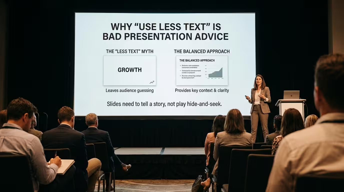
“Use less text.” It is probably the most repeated piece of presentation advice after “keep it simple.” And it is often useful.
The problem is what happens when you actually have something important to say.
A financial result needs its definition. A research slide needs the qualification that changes how the number should be interpreted. A proposal may need three conditions, not one catchy sentence. A training presentation may need terminology that the speaker cannot reasonably expect everyone to remember from narration alone.
So the useful question is not “How do I use less text?” It is: “Which information needs to exist on the slide, and which information only exists because I have not decided what the slide is supposed to do?”
The problem is not text. It is the wrong job for the slide.
Imagine two slides containing exactly the same 80 words.
On the first, those 80 words are a paragraph explaining a conclusion the presenter is already saying aloud. The audience has to read the paragraph while listening to the speaker. That is a genuine design problem.
On the second, the 80 words are the labels, assumptions, definitions, and conditions required to understand a complex business decision. Removing half of them may make the slide look cleaner while making the decision less understandable.
Those slides have identical word counts but completely different problems.
Research on presentation design does support the concern behind the usual advice. When audiences have to read dense text while simultaneously processing spoken information, the verbal channels compete for limited working-memory capacity. PLOS research on presentation slides therefore recommends using words as guideposts rather than turning the slide into a second speech.
But that does not establish a universal rule that fewer words always produce a better slide.
It establishes something more useful: unnecessary verbal processing is expensive.
That distinction changes how I approach text-heavy slides.
“Less text” fails when the text carries the meaning.
There is a simple test I use before deleting copy: if I remove these words, does the audience lose information or only decoration?
Consider a chart showing a 12% decline in revenue. The number may look perfectly clear on its own. But 12% compared with what? Which period? Is it nominal or inflation-adjusted? Does it exclude one business unit? Is the decline temporary?
Some of that information may belong in a footnote rather than the headline. But if removing it changes the interpretation of the chart, it is not “clutter.” It is part of the evidence.
This is where aggressive text reduction can become counterproductive. Designers sometimes remove the qualification because the slide looks stronger without it. The audience gets a cleaner visual and a weaker argument.
The better approach is to separate text by function:
- Message: what the audience should understand.
- Evidence: the number, quotation, finding, or detail supporting the message.
- Navigation: labels that tell the audience what they are looking at.
- Qualification: assumptions, dates, definitions, limitations, or exceptions.
- Speaker support: words that mainly exist because the presenter is afraid of forgetting them.
The fifth category is usually where “use less text” is excellent advice.
The fourth category is where blindly following the rule can damage the slide.
A slide does not have to contain only the headline.
One common reaction to text-heavy slides is to reduce everything to a large statement and move the details into what the presenter says.
That works beautifully in some live presentations. It is much less reliable when the deck has to survive without the presenter.
A board deck sent after a meeting, an investor update, an internal report, a training deck, and a conference keynote may all be called “presentations,” but they are not consumed in the same way.
For a live keynote, the speaker can provide context in real time. For a self-reading deck, the slide itself has to carry considerably more of the argument.
That distinction matters because some presentation guidance assumes the speaker is always present. UC San Diego's presentation recommendations explicitly frame slides as visual aids for an audience rather than memory aids for the presenter, while also acknowledging that the appropriate amount of text depends on the situation.
I would therefore decide the required text level before deciding the visual style.
If the audience is listening: reduce text that duplicates your narration.
If the audience is reading: retain the information they need to reconstruct the argument.
If the slide will do both: separate the primary message from supporting detail instead of pretending one text density works for both modes.
The better rule is “remove redundancy,” not “remove words.”
This is the distinction that makes the usual advice much more useful.
Suppose the speaker says:
“Our European revenue increased 18% because enterprise contracts expanded in Germany and France.”
And the slide says exactly the same thing in a four-line paragraph.
The audience now has to process the same verbal information twice. That is a poor use of the slide.
But imagine the slide instead shows:
Europe: +18% revenue
with Germany and France highlighted on a map and a short note explaining that enterprise contracts were the primary driver.
The text is still doing important work. It simply is not competing with the speaker sentence by sentence.
This aligns with research on cognitive load and presentation slides: full sentences can compete with spoken processing, while concise text can function as a guide to the visual or verbal explanation.
So instead of counting words, look for duplicate channels.
If the speaker, chart, headline, and caption all communicate the same thing, reduce the repetition.
If each element answers a different question, keeping all of them may be justified.
Sometimes the correct solution is more slides, not less text.
This is where the “less text” rule creates another bad habit: shrinking the type until the content technically fits.
The designer starts with four points. The slide feels crowded. The font becomes smaller. The margins disappear. The presenter then announces that there is “too much content” and removes useful information.
There is a third option: change the sequence.
A complicated explanation can often be distributed across several slides, each introducing one part of the argument. Recent guidance on presentation design describes progressive disclosure as a way to reveal complex information sequentially rather than requiring the audience to decode everything at once.
For example, instead of one slide containing:
- the problem
- three causes
- the proposed solution
- the implementation timeline
- the expected result
you might use a sequence:
Slide 1: What is changing?
Slide 2: What is causing it?
Slide 3: Where is the largest opportunity?
Slide 4: What should we do?
Slide 5: How will it be implemented?
The total amount of information has not necessarily decreased. The audience's task has changed.
That is an important design distinction: presentation simplicity does not always mean content reduction. Sometimes it means better sequencing.
There are slides where more text is actually the honest choice.
A legal disclaimer, methodology note, comparison table, research definition, technical specification, or detailed appendix may genuinely require more words.
The mistake is not having a text-heavy slide. The mistake is designing a text-heavy slide as if it were a billboard.
When substantial text is unavoidable, the design problem changes from “How can I delete this?” to “How can I make this readable and navigable?”
That can mean:
- breaking a long passage into meaningful sections;
- making headings carry the structure rather than adding decorative elements;
- using indentation or columns to expose relationships;
- distinguishing primary information from qualifications;
- moving secondary detail into an appendix when it is useful but not required for the main argument.
Notice what is missing from this list: an arbitrary maximum word count.
Rules such as “never use more than 40 words” can be useful as a warning signal, but they are not a substitute for judging what the audience needs. Even institutional presentation guidance that recommends low text density generally frames it as a practical guideline rather than a universal law.
Templates can help with text — if the layout follows the content.
A template is useful here for a reason that has little to do with decoration.
When every slide starts as a blank rectangle, people tend to solve content problems by squeezing everything into the available space. A set of layouts designed for different content structures gives you another option: choose a layout that matches the information instead of forcing the information into one layout.
For example, a comparison layout can separate two dense alternatives. A process layout can distribute explanatory text across stages. A chart layout can give the number more visual weight while keeping the methodological note available. A structured report slide can accommodate more copy without making every line look equally important.
ImagineLayout's library includes PowerPoint templates as well as diagrams and charts, which can be useful when the problem is not simply “too many words” but finding an appropriate visual structure for the information. Browse presentation templates and visual layouts.
The key is not to use a template to hide excessive content. It is to use the layout to reveal the relationships inside that content.
Before deleting text, ask what the audience would lose.
“Use less text” survives because it corrects a very real problem: presenters routinely put information on slides that exists mainly to support themselves, not the audience.
But as a design rule, it is incomplete.
The more useful version is:
Remove text that duplicates, distracts, or compensates for unclear thinking. Keep text that the audience needs to understand, interpret, compare, verify, or act.
That also gives you a better editing sequence. First decide what the slide must accomplish. Then identify the information required to accomplish it. Only after that should you start cutting words.
Sometimes the result will be a three-word headline and a large chart.
Sometimes it will be 80 carefully structured words.
And sometimes the best “less text” solution is not deleting a single word — it is turning one overloaded slide into four understandable ones.
Comments (0)