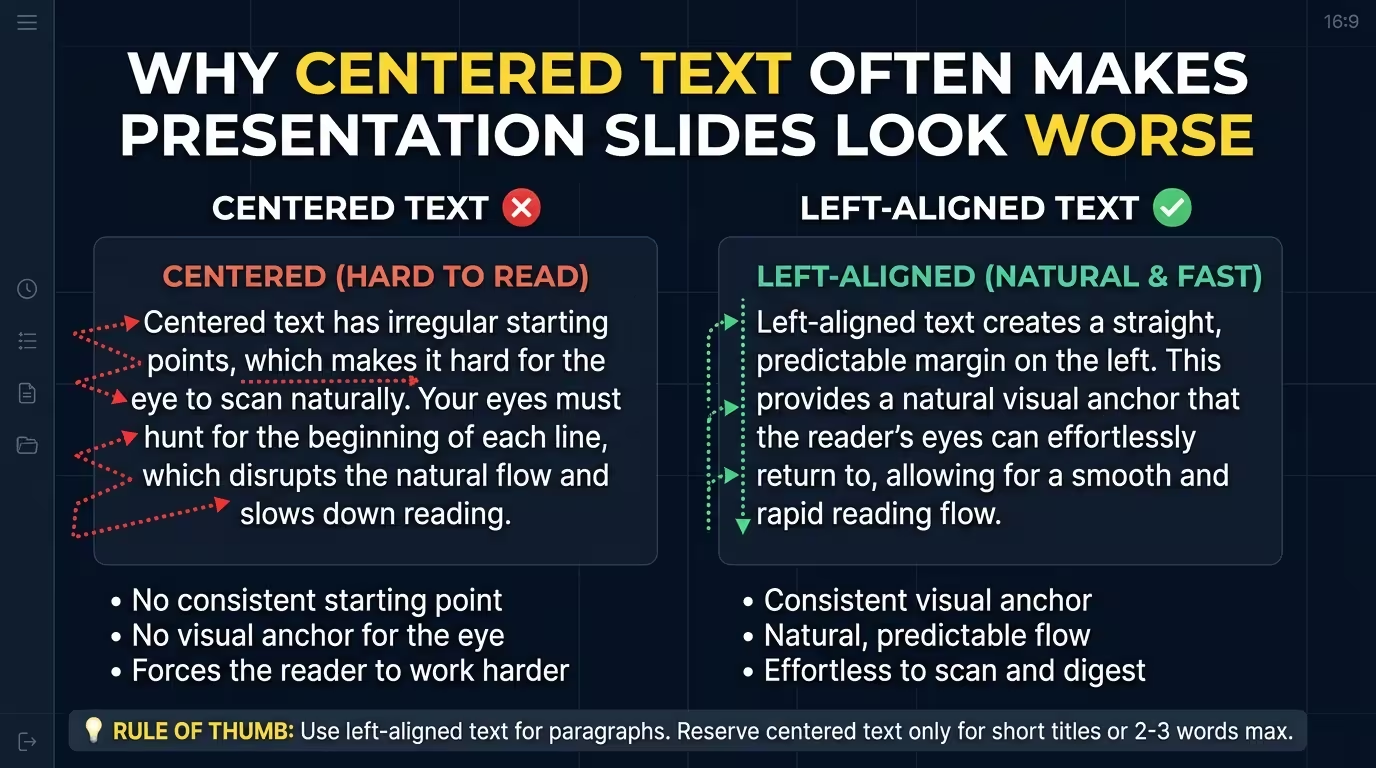
Centered text has an unfair advantage: it looks organized before anyone has actually tried to read it. A headline sits neatly in the middle, the lines appear balanced, and the slide feels symmetrical. Then the audience has to scan the content—and the problems start to show.
For presentation designers, the issue is not that centered text is inherently bad. The real problem is using it for content that needs a clear reading path. Once a slide contains several lines, supporting details, labels, or multiple visual elements, centering can make the relationships between them much harder to see.
The problem starts with the edge of the text
Read a normal left-aligned paragraph for a moment. Your eyes know where each new line begins. Even when the line lengths change, the left edge acts like a fixed starting point.
Now center the same paragraph. Every line begins somewhere slightly different. The eye has to locate the beginning of the next line instead of returning to the same vertical position.
This is one reason typography guidance from WebAIM describes left-aligned text as generally easier to read and specifically notes the additional reading overhead created by long centered blocks.
On a presentation slide, the problem becomes more noticeable because the audience is not reading a document at their own pace. They are usually listening to a speaker while looking at the screen. The text needs to be easy to enter, scan, leave, and re-enter.
The practical rule is therefore narrower than “never center text”: the longer and more information-dense the text block becomes, the more valuable a stable alignment edge becomes.
Centered text can quietly flatten hierarchy
Imagine a slide with a headline, a two-line explanation, three short points, and a small source note. If everything is centered, the slide may look symmetrical—but symmetry is not the same thing as hierarchy.
Each block occupies the same central axis. The viewer has fewer clues about which elements belong together and which element should be read first.
This matters because alignment is not merely an aesthetic decision. It creates relationships between objects. The American Evaluation Association's slide-design guidance recommends consistent alignment between content, headers, and graphics and specifically advises against centered text justification.
Consider what happens when the same slide uses a strong left edge:
- The headline establishes a starting point.
- The supporting text inherits that position.
- A chart or image can align to the same guide.
- A small label can sit on the same vertical axis without needing its own visual explanation.
The result is not simply “cleaner.” The alignment itself tells the audience which objects are related.
The hidden cost appears when text sits next to graphics
Centered text is easiest to control when it is isolated. Put it beside an image, chart, icon, or diagram and the weaknesses become much easier to see.
Suppose a chart occupies the right half of the slide and explanatory copy occupies the left. A left-aligned text block can create a predictable boundary between the two areas. Its left edge can also line up with the slide title, footer, or other content.
Center that same text and its edges start moving inward and outward depending on the length of each line. The relationship with the graphic becomes less explicit.
This is where a useful distinction appears: center alignment is an alignment to an axis; left alignment is often an alignment to a system.
A centered block can look perfectly positioned relative to the slide itself while being poorly positioned relative to everything around it.
That is why a slide can be mathematically symmetrical and still feel strangely disconnected.
Imagine, hypothetically, a consulting slide with a large number on the left and an explanatory paragraph underneath it. If the paragraph is centered independently, the text may appear visually detached from the number even though both occupy the same half of the slide. Aligning the paragraph to the number's text edge can immediately make the two read as one unit.
Why centered titles are a different case
There is a reason centered text keeps appearing in professional presentations: it can work extremely well when the amount of text is small and the slide has a single dominant message.
A short title such as “The Market Has Shifted” does not create the same reading problem as a six-line paragraph. There are fewer line starts to track, and the central axis can become part of the visual composition rather than an obstacle to reading.
Centered alignment is particularly defensible when:
- the text is short;
- there is one dominant message;
- the surrounding composition is intentionally symmetrical;
- the text is functioning as display typography rather than body copy;
- there are few competing objects that need to share alignment guides.
UConn's presentation-design guidance makes a similar distinction in practice: it recommends left alignment for slide text because centered text is more difficult to read, while other presentation-design resources distinguish short display text from longer body copy.
The mistake is taking a layout that works for a title slide and applying its alignment logic to every content slide in the deck.
Look at the slide as a system, not as a text box
One of the fastest ways to diagnose a weak slide is to stop reading the words.
Cover the text mentally and look only at the edges, guides, shapes, images, and gaps. Ask: where is the visual structure?
If every text box is centered independently, you may discover several invisible axes competing with one another. The title has one center. The paragraph has another visual width. The chart sits on its own center. A caption is centered beneath an image.
Nothing is technically misaligned, yet nothing is clearly connected.
This is where a grid becomes more useful than a collection of individual alignment commands. ImagineLayout's own guidance on slide alignment makes the same broader point: establish guides early, align related elements to each other, and pay attention to relationships such as icon-to-label and image-to-caption rather than only to the slide boundaries. :contentReference[oaicite:5]{index=5}
A useful test is to ask of every text block:
- What other object does this text belong to?
- Which edge should communicate that relationship?
- Does the text share a guide with the title or another content block?
- Is centering helping the composition, or merely making the box look symmetrical?
That last question catches a surprising number of weak layouts.
When centered text actually improves the slide
There is no need to remove centered alignment from your design vocabulary. The point is to give it a job.
Centered typography can be effective for a section divider, a short statement, a large statistic, a quotation, or a deliberately symmetrical opening slide. It can also create a sense of pause between denser parts of a presentation.
The constraint is simple: the shorter and more self-contained the message, the more freedom you have to center it.
As soon as the audience needs to compare several lines, follow a sequence, connect text to graphics, or scan multiple pieces of information, a consistent edge usually becomes more useful.
This is also where templates can help. A well-built presentation template does not merely provide attractive centered or left-aligned text boxes. It establishes repeatable relationships between titles, content areas, charts, images, and supporting labels. That makes alignment a structural decision rather than something the designer has to reinvent on every slide.
ImagineLayout's current template library, for example, includes presentation layouts and editable diagrams designed around repeatable slide structures rather than isolated text formatting.
The simplest test: follow the first line
Before finalizing a slide, try this quick check: look at the first line of every text block and trace where your eye wants to begin reading.
If the starting points form a deliberate pattern, the slide probably has a useful alignment system.
If every block begins somewhere different because everything has been centered, the slide may be asking the audience to solve a layout problem before they can solve the content problem.
That is why centered text so often makes presentation slides look worse. It is rarely the center itself that causes the trouble. The problem is that centering can make a text box look finished while leaving the larger slide structure unresolved.
Use the center when the composition needs an axis. Use an edge when the audience needs a path.
Comments (0)