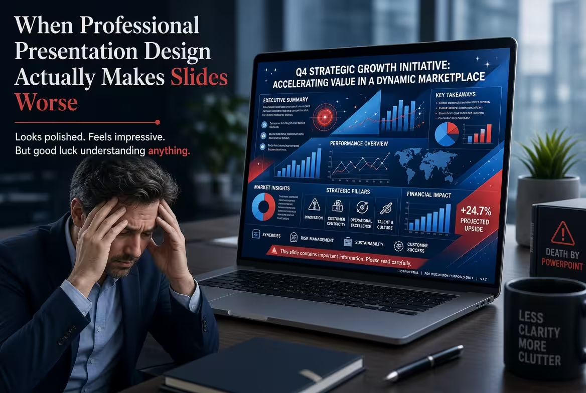
A slide can look professionally designed and still fail at the one job that matters: helping someone understand what they are looking at.
That is the uncomfortable part of professional presentation design. Once you know how to create polished layouts, consistent typography, diagrams, and visual systems, it becomes very easy to improve a slide visually without improving the presentation itself. Sometimes the design is not solving the problem anymore. It is the problem.
The most useful question is therefore not “Does this slide look professional?” It is “Does the design make the intended idea easier to see, understand, remember, or act on?”
When the design becomes more interesting than the message
Imagine a slide explaining a simple decision: three options, one recommendation, and a short reason for choosing it.
There are many ways to make that slide look impressive. You can turn the options into cards, add icons, introduce a colored scoring system, build a comparison matrix, add decorative shapes, and create a visual path toward the recommendation.
At some point, however, the viewer has to process the design before reaching the decision.
This is one of the easiest ways professional presentation design goes too far: the visual structure becomes a second message that competes with the first.
A good design system should reduce the amount of interpretation required from the audience. If viewers have to figure out what the colors mean, why elements are arranged in a particular shape, whether an icon represents a category or an action, and which of several large objects deserves attention, the design has created work.
That does not mean every slide should be visually plain. It means visual complexity needs a job.
If removing a decorative element does not make the underlying idea harder to understand, that element is probably not carrying enough weight to justify itself.
When visual hierarchy tells the wrong story
A designer can create an extremely clear hierarchy—and still prioritize the wrong thing.
This happens frequently with executive, financial, and analytical slides. A large percentage, headline, chart, or highlighted number naturally attracts attention because the design says it matters. But the audience may actually need to notice a different piece of information first.
Consider a hypothetical quarterly performance slide. The largest element is a revenue figure. Underneath it sits a smaller operational warning that explains why the result is unlikely to continue.
From a design perspective, the slide may look beautifully organized. From a communication perspective, it may be misleading because the visual hierarchy tells the audience to celebrate before they understand the qualification.
This is why hierarchy should not be treated as purely visual.
The strongest visual position should belong to the most important decision or interpretation, not automatically to the largest number or most attractive graphic.
Before increasing the size, contrast, or visual weight of an element, ask what you want the viewer to conclude after noticing it. If that conclusion is incomplete without another element, the hierarchy may need to change.
When a template dictates the content instead of supporting it
Templates are useful precisely because they solve recurring layout problems. The danger begins when the content is forced into a layout simply because the layout already exists.
A polished template might provide six perfectly balanced content blocks. Your argument might only contain three meaningful points.
Filling the other three blocks creates a strange incentive: the slide starts asking for information that the presentation does not actually need.
This is especially common with professional presentation design systems built around cards, grids, timelines, process diagrams, and modular components. Once the visual language is established, every new idea starts looking like something that needs to be converted into one of those components.
But not every idea is a process. Not every comparison needs a matrix. Not every group of facts needs cards.
One of the better tests I use is simple: if the content were written on paper without any layout, what relationship would actually exist between the pieces?
Then design that relationship.
Do not invent a relationship because the template has a convenient diagram for it.
ImagineLayout's presentation template library is useful in exactly the right way when treated as a starting system rather than a finished answer. A template can provide a structural vocabulary, but the content still has to determine which structure deserves to survive.
When diagrams make simple ideas harder
Diagrams have an obvious advantage: they can expose relationships that are difficult to describe in prose.
They also create a temptation to turn almost any relationship into a diagram.
Suppose a slide needs to communicate a straightforward sequence:
- Collect the information.
- Review the findings.
- Make a decision.
- Execute the decision.
A four-step horizontal process might be completely appropriate. But if the same content is turned into a circular loop, connected network, layered pyramid, or elaborate infographic, the viewer may start looking for meaning that is not actually there.
Does the process repeat? Is there a hierarchy? Are the steps simultaneous? Does one influence another?
The graphic has introduced questions that the original content never asked.
This is a useful boundary for professional presentation design: a diagram should encode a relationship, not merely decorate a list.
If the audience could misunderstand the relationship because of the visual metaphor, ordinary text may actually be the more sophisticated solution.
For presentations that genuinely need conceptual relationships, an editable diagram system can save considerable production time. For example, ImagineLayout's Concept Keynote Charts provides multiple diagram-oriented layouts. The important part is deciding which relationship deserves visualization before choosing the visual form.
When consistency becomes visual monotony
Consistency is useful until every slide starts behaving exactly the same way.
The problem is subtle because a consistent deck often looks more professional during a quick thumbnail review. The colors match. Titles occupy the same position. Components repeat. Margins are controlled. Nothing appears accidental.
But a presentation is not a collection of independent posters. It has rhythm.
A title slide, a major argument, a dense analytical chart, a transition, and a final recommendation do not necessarily deserve identical visual treatment.
If every slide has the same number of objects, identical title placement, identical card shapes, and identical visual density, the audience receives fewer signals about changes in importance.
The answer is not random variation. It is controlled inconsistency based on function.
A deck can maintain the same typeface, color logic, spacing principles, and graphic language while deliberately changing composition when the communication task changes.
For example, a key recommendation might need a quieter composition than the analytical slide immediately before it. A transition slide might need almost no information because its job is to reset attention. A complex chart may legitimately break the established modular grid because the data itself requires a different structure.
Professional design is not necessarily about making every slide look related. It is about making the differences between slides meaningful.
When animation and visual polish steal attention from delivery
A slide can work perfectly as a static image and become worse the moment animation is added.
This happens when movement attracts attention without controlling the order in which information should be understood.
A build can be useful when the audience needs to see a relationship emerge step by step. It is less useful when every icon, label, line, and decorative element enters independently simply because the software allows it.
The same principle applies to visual effects. A transition, animated chart, or elaborate entrance can become the event rather than the information.
There is also a practical problem: the presenter has to deliver the slide while the slide is doing something.
If the visual timing is difficult to control, the speaker can end up waiting for the animation, speaking ahead of it, or unconsciously adjusting the explanation to the mechanics of the slide.
That is a poor trade.
When considering animation, ask what misunderstanding disappears because the animation exists. If the answer is “none,” the effect may be visual decoration rather than communication.
When branding makes every slide look like an advertisement
Branding creates another interesting failure mode: the presentation becomes extremely recognizable and surprisingly difficult to read.
Large logos, branded color fields, repeated graphic motifs, decorative gradients, and persistent visual signatures can make a deck feel highly controlled. They can also consume the visual attention that should belong to the content.
This matters most when the presentation is supposed to communicate analysis rather than promote a brand.
A sales presentation can tolerate more brand presence than an internal operating review. A conference keynote can use a stronger visual identity than a technical workshop. A board presentation may need the brand to become almost invisible once the core discussion begins.
The right amount of branding therefore depends on why the audience is looking at the slide.
If viewers already know who is presenting, the logo does not need to repeatedly prove the company's existence. The design can spend that visual space on the decision, evidence, or argument instead.
When professional design should deliberately disappear
The most difficult design decision is sometimes doing less—not because minimalism is inherently better, but because the content has reached a point where additional design would interfere with it.
A complicated financial table may need careful typography and alignment but no decorative visualization. A powerful quotation may need nothing more than readable type and enough room around it. A single conclusion may deserve an almost empty slide because the presenter needs the audience to stay with one thought.
This is where professional presentation design becomes less about visible craftsmanship and more about restraint.
I often think of the best-designed slide as one where the audience does not spend time admiring the design because the design has made the intended thought unusually easy to follow.
That does not mean the slide should look unfinished. It means the craft is serving the communication so closely that the two become difficult to separate.
ImagineLayout's Design Presentation Keynote template, for example, can provide a prepared visual framework for building presentation graphics. But a framework should remain subordinate to the argument. If the content needs a different composition, changing or abandoning the prepared layout is part of good design—not a failure to use the template correctly.
The practical test is straightforward. Hide the decorative layer mentally and look only at the communication: what is the audience supposed to notice, understand, compare, decide, or remember?
Then bring the design back in.
If it makes that task easier, keep it. If it merely makes the slide look more finished, reconsider it.
Comments (0)