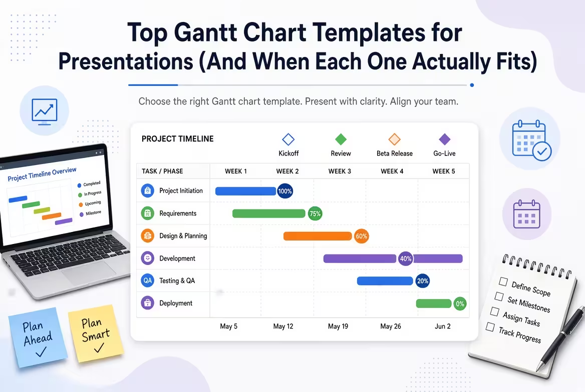
Open ten "top Gantt chart templates" articles and nine of them will hand you the same list: a scheduling tool with drag-and-drop bars, another scheduling tool with drag-and-drop bars, and a spreadsheet formula for people who enjoy suffering. That's fine if you're running a project. It's the wrong answer if you're fifteen minutes from a stakeholder meeting and need one slide that shows where things stand.
Those are two different problems. A project-management Gantt tool is meant to be edited every day — tasks shift, dependencies redraw themselves, someone on the team updates a percentage-complete bar on a Tuesday afternoon. A presentation Gantt chart template is meant to be looked at once, understood in ten seconds, and then closed. Confusing the two is why so many status decks end up with a screenshot of a scheduling app crammed onto a slide, axis labels cut off, dependency lines running into the footer.
Why a static template beats a live tool screenshot in a deck
I've sat through enough steering-committee meetings to notice the pattern: the moment someone pastes a raw export from their PM software into a slide, the room's attention drops. Not because the data is wrong, but because the chart was designed for a screen you scroll and zoom, not one projected for ninety seconds while someone talks over it. A presentation-built Gantt template strips out the interface chrome — filters, sidebars, status dropdowns — and keeps only what a viewer needs to read at a glance: what's happening, when, and what depends on what.
That's also the honest limitation worth naming upfront. None of the templates below are live scheduling tools — they won't recalculate dates when a task slips, and they won't sync with your team's actual task tracker. If you need that, pair the template with your PM software and only bring the polished version into the room.
Match the time horizon to the meeting, not the project
The single most common mistake I see is picking a template based on how long the project runs, rather than how much detail the audience in front of you actually needs. A nine-month product launch doesn't need a nine-month chart in every meeting — it needs a weekly view for the team standing up the launch and a 6-month view for the executive who checks in once a quarter.
- Weekly view: sprint reviews, team stand-ups, any audience that's executing the work day to day.
- Monthly view: department reviews, client status updates, cross-functional syncs where phases matter more than individual tasks.
- 6-month view: board updates, investor decks, annual planning — where the point is showing trajectory, not task-level detail.
Get this backwards — a weekly-granularity chart in front of a board, or a 6-month rollup in a sprint review — and the slide reads as either overwhelming or useless, regardless of how well it's designed.
The monthly Gantt PowerPoint template: the default for most status decks
If you only keep one Gantt template on hand, this is the one that earns its place. Monthly granularity is the sweet spot for the majority of recurring status updates — enough resolution to show which phase is active without forcing you to update the slide every week. It ships as twelve editable PowerPoint slides with color-coded bars, milestone markers, and dependency connectors, and it's free for personal and commercial use.
One thing worth flagging before you download it: it's explicitly a presentation layout, not a scheduling engine — there's no live date logic under the hood, so shifting a bar means dragging it yourself, not editing a start-date field that recalculates everything downstream. For a static status slide that's rarely a real limitation; for anyone hoping to manage the actual project inside PowerPoint, it will feel restrictive fast.
Need the same layout in Keynote? Don't just import the .pptx
Presentation compatibility for Gantt-style charts is more fragile than it looks. Bars, connectors, and milestone icons are usually built from grouped shapes, and PowerPoint-to-Keynote imports frequently break that grouping — arrows detach from their bars, or the milestone diamonds shift a few pixels off their dates. The cleaner route is a native Keynote Gantt chart template built directly in the .key format, which keeps the zone segmentation and dependency arrows intact without a conversion step. It mirrors the monthly PowerPoint layout above, so teams that present from a mix of Mac and Windows machines can keep the same visual language across both.
Planning across two quarters: when monthly still isn't wide enough
Research initiatives, product rollouts, and anything spanning half a year or more tend to outgrow a monthly grid — not because the design breaks, but because six bars stretched across twelve months start compressing into a strip too thin to read task labels on. A 6-month Gantt PowerPoint template solves this by widening the time axis rather than shrinking the bars, leaving room for milestone diamonds and dependency chains without the crowding.
This is also where the practical vs. board-ready trade-off shows up clearest. A 6-month view is the right call for executive or investor updates precisely because it forces you to leave out daily task noise — but if a stakeholder in that meeting asks "what's happening this specific week," you'll want the monthly or weekly version open as a backup slide, not trying to zoom into six months of bars on the fly.
A number worth knowing before you build a chart nobody looks at
It's tempting to assume every project-management tool user is already living inside their Gantt view. Capterra's research, summarized in a recent Plaky project-management statistics report, found that roughly a third of users with Gantt-chart access in their PM software simply don't use the feature — while a separate fifth of users without one say they actively want it. Read together, that's less a software problem than a habit and framing problem: the chart exists, but it isn't presented in a way that earns a look. A dedicated presentation template, shown once with clear framing rather than left as a background tab, is often what closes that gap in an actual meeting.
A quick gut-check before you download anything
Before picking a template, it's worth asking one honest question: is this slide meant to inform a decision, or just to prove that a plan exists? If it's the former, match the time horizon to the audience as above, and keep the chart to one slide — a Gantt chart that needs a second slide to finish has usually stopped being a status update and turned into a document. If it's the latter, any of the free templates above will do the job, and the time saved not fighting with manual shape alignment is the actual point of using one.
Comments (0)