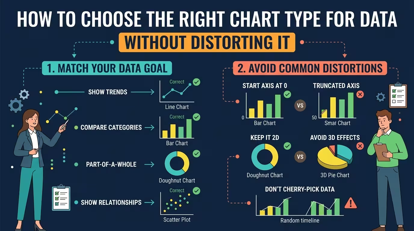
A chart can contain perfectly accurate numbers and still give the audience the wrong impression. The problem is often not the data — it is the visual form used to display it.
If you are preparing a presentation, report, dashboard, or research slide, choosing the right chart type means more than deciding between a bar, line, or pie chart. You need to preserve the relationship the data actually contains while making the intended comparison easy to see.
Start with the relationship, not the chart
One of the most reliable ways to choose a chart is to describe the intended takeaway in a single sentence before opening PowerPoint or another visualization tool.
For example, “Product A generated more revenue than Product B” is a comparison. “Revenue increased each quarter” is a change-over-time statement. “Advertising spend is associated with conversions” is a relationship between two variables.
Those sentences point toward different visual structures. A bar chart makes category differences easy to compare. A line chart gives continuity to a time series. A scatter plot shows whether two numerical variables move together.
This distinction matters because a chart does not merely display information. It tells the viewer what kind of relationship to look for.
- Compare categories: bar or column chart.
- Show change over time: line chart, sometimes area or column.
- Show a ranking: ordered horizontal bars are often the clearest choice.
- Show a relationship: scatter plot.
- Show a distribution: histogram or box plot.
- Show parts of a whole: stacked bars, or a pie/donut when the number of parts is small and the whole genuinely matters.
The important step is not memorizing the list. It is identifying the relationship before choosing the visual.
When a bar chart is safer than a more sophisticated chart
Suppose the audience needs to answer one simple question: which category is larger?
A horizontal bar chart is difficult to misunderstand because the comparison is based on position along a common scale. That makes it especially useful for rankings, category comparisons, and values with long labels.
The temptation is to replace the bars with something visually more elaborate: circles, bubbles, radial charts, gauges, or decorative infographic shapes. That can make a slide look more distinctive while making the numerical comparison harder.
The test is simple: if the viewer has to estimate area, angle, radius, or bubble size to compare two values that could have been compared by length, you may have made the data harder to read without adding information.
Ordering also changes interpretation. If the purpose is ranking, sort the categories deliberately. If the categories have a meaningful natural order, such as age groups or stages in a process, preserve that order instead of automatically sorting by value.
Line charts become misleading when continuity is implied where none exists
A line connecting points does more than guide the eye. It implies that the values belong to a continuous sequence.
That is exactly what you want for measurements such as monthly revenue, daily temperature, or quarterly production. The connecting line helps the viewer see direction and rate of change.
But imagine plotting sales for five unrelated product categories and connecting them from left to right. The line now suggests a progression between categories that does not exist in the underlying data.
In that situation, a bar chart is usually more faithful to the structure of the data.
This is one of the easiest ways to accidentally introduce a false message: the values are correct, but the connection between them is invented by the chart.
There is another edge case. Time itself does not automatically justify a line chart. If you have only a few discrete periods and the main question is “which period was higher?”, columns may make the comparison more immediate. Use the line when the continuity and direction of the series actually matter.
Pie charts are not automatically wrong — but they have a narrow job
Pie charts often receive blanket criticism, but the real problem is usually more specific: they become weak when the viewer has to compare many similar angles.
A pie or donut can work when the audience needs to understand a small number of parts as proportions of one clearly defined whole. It becomes much less useful when there are many categories, several slices are nearly identical, or the audience needs precise comparisons.
Consider a hypothetical budget with four categories: salaries, software, travel, and facilities. Showing their approximate share of the total may be reasonable.
Now imagine twelve categories ranging from 6% to 11%. The same visual encoding creates a much harder comparison. A sorted bar chart would let the audience compare the values directly instead of judging small differences in angles.
There is also a structural question people often skip: do the numbers actually form a meaningful whole? If categories overlap, can occur simultaneously, or are independent measurements, presenting them as slices of one pie can imply a relationship that the data does not have.
The axis can distort the story even when the chart type is correct
Choosing the correct chart is only half the problem. A perfectly appropriate bar or line chart can still exaggerate or suppress differences through its scale.
Imagine two values: 98 and 100. A vertical bar chart beginning at zero will show a small difference. If the axis begins at 97, the visual difference becomes dramatically larger relative to the displayed range.
That does not automatically make a non-zero baseline invalid. Line charts, for example, often benefit from a tighter scale when the objective is to reveal relatively small movements over time. The problem occurs when the scale is chosen without considering what visual claim the audience will infer.
For bars, the baseline deserves particular attention because the viewer reads bar length as magnitude. Cutting the baseline can make a modest difference look like a major one.
For lines, the more important question is often whether the scale makes meaningful changes visible without turning normal variation into apparent volatility.
Before publishing, ask: if I changed only the axis range, would the perceived importance of the story change substantially?
If the answer is yes, the scale needs deliberate justification.
Stacked charts hide some comparisons by design
Stacked bars are useful when the total and its composition both matter. They are much less effective when the audience must compare every individual segment across several categories.
The reason is geometric. The bottom segment shares a common baseline, so its values are relatively easy to compare. The next segment begins at different heights, making its length harder to judge. Higher segments can become difficult to compare accurately without reading labels.
Suppose a presentation compares departmental spending across five years and stacks six expense categories in every column. The chart may successfully show total spending and broad composition. But if the main question is whether travel expenses increased from year to year, that segment may be visually buried.
In that case, a separate line or grouped bar chart may communicate the specific comparison more honestly.
This leads to a useful rule: choose the chart according to the comparison the audience actually needs, not according to how many dimensions you have available.
Scatter plots protect relationships that summary charts can hide
Two metrics can have the same averages and still behave very differently.
Imagine comparing advertising spend with sales across several campaigns. A scatter plot can reveal clusters, outliers, nonlinear patterns, or the absence of an obvious relationship. Replacing those observations with two average numbers would remove much of the structure contained in the dataset.
This is where chart selection becomes an analytical decision rather than a design decision.
If the question is “Are these two variables related?”, use a visual that keeps individual observations visible. A scatter plot is often appropriate because every point represents an observation rather than collapsing the dataset into a single summary.
The same principle applies to distributions. If the audience needs to understand how values are spread, an average alone is insufficient. A histogram or box plot can reveal concentration, skew, range, and unusual observations that a simple KPI number conceals.
Aggregation can distort data before the chart even appears
Sometimes the chart is blamed for a distortion that actually happened one step earlier.
Suppose monthly sales are converted into quarterly averages before being plotted. The resulting line may look smooth and stable, but the aggregation has removed month-to-month variation. The chart is faithfully displaying the processed data while no longer showing the original pattern.
The same issue appears when categories are merged, outliers are removed, or multiple measurements are reduced to a single average.
Before choosing a visualization, check what each plotted point actually represents.
- Is it an individual observation?
- Is it a sum, average, median, or percentage?
- Were categories combined?
- Were extreme values excluded?
- Does each period contain the same amount of data?
- Are the categories mutually exclusive?
A beautiful chart cannot repair an aggregation that answers a different question from the one the audience thinks it is seeing.
A practical chart-selection test for presentation slides
When I need to choose a chart quickly, I reduce the decision to five questions:
- What must the viewer compare? Categories, periods, distributions, proportions, or variables?
- What structure must remain visible? Order, continuity, individual observations, or composition?
- What could the chart accidentally imply? A false trend, false proportion, false baseline, or false relationship?
- Which visual encoding makes the required comparison easiest? Position is generally easier to compare than angle, area, or decorative geometry.
- What information disappears if I simplify the dataset? Check aggregation, outliers, category grouping, and time intervals before finalizing the visual.
This process is more reliable than starting with a gallery of chart types and choosing the one that looks best.
Use templates for structure, not as a reason to force the data
A presentation template can save considerable design time, but it should never dictate the analytical form of the chart.
ImagineLayout's Data Visualization Techniques PowerPoint Charts Template includes multiple chart structures, including bar, line, scatter, area, and other visualization layouts. The useful part is not simply having many chart types available; it is having editable structures that can be adapted after the analytical decision has already been made.
For broader presentation work, the Customizable PowerPoint Charts Template also covers several common chart families, including bar, line, pie, area, and scatter charts.
The key sequence is therefore question → data structure → chart type → visual design, not template → chart → explanation.
When that sequence is reversed, designers often end up adjusting the data to fit the available graphic. That is exactly when a polished presentation can become less truthful than a simple spreadsheet.
The safest chart is not necessarily the simplest-looking one. It is the one whose visual grammar matches the structure of the data closely enough that the audience does not have to correct the chart's assumptions in their head.
Before you send the slide, hide the labels for a moment and look only at the shapes, positions, lengths, and connections. Ask yourself what conclusion a viewer would reach in three seconds. If that conclusion is stronger, weaker, or simply different from what the underlying numbers support, the problem is probably not the dataset. It is the chart.
Comments (0)