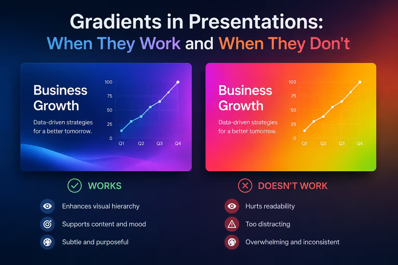
A client once sent me a deck back with one comment: "It looked amazing on my laptop, terrible on the projector." The culprit wasn't the layout or the fonts. It was a dark-to-light gradient background that turned into visible banding the moment it hit an older conference room projector. That's the thing about gradients in presentations — they're one of the few design choices that can look completely different depending on where they're displayed, and most advice on this topic never mentions that.
What a gradient actually does on a slide
A gradient adds a sense of depth and direction. Flat color says "here is information." A gradient says "look here first, then here." That's genuinely useful when you want to guide the eye toward a headline or a single data point — but it's a directional tool, not a decorative one. I often notice designers reaching for a gradient because a slide feels "flat," when the real problem is weak hierarchy in the type, not a lack of color transition.
If you can't explain what the gradient is directing attention toward, it's decoration, and decoration is exactly what gets cut when a deck gets forwarded to someone who wasn't in the room.
Where gradients genuinely earn their place
- Section dividers and title slides. These are seen once, briefly, and don't need to hold up under close reading. A subtle gradient behind a title slide (say, a hypothetical navy-to-charcoal transition behind white text) can add polish without competing with content.
- Single hero numbers. A gradient fill behind one large statistic — not a chart, just a number and a label — can make it feel like the visual focal point of the slide.
- Backgrounds behind sparse text, not behind data. Gradients and empty space tolerate each other well. Gradients and dense content don't.
Where gradients quietly break decks
This is the part most articles skip, and it's the part that actually costs people credibility in a meeting.
Projector and screen variance. Conference room projectors, especially older ones, often can't reproduce smooth tonal transitions — you get visible stepping or banding, particularly in the midtones of blue and purple gradients. What renders as a smooth gradient on a calibrated monitor can look like a striped background on a bulb-based projector that's had years of color drift.
Print and PDF export. Gradients compress differently than flat color when a deck gets exported to PDF or printed as a handout. I wouldn't recommend a gradient as a full-slide background for any deck you know will be printed — the file size balloons and the color shift between screen and paper is rarely subtle.
Text contrast that only "sort of" passes. A gradient background means your text has to stay legible across a range of tones, not just one. White text that reads fine against the dark end of a gradient can drop below comfortable contrast against the lighter end. This is a real accessibility issue, not a style nitpick — and it's one of the most common reasons a gradient slide fails a basic readability check.
The specific case of charts and dashboards
This is where I'd push back hardest against gradient use. A gradient fill on a bar chart or a KPI tile might look modern, but it actively works against the function of the chart: comparing values at a glance. A viewer's eye reads color intensity as meaning, so a gradient bar can make someone unconsciously judge a value as "less" or "more" based on where the color sits in the transition, independent of the actual data. If a chart needs to be read quickly and correctly — which is the entire point of a chart in a business deck — flat, consistent color communicates faster than a gradient does. Save the gradient for the slide's background, if anywhere, and keep the data itself in solid fills.
A simple way to decide
Before adding a gradient, I ask three questions:
- Will this slide be read closely, or glanced at? (Glanced at = gradient is safer.)
- Will this deck be projected, printed, or exported as a PDF anywhere I don't control? (If yes, test it there before finalizing.)
- Is there data on this slide that needs to be compared accurately? (If yes, keep that element flat.)
None of this means gradients are outdated or unprofessional — plenty of strong decks use them well, usually in title slides, section breaks, or as a subtle backdrop behind a single dominant element. The failure mode isn't the gradient itself. It's using it somewhere that demands precision — data, dense text, or an unpredictable display — and finding out only when it's already in front of a room.
Next time you're about to add one, open the slide on the dimmest, cheapest screen you have access to. If it still reads clearly there, it'll hold up anywhere.
Comments (0)