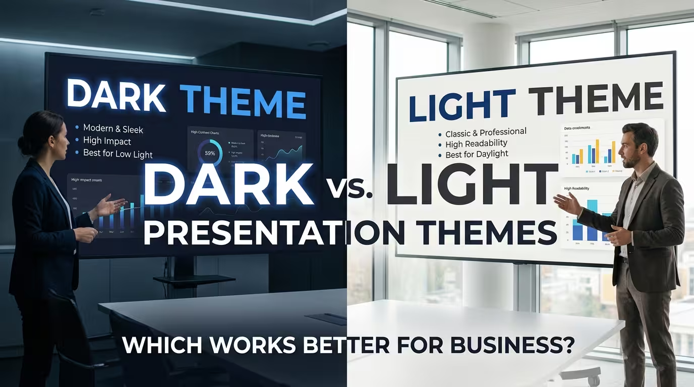
A dark presentation can make a business deck feel focused and deliberate. A light presentation can make the same content feel open, analytical, and easier to work through. Neither is automatically more professional.
The useful question is not “Which theme looks better?” It is “What does this presentation need the audience to do?” That answer changes how you should treat backgrounds, charts, photography, text, and even the room where the deck will be shown.
Dark vs. light is really a question of presentation behavior
Imagine two business meetings. In the first, an executive presents a new product for ten minutes while the audience watches from a darkened room. In the second, a finance team spends forty minutes reviewing a dense quarterly report and discussing individual numbers.
The subject matter could be similar, but the visual demands are not.
A dark theme can help create a more concentrated, presentation-led experience. A light theme tends to behave more like a working surface: charts, tables, annotations, and longer text blocks can sit on it without making the slide feel as visually heavy.
This distinction is more useful than assigning personality traits to colors. A dark background is not inherently more “premium,” and a white background is not automatically more “corporate.” The theme establishes the visual environment in which the content has to perform.
For example, a dark business-strategy deck can make individual chart elements stand out against the surrounding field. ImagineLayout's dark business strategy chart template is an example of this approach, using a dark canvas for strategy and analysis visuals.
When a dark presentation theme makes sense
Dark themes become useful when the presentation is primarily an act of directed attention. The audience is expected to follow the presenter rather than continuously work inside the slide.
This is particularly effective for:
- Keynotes and product launches where individual visuals need to make an immediate impression.
- Executive presentations with relatively few points per slide and a strong speaking component.
- Pitch decks where large product images, interface screenshots, or visual concepts are central to the story.
- Strategy presentations where a small number of important metrics or comparisons need strong visual separation.
- Dark-room presentations where a bright slide background would introduce a large luminous area around otherwise focused content.
There is a practical catch: dark backgrounds punish weak color decisions more visibly. A slightly muted accent that works on white can disappear against charcoal. Small gray text that seems sophisticated in the editor can become difficult to read once the deck is projected.
That means a dark theme usually works best when the designer controls the contrast deliberately rather than simply changing the background from white to black.
When a light presentation theme is the better working surface
Light themes have a different advantage: they tolerate information.
If a slide contains a detailed chart, a process diagram, several labels, or a table that people need to inspect while discussing it, a light background often gives those elements more room to coexist without turning the entire slide into a high-contrast spectacle.
Consider a quarterly business review. The audience may want to compare values, ask questions about individual categories, and look back at previous slides. The presentation is no longer just a sequence of visual statements. It is becoming a shared analytical document.
That is where a light theme can be particularly practical.
A useful example is ImagineLayout's light process chart template. The light treatment leaves the diagrams themselves to carry the visual structure instead of making the background a major part of the composition.
Light themes also have an operational advantage when a presentation will be printed, exported to PDF, embedded into a report, or viewed in a bright office. The same slide does not have to be redesigned around a dark presentation environment.
The room can matter more than the brand
One of the easiest mistakes is choosing a theme during slide production without considering where the finished deck will actually be viewed.
A designer might approve a dark deck on a calibrated monitor. The presentation then gets shown in a bright conference room, through a projector with weaker black levels, while people sit several meters away from the screen. The design decision has changed because the viewing conditions changed.
The reverse happens too. A light deck can feel perfectly reasonable on a laptop but become unnecessarily bright when projected onto a large screen in an otherwise dark auditorium.
So before locking the theme, ask four practical questions:
- Will the room be bright, dim, or unpredictable?
- Will the audience sit close to a laptop-sized screen or far from a large display?
- Will the deck be presented live, or will people mainly read the PDF afterward?
- Will the slides also need to work in print?
If the presentation has to survive all four conditions, a light-first system is often easier to adapt because the same content can be repurposed for documents and printed material with fewer changes. That does not make light universally better; it makes the downstream workflow simpler in mixed-use situations.
Charts expose the difference faster than text does
Dark and light backgrounds can both support a strong chart. The problem appears when you try to move the same chart between them without redesigning its visual hierarchy.
On a light slide, dark axes, labels, and neutral data series can recede naturally while one accent color identifies the important value. On a dark slide, the same hierarchy may need different neutrals and lighter labels so that secondary information remains visible without competing with the main metric.
This is why a genuine theme is more than a background color.
It should define at least:
- the background neutral;
- the primary and secondary text colors;
- the treatment of gridlines and axes;
- the default chart colors;
- the emphasis color for the most important value;
- the appearance of diagrams, icons, and dividers.
ImagineLayout also has diagram templates designed for both light and dark treatments. That kind of flexibility is useful when the underlying diagram structure matters more than committing the entire presentation to one dramatic visual style.
The important point is that you should not design a dark deck and then “make it light” by changing two colors. The chart hierarchy has to survive the theme change.
Photography changes the decision again
Photography is one of the strongest reasons not to choose a presentation theme from a color palette alone.
A dark slide can make a full-bleed photograph feel cinematic, especially when the image itself contains shadows or a restrained color range. A light slide can provide a more neutral frame for bright product photography, screenshots, diagrams, and editorial-style images.
But there is an important exception: the image itself may already determine the background.
If most of your deck consists of product screenshots with pale interfaces, placing them on a dark canvas may create strong separation. If the same screenshots contain large black interface areas, the dark background may cause their edges to disappear.
So instead of asking whether your brand is “dark” or “light,” collect three or four representative visuals from the actual presentation and test them on both backgrounds. The theme that produces fewer exceptions is usually easier to maintain across the deck.
Do not confuse visual style with information density
A common design mistake is choosing a dark theme because the presentation is supposed to look sophisticated, then filling it with the same amount of information that would normally appear in a report.
The result is often a deck that looks impressive in a thumbnail but becomes tiring to inspect at full size.
The opposite problem also exists: a light theme can encourage designers to keep adding charts, labels, notes, and supporting text because everything technically fits. The slide remains readable, but the audience no longer knows what deserves attention first.
This is where theme selection should interact with slide architecture.
If the presentation is built around one large statement, a strong visual, or one key metric per slide, dark can give that content a controlled stage. If the presentation is built around comparison, analysis, documentation, or discussion, light can provide a more neutral working field.
The background is therefore not solving hierarchy by itself. It is either helping or hindering the hierarchy you already designed.
What should you choose for a business presentation?
There is no universal winner between dark and light presentation themes. The choice becomes much easier when you match the theme to the job of the deck.
- Choose dark when focus, immersion, large visuals, strong contrast, or a presentation-led experience are central.
- Choose light when the audience needs to inspect data, read detailed content, compare information, collaborate, print, or reuse the deck as a document.
- Test both when the presentation combines keynote-style storytelling with dense business analysis.
- Design for the actual environment rather than the appearance of the deck in your editing window.
For mixed business decks, there is also a third option: keep one primary theme and use the opposite background selectively. A dark opening or section divider can create a visual change without forcing every chart, table, and working slide into a dark system. Likewise, a predominantly light deck can use a dark slide for a major reveal, product image, or strategic statement.
The strongest theme is usually the one that makes the content easier to understand without becoming the content itself. If people leave the meeting talking about the background color, the design has probably taken more attention than it needed.
Comments (0)