A design director I know spent three weeks getting her company's annual report typography "right" — an 80-point headline system, generous white space, a palette pulled straight from the brand guidelines. Legal returned it four days before print with two pages of mandatory disclosure language that didn't fit the grid. Nobody had asked what happens when the compliance team's copy arrives after the design is locked. That gap — between what annual report trend lists show you and what actually survives a legal pass — is where most of this year's advice quietly falls apart.
Bold typography looks easy until the disclosures show up
Large, expressive type as the primary visual driver is everywhere in this year's presentation and report design coverage — headlines doing the work that used to belong to a supporting graphic. It's a real shift, and it reads well on a stage or a landing page. An annual report isn't either of those things. It has a risk factors section, a compensation table, and forward-looking-statement language that a lawyer wrote to be defensible, not legible at 80 points.
What actually works is narrower than the trend suggests: bold type on the front third of the report — chairman's letter, year-in-review, the three metrics leadership wants remembered — and a conventional, dense-but-clean typographic system once you hit the financial statements. Treating the whole document as one typographic system is where the "bold minimalism" trend breaks; treating it as two documents stitched together is what actually ships on deadline.
Bento-grid layouts solve a problem most reports don't have
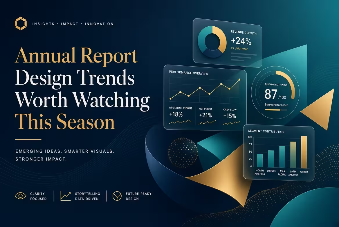
The modular grid — a hero metric in the largest cell, supporting numbers in smaller ones — has become a default way to present KPI-heavy slides this year, and it genuinely earns its place on a pitch deck or an investor update where you're choosing which three numbers matter. An annual report's financial section usually can't make that choice. Auditors expect completeness, not curation, and a modular grid built for hierarchy starts fighting the requirement to show every line item rather than the headline one.
Where the grid does earn its keep is the same place bold type does — the narrative front matter, not the statements. One hero metric, one supporting quote, two or three secondary figures: that's a strong opening spread. Past that point, the constraint isn't design taste, it's disclosure completeness, and no layout trend changes that.
The attention problem is worse than most reports assume
Here's the part that trend articles tend to skip: how little time the reader actually spends. Research on individual investors' behavior, conducted by NYU Stern finance professors Toomas Laarits and Jeffrey Wurgler and published as an NBER working paper, tracked what people actually look at before making a trade — and found the typical investor spends only a handful of minutes on research before buying, with the bulk of that time going to a price chart rather than the underlying fundamentals. Earnings, dividends, and other fundamental data barely register in that window.
That's not a reason to give up on the financial narrative section — it's a reason to stop treating the executive summary as a formality. If the reader's attention window is measured in minutes, not sessions, the first two spreads are doing almost all of the persuasive work the rest of the document is theoretically there to support. A slide-title discipline built for exactly this problem — writing the takeaway as a full sentence a reader can skim without opening the chart underneath it — translates directly to a report's section headers and pull quotes, and it's one of the few genuinely transferable habits from presentation design into report design this year.
Executive summaries are shrinking, and the full report isn't going anywhere
The instinct to compress everything into a tight, front-loaded summary is showing up in report design the same way it's showing up in pitch decks — and it's worth being precise about what that instinct is actually solving. A short summary works when the reader's job is to decide something in one sitting. It works less well when the reader's job is to investigate, which is closer to what an analyst or auditor is actually doing with the back two-thirds of an annual report. Cutting a document down to its essentials is a different exercise from cutting a persuasion deck, and conflating the two is how reports end up with a beautiful four-page summary bolted onto ninety pages that nobody redesigned.
The trend that's actually durable isn't "shorter reports." It's a genuine two-layer structure: a designed, narrative-led front section built to be read in one sitting, and a reference section built to be searched rather than read start to finish — increasingly as a tagged, navigable PDF or a lightweight interactive version rather than a flat document. That second half needs a completely different set of design decisions than the first, and most in-house teams still design it as if it's an extension of the front cover.
Sustainability visuals only work when the data backs the color palette
Earthy tones, nature photography, and biodiversity imagery have become close to a default visual language for the ESG sections of this year's reports. Used honestly, it's a reasonable shorthand — readers pattern-match a green-and-terracotta palette to a sustainability narrative almost instantly. Used to dress up a section with thin underlying data, it's exactly the kind of visual choice that invites scrutiny rather than trust, particularly from institutional readers who've grown more skeptical of ESG sections generally over the past two reporting cycles.
The safer version of this trend treats the palette as a signal that has to be earned by the numbers next to it, not a substitute for them. If a sustainability section can't support its visuals with a specific, sourced figure, the fix isn't a better color palette — it's fewer claims stated more precisely, which is a harder edit than most teams budget time for.
Consistent charting matters more than any single chart trend
Individual chart styles come and go — the specific look of a bar chart or a KPI callout will look dated in two years regardless of which one you pick this season. What doesn't date is whether every chart in a 90-page document was built to the same visual system, or whether finance, marketing, and the design team each brought their own defaults to the file. A consistent chart template library across the whole report solves a problem that no individual trend does: a reader flipping between the revenue chart on page 12 and the regional breakdown on page 40 shouldn't have to re-learn how to read a chart halfway through the document.
None of this is really about which trend to chase this reporting season. It's about deciding, section by section, whether a given piece of the report is being read in one sitting or searched under pressure — and designing those two halves as if they have different jobs, because they do.
Comments (0)