I once watched a colleague spend twenty minutes manually redrawing a org chart that a diagramming add-in could have generated in under a minute. That's usually how it goes with PowerPoint add-ins — most people either ignore them completely or install a dozen and never open half of them. Neither approach gets you very far.
Add-ins aren't magic. They won't turn a bad deck into a good one. But the right ones remove friction from parts of the workflow that genuinely waste time: sourcing images, building charts, keeping icon styles consistent, or getting live feedback from an audience. Below is a breakdown of the categories that, in my experience, actually pay off — plus a few honest notes on where they fall short.
Stock Images and Visual Assets
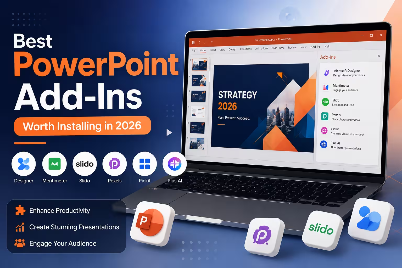
Sourcing decent visuals is still one of the biggest time sinks in deck-building, especially under deadline pressure. Add-ins built around stock libraries — Pexels, Unsplash, and Pickit are the names most people run into — let you search and insert photos without leaving PowerPoint.
The value here is speed, not curation. You're still responsible for choosing images that match your tone and audience; a stock add-in will happily hand you generic business-handshake photos if that's what you search for. One thing people overlook: licensing terms vary between these libraries, so it's worth a quick check before using images in anything client-facing or commercial.
Icon Libraries
Icons8 and similar add-ins solve a smaller but real annoyance — mismatched icon styles across a deck. Nothing signals "assembled in a hurry" faster than mixing a flat icon next to a 3D one next to a clipart-style graphic. A dedicated icon add-in keeps everything in the same visual family, which matters more than most people realize until they see a deck where it's inconsistent.
I wouldn't recommend relying on these libraries for anything highly specific to your industry — you'll often still need custom iconography for niche concepts, and that's a design task, not an add-in one.
Diagramming and Process Visualization
This is where add-ins like Lucidchart's PowerPoint integration earn their keep. Org charts, flowcharts, and process diagrams are tedious to build natively in PowerPoint's shape tools, and they're even more tedious to update when something changes upstream. A diagramming add-in lets you build the visual once in a connected tool and refresh it on the slide instead of rebuilding shapes by hand.
The trade-off is a bit of a learning curve, and for a single simple flowchart, native PowerPoint shapes are sometimes just faster. It's the recurring, complex diagrams — the ones that change every quarter — where this category earns its place.
Audience Engagement and Live Polling
Mentimeter and Poll Everywhere both integrate directly into slides, letting an audience respond via phone while you're presenting, with results appearing live on screen. For training sessions, internal town halls, or conference talks, this is one of the few add-in categories that changes what's possible in a presentation, not just what's convenient.
That said, live polling depends entirely on network conditions and audience willingness to pull out their phones. I've seen it fall completely flat in rooms with poor Wi-Fi or a distracted crowd — worth testing the setup ahead of time rather than trusting it cold in front of a room.
Data and Chart-Building Tools
For anyone regularly building financial or comparison-heavy decks, add-ins built specifically around chart construction — think-cell is the one most consultants and analysts will recognize — handle chart types and formatting that PowerPoint's native chart engine handles clumsily: waterfall charts, Gantt timelines, and Mekko charts, for example.
If your slides are mostly narrative with the occasional simple bar chart, this category is probably overkill. It earns its cost when charts are a recurring, central part of your work rather than an occasional addition.
Design Automation
PowerPoint's built-in Designer feature (available directly in Microsoft 365, not a separate add-in) suggests layout variations based on the content already on your slide. It's genuinely useful for a first pass on a plain bullet-point slide, less useful once you're working from a defined brand template, since it tends to suggest generic layouts that ignore your established style.
One thing worth noting: automated design suggestions are a starting point, not a finished product. I'd treat them the way you'd treat a rough draft — useful for breaking a blank-slide stall, not a substitute for reviewing whether the layout actually fits your content.
What Actually Matters When Choosing
Here's the pattern I'd point to after using a fair number of these over the years: the add-ins worth keeping are the ones that solve a problem you hit repeatedly, not one you hit once. If you build one org chart a year, native shapes are fine. If you build data-heavy decks every week, a dedicated charting add-in will save real hours. If you present to live audiences often, polling is worth the setup cost. If you present mostly to yourself or a small internal team, it probably isn't.
Before installing anything new, it's worth asking what specific, recurring task in your own workflow is currently the slowest. That answer tends to point directly at the right category — and away from the temptation to install everything at once.
Comments (0)