PowerPoint Chart Templates
The 1,152 PowerPoint Chart templates in this category are built as native PowerPoint objects — grouped shapes rather than embedded Excel chart objects — so they open and edit identically across PowerPoint 2016 through 365 without a linked spreadsheet dependency. Files ship in .pptx format at 16:9 widescreen, and most also unzip cleanly in Keynote and Google Slides, though gradient fills and custom bullet glyphs are the two elements most likely to substitute on import.
Editing usually means ungrouping the chart object first, since data values are represented by literal shape dimensions — bar height, pie wedge angle, line vertex position — rather than a bound data table, so there's no "Edit Data" ribbon option like a native Office chart. Text labels sit in placeholders layered above the shapes, so resizing a chart proportionally after ungrouping can misalign labels that were originally centered by eye rather than anchored to a shape edge.











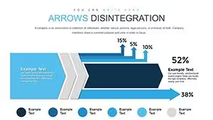


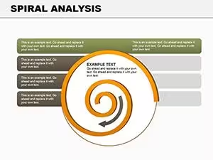


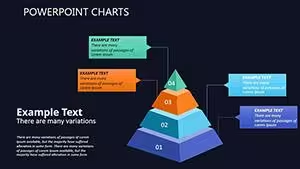
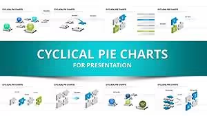
Layout Structure
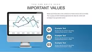
Most chart templates in this category consist of one grouped object per slide sitting on top of a mostly blank layout — the slide master here typically defines only a title placeholder and a footer, leaving the chart's grouped shapes to carry all layout logic independently rather than inheriting from placeholder styles. Data-carrying elements (bars, wedges, nodes) are separate shapes nested inside the group, while labels are typically native PowerPoint text boxes rather than text embedded inside the shapes, which is why label fonts sometimes don't match shape fill changes made through the Format Shape pane. Multi-series charts (stacked bar, grouped bar) usually nest a second layer of grouping — series group inside category group — so a single ungroup command only unlocks the outer layer and a second ungroup is needed to reach individual bars.
Editing Limitations & Formatting Behavior
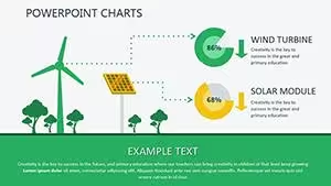
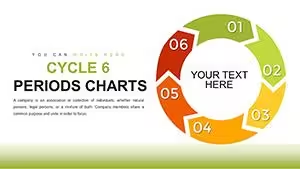
Pie and donut-style templates scale wedge angles correctly when the whole group is resized proportionally, but scaling only the width or only the height distorts the wedge geometry since PowerPoint doesn't recalculate arc math on non-uniform resize — the fix is holding Shift while dragging a corner handle. Flow and process-style charts that use connector lines between shapes will detach those connectors if a shape is moved after the group has been broken apart, because ungrouping removes the connector's binding to the shape's connection points. Exporting these templates to PDF can shift drop-shadow effects and gradient fills slightly, particularly radial gradients on sphere or 3D-style charts, since PDF rendering approximates PowerPoint's shading engine rather than reproducing it exactly. Font substitution shows up most often on templates using a non-default font pairing for chart labels — opening the file on a machine without that font installed silently swaps it for the nearest match, which can shift label widths enough to overlap adjacent wedges or bars.
Adjacent Category Comparison
PowerPoint Charts differs from PowerPoint Diagrams mainly in what the grouped object represents: Diagrams templates are structural (hierarchies, flows, matrices) built from connector-linked shapes, while Charts templates represent numeric or proportional data through shape geometry itself. PowerPoint Shapes, by contrast, is a smaller library (48 templates) of individual graphic elements meant to be dropped into an existing layout rather than used as a complete slide. Keynote Charts covers the same 12 chart types (1,106 templates) but ships as .key files with Apple's native shape rendering, which is why gradient and shadow effects that look correct in Keynote can shift when the same design is exported back to .pptx.
FAQ
Why doesn't Edit Data appear when I right-click these charts?
The chart shapes in this category are built as native PowerPoint drawing objects, not as embedded Excel chart objects, so there's no bound data table for PowerPoint to open. Each data point corresponds to a literal shape property instead — a bar's height, a wedge's sweep angle, a line's vertex coordinates — which you adjust directly on the shape rather than through a spreadsheet. This is why changing a value means resizing or repositioning individual shapes after ungrouping, not typing a new number into a table. Templates in the same category built around a genuine embedded chart object are rare and are usually labeled as such in the product title.
What happens after ungrouping a multi-series bar chart template?
Multi-series templates typically nest two levels of grouping, an outer group for the whole chart and an inner group per data series, so a single Ctrl+Shift+G only exposes the outer layer. Ungrouping once leaves the series bars still bundled together, which is useful if you only need to reposition or recolor an entire series at once. A second ungroup on the series-level group breaks it down to individual bar shapes, at which point each bar can be resized or recolored independently. Re-grouping afterward doesn't restore the original two-tier structure — PowerPoint flattens everything into a single new group instead.
Do the pie and radar chart templates keep proportions when opened in Google Slides?
Pie and radar chart shapes generally import into Google Slides with their wedge angles and axis lines intact, since both use standard vector shape geometry that Google's PPTX parser handles reliably. Gradient fills are the most likely element to change, since Google Slides supports a narrower gradient model than PowerPoint and tends to flatten multi-stop gradients to two stops on import. Custom bullet glyphs used in accompanying label text can also revert to a default bullet style. For charts relying on drop shadows for depth (common in 3D-style pie variants), the shadow angle and blur radius sometimes shift slightly, which is worth checking before presenting directly from Slides.
Why do connector lines in flow-style charts detach after I move a shape?
Connector lines in this category are bound to specific connection points on each shape while the chart is still grouped, and that binding is what keeps the line attached when a shape is dragged. Breaking the group to edit individual shapes removes that binding, since PowerPoint's connector system tracks connection points at the group level for compound objects like these. Once detached, moving a shape leaves the connector line in its original position rather than following the shape. Reconnecting requires manually dragging each connector endpoint back onto the shape's connection point, which is easiest to do before ungrouping if only colors or text need to change.