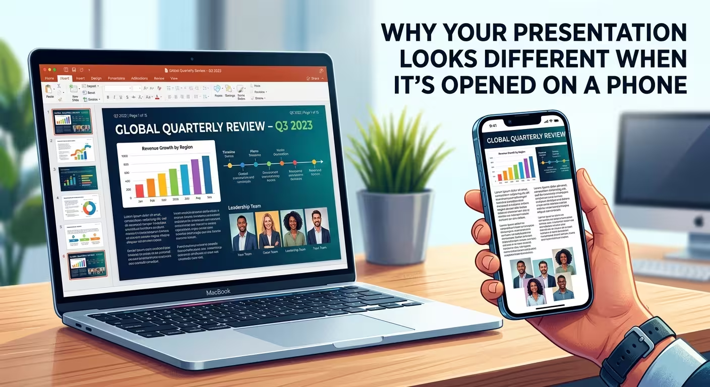
Three days is a long time to spend on a deck that gets judged in the first four seconds someone looks at it. So when your boss opens the file on their phone during a commute or a coffee run and every text box has slid half off its shape, it doesn't feel like a technical glitch — it feels personal. It isn't. And it's also not something "designing better" would have prevented, because the problem usually isn't happening on your screen at all. It's happening on theirs, in a piece of software you never opened.
The file your boss saw probably wasn't PowerPoint or Keynote
Here's the part that gets skipped in almost every "presentation design tips" article: when someone taps a .pptx or .key file on a phone — in Mail, Slack, WhatsApp, or a Files app — the phone frequently doesn't launch the full presentation software to render it. On iPhone, Apple's own Quick Look framework documentation lists Microsoft Office documents and iWork files among the formats it can preview, using its own lightweight generator rather than the actual PowerPoint or Keynote rendering engine. That generator draws a fast approximation of your slide — text, shapes, basic layout — and quietly drops or reinterprets anything more complex: embedded fonts, precise line spacing, layered objects, animations.
So the deck your boss "opened" wasn't rejected by PowerPoint. It was drawn by a preview tool built for speed, not fidelity, and that tool has never seen your custom template before. The same failure shape shows up with a tired conference-room projector — the content doesn't change, but the thing rendering it has different capabilities than what you designed on, and nobody warns you which corners it's going to cut.
Why the text specifically is what falls apart
Text boxes are the most fragile object on any slide because most of them are quietly doing math in the background. Microsoft's own support documentation for AutoFit confirms that by default, a placeholder is set to Resize shape to fit text or Shrink text on overflow — meaning the box you built at a certain size isn't fixed, it's a formula that recalculates based on the font actually available in the moment it's rendered. Swap the renderer, and you swap the inputs to that formula.
Font substitution makes this worse in a way most people never notice, because the software doesn't warn you it's happening. PowerPoint-specialist troubleshooting threads and Microsoft's own community forums describe the same pattern repeatedly: if the exact font isn't available to whatever's opening the file, the software silently substitutes a similar one and reports the original font's name anyway — so nothing in the interface tells you a swap occurred. A substituted font with even slightly different character widths is enough to push a headline two lines instead of one, which cascades into every box below it moving to compensate.
This is exactly why shrinking text to make it fit is the wrong reflex in the first place — a box that's already running close to its limit on your machine has zero margin left once a phone's preview renderer does its own substitution math on top of it.
Aspect ratio isn't the problem people assume it is
It's tempting to blame the phone's portrait screen directly — surely a 16:9 slide just doesn't fit a tall, narrow display. In practice this is rarely what breaks a deck, because both Quick Look and Office's mobile viewers scale the entire slide down as one image-like unit rather than reflowing it, the same way a photo scales down without cropping. The slide gets smaller, not distorted. What actually breaks is internal spacing that was already tight before scaling — a caption sitting 2px above a chart's edge on your laptop has no room left once the whole slide shrinks and any element inside it recalculates independently.
The check that takes less time than reopening the file
None of this means testing on an actual phone before every send — that's not realistic on a deadline. What is realistic: export a PDF version alongside the native file before sending anything that matters. A PDF freezes every text box, font substitution decision, and spacing choice exactly as it existed at export time — there's no recalculation left for a preview renderer to get wrong, because there's no live text left to reflow. If you're sending to someone likely to open on mobile — which, for anything landing in an inbox or a chat thread rather than a scheduled meeting invite, is close to a coin flip — the PDF is the version that actually reaches them looking the way you built it.
Second check, cheaper than it sounds: open the file on your own phone once before it goes out, even briefly. You're not testing for perfection — you're testing for the specific failure mode of a headline wrapping to a second line or an image overlapping a caption, which is visible in about three seconds and tells you whether the deck needs a PDF fallback or not.
Where three days of work should have gone instead
The frustrating part of this whole failure mode is that none of it was a design mistake. The palette was fine, the hierarchy was fine, the content was fine — three days went into decisions a phone's preview renderer was never going to evaluate on those terms. That's the actual argument for starting a deck from a structure that's already been stress-tested across renderers and devices rather than building every text box's spacing tolerance from scratch under deadline pressure — most of the hours in a presentation project go into exactly this kind of invisible formatting work, not the parts anyone remembers doing.
Next deck, before it leaves your outbox: export the PDF, glance at it on your own phone for three seconds, and send both files. The design work you already did was fine. Just make sure the version that reaches your boss's thumb is the one you actually built.
Comments (0)