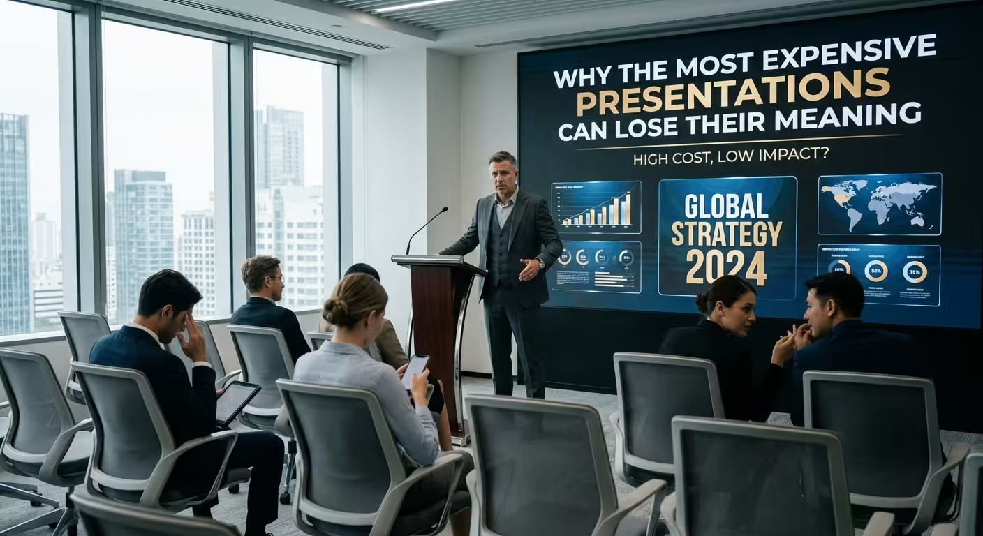
Picture a mid-size company that pays an agency five figures for a rebrand pitch deck — motion transitions between sections, custom iconography, a cinematic case-study reel. Three days after the pitch, half the room can describe how the deck looked and can't quite recall what it was actually asking them to approve. This is a hypothetical scenario, but it's a familiar one to anyone who's sat through a deck that clearly cost more than the meeting it was shown in — and it points at something that has nothing to do with taste. Money doesn't automatically buy clarity. Past a certain point, it can spend directly against it.
Money Buys More Elements, Not More Argument
Here's the mechanical reason this keeps happening: production budget and argument quality aren't the same purchase. An agency retainer typically buys assets — custom illustration, animated transitions, a video interlude, a bespoke icon set — because assets are what's billable and demonstrable in a proposal. Nobody signs off a five-figure invoice for "we thought harder about which three numbers actually matter." The work that makes a deck's point land is editorial, and it's largely invisible in a pitch for services. So budget flows toward what can be shown and priced, and the deck ends up with more of everything except the one thing that was supposed to improve.
What the Research Says Is Actually Happening in the Room
This isn't just a hunch about attention spans. A multi-level meta-analysis published in Educational Psychology Review, pooling roughly 177 effect sizes across 50 studies, examined what researchers call "seductive details" — interesting but tangential elements added to learning material — and found a small but statistically reliable drop in comprehension when they were present, with the effect showing up specifically in how well people understood and retained the core content, not just in how long they took to get through it. The researchers traced the mechanism to extraneous cognitive load: attention spent processing the interesting-but-irrelevant thing is attention that isn't available for the thing that mattered.
A slide deck isn't a classroom, but the mechanism doesn't care what room it's in. Custom illustration on a slide that didn't need one, a motion transition that adds nothing but flourish, a cinematic case-study reel sitting between two slides making a financial argument — these are seductive details with a bigger budget behind them. They weren't added to obscure the point. They were added because someone had money to spend on production, and production tends to spend itself on things that look impressive rather than things that clarify.
The Part That Makes This Harder to Catch
There's a second layer working against the person reviewing the deck before it ships, and it's the opposite problem from a badly designed one. Polish tends to read as competence — psychologists sometimes describe this under the umbrella of processing fluency, the tendency for things that are easy and pleasant to look at to also feel more credible. A deck that looks expensive gets less scrutiny in the review meeting, not more, because everyone in the room assumes that if it looks this finished, someone already checked the logic. I wouldn't trust that assumption on any deck I've reviewed — the smoothness of a transition has never once told me whether the argument underneath it holds up, and it's exactly the decks that look most "done" that get the least pushback before they go out the door.
The Slide Nobody Wants to Cut Once It's Been Paid For
Budget introduces a specific version of the bloat problem that a free or cheap deck doesn't have: sunk cost. On an internal deck built in an afternoon, cutting a slide costs nothing. On a deck where the client paid for the full animation package, cutting the animated slide feels like throwing away money that was already spent — so it stays, whether or not it's carrying its weight. [The same instinct that keeps a logo wall or a "Thank You / Questions?" slide alive in an ordinary corporate deck](https://imaginelayout.com/blog/10-things-to-remove-from-corporate-presentations) gets reinforced when the thing being kept has a line item attached to it. Nobody wants to be the person in the room who says the expensive part didn't work.
"Looks Expensive" and "Cost More" Aren't the Same Claim
This is where the instinct behind big-budget decks quietly misreads its own goal. The visual signals that actually read as premium — generous white space, one restrained color decision, a hierarchy that's obvious at a glance — are usually cheaper to produce than the ones being paid for. [Restraint is doing the expensive-looking work that a full brand palette and a motion package are being hired to do](https://imaginelayout.com/blog/why-black-and-white-presentation-design-looks-expensive), and restraint doesn't require an agency retainer to execute. Spending more money to add more elements is optimizing for the wrong variable entirely if the actual goal was "this should look considered."
Deciding Where the Extra Budget Should Actually Go
None of this means production budget is wasted by definition — it means it needs a better target than "more of everything." [Whether a deck's job is to get a fast yes or to survive careful, slower scrutiny changes what's actually worth investing in](https://imaginelayout.com/blog/does-minimalism-make-a-presentation-better): a fast-decision deck benefits from spending on the one visual that makes the key number impossible to miss, while a diligence-style deck benefits from spending on structural clarity across dozens of slides, not a hero animation on slide one. Starting from a template that already has a working hierarchy built in — rather than a blank canvas an agency fills with billable assets — tends to redirect that spend toward the argument itself, because the visual scaffolding isn't a decision that has to be paid for from scratch.
Go back to that company with the five-figure rebrand deck. The problem was never that they spent too much. It's that none of the spending was aimed at the thing the room actually needed to walk away remembering — and that's a briefing decision, not a production one, made well before anyone opens a design file.
Comments (0)