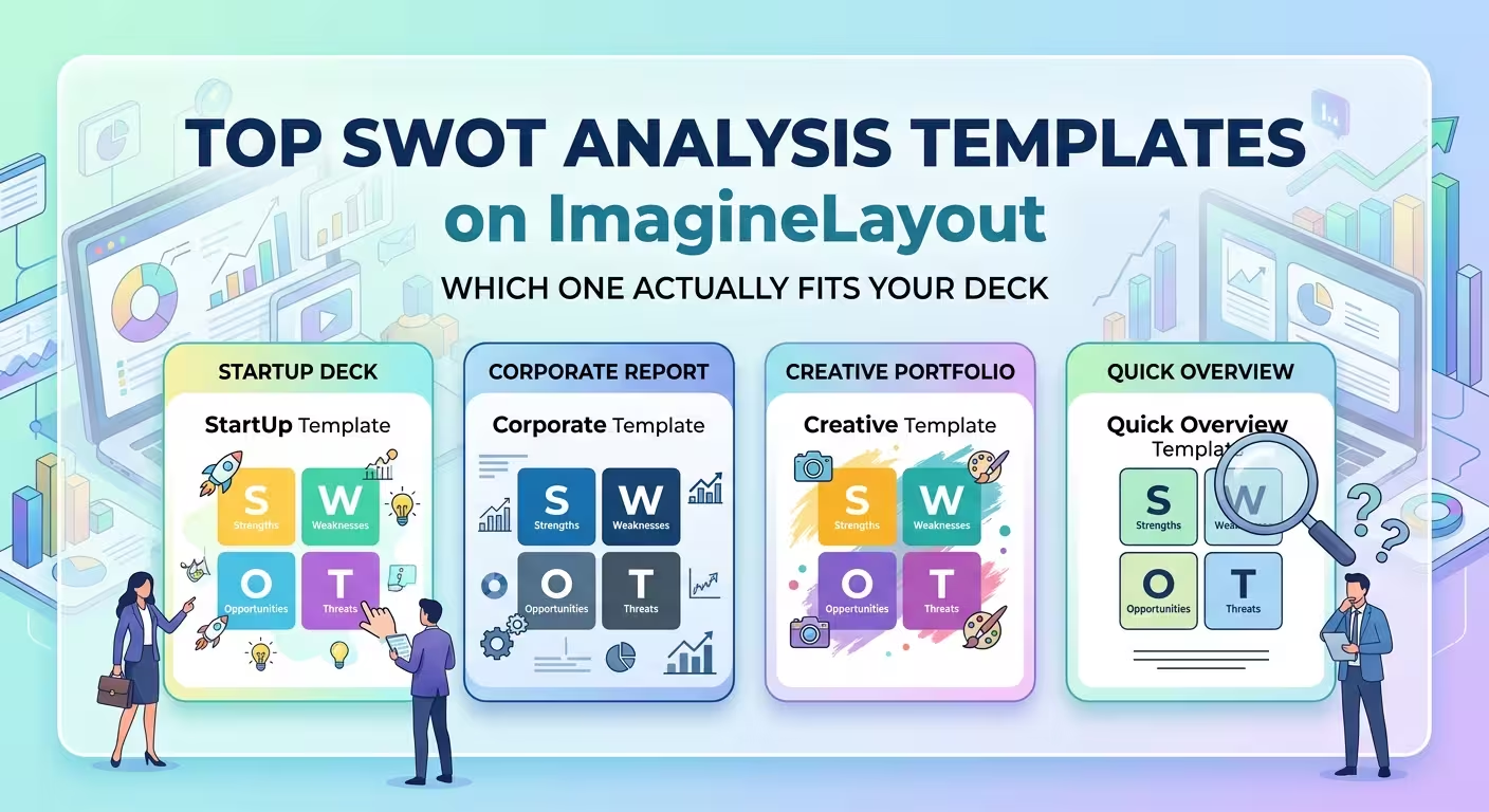
Most SWOT slides still look like they did in 1965 - four boxes, four labels, done in five minutes before the meeting. That's not necessarily wrong. But it means the template choice rarely gets any thought, even though the format you pick changes what the audience actually does with the information afterward. If you're building a strategy deck this week and typing "SWOT analysis templates" into a search bar, you're probably past the "what is SWOT" stage and just need to know which layout won't fight you once you start filling it in.
ImagineLayout currently sells three PowerPoint chart templates built specifically around the SWOT framework, and they're not interchangeable skins on the same grid - they're built for different rooms. One is a 17-slide cube designed to reveal information gradually. One is a 29-slide box format meant for teams that need to break each quadrant into sub-factors. One is a 49-slide set with matrix and relationship variations for people who run SWOT sessions repeatedly. Here's how to tell which one you actually need before you buy the wrong one.
Why the four-box grid isn't always the right starting point
A 2023 State of SWOT survey by Competitive Intelligence Alliance found that a large share of respondents - roughly 45% - had run at least one SWOT analysis within the two months before taking the survey, which tells you this isn't a once-a-year ritual for most teams that use it. That frequency matters for template choice: if you're rebuilding a SWOT deck every quarter, a flashy one-off cube slide stops paying for itself after the second use, while a template built for repeat use with swappable matrix variants starts to make more sense.
In my experience, the mistake isn't picking an ugly template - it's picking a format that matches the wrong stage of the process. A single polished quadrant slide is great for the meeting where a decision gets made. It's a poor fit for the working session where the decision gets built, because there's nowhere to put the messy intermediate thinking.
The cube format: built for the reveal, not the reference document
The SWOT Analysis Cube template uses a 3D-style cube where each face maps to a quadrant, spread across 17 slides that let you build the cube piece by piece. It works well when you're pitching - an investor meeting, a board update, a classroom case study - because the spatial reveal gives you natural pauses to explain each quadrant instead of dumping all four at once.
The trade-off shows up after the meeting ends. If someone asks you to email the SWOT slide as a standalone reference, a cube built for progressive reveal doesn't compress well into one static image - you lose the thing that made it effective live. Use this one when you're presenting in the room, not when the deliverable is a PDF someone will scroll through alone at their desk next week.
The box format: when one quadrant needs more than four bullet points
The SWOT Analysis Box template runs 29 slides and is built around box-style layouts designed to hold sub-factors under each quadrant rather than a single summary line. Even though it's positioned for architecture firms, the underlying structure - more granular boxes per quadrant - suits any team where "weaknesses" isn't one bullet but a cluster of related issues that need their own space.
This is the one to open for a half-day strategy workshop where the SWOT gets built live with a group, not presented after the fact. The trade-off is length: 29 slides in a 15-minute update slot will bury your actual point. If your meeting is short, this format works against you regardless of how well it's designed.
The full chart set: for teams that run this more than once
The SWOT Analysis PowerPoint Charts template is the largest of the three at 49 slides, and it's less "one deck" and more "one library" - core 2x2 matrices, relationship mappings between quadrants, and hybrid layouts for weighted SWOTs where some factors carry more strategic weight than others. That variety is the actual reason to pick this over the other two: it's not that any single slide in it is better, it's that you're not locked into one visual metaphor for every future SWOT you run.
The catch is the learning curve. With three layout families instead of one, it takes longer to find "your" default slide the first time you open it. If you only need to build one SWOT this month, the cube or the box template will get you there faster.
Matching the template to the meeting, not the other way around
The pattern across all three: the format isn't about which one looks more modern, it's about whether the deck's job is to be presented once, worked through live with a group, or reused across a series of reviews. A cube you can't screenshot cleanly is a liability in an async report. A 29-slide box deck is a liability in a five-minute standup. Neither is a flaw in the template - it's a mismatch with how it got used.
Before you open any of these, it's worth answering one question first: after this meeting, does anyone need to reread the SWOT slide without you in the room to explain it? If yes, favor the format that survives as a static page. If no, favor the one built for the live reveal.
Comments (0)