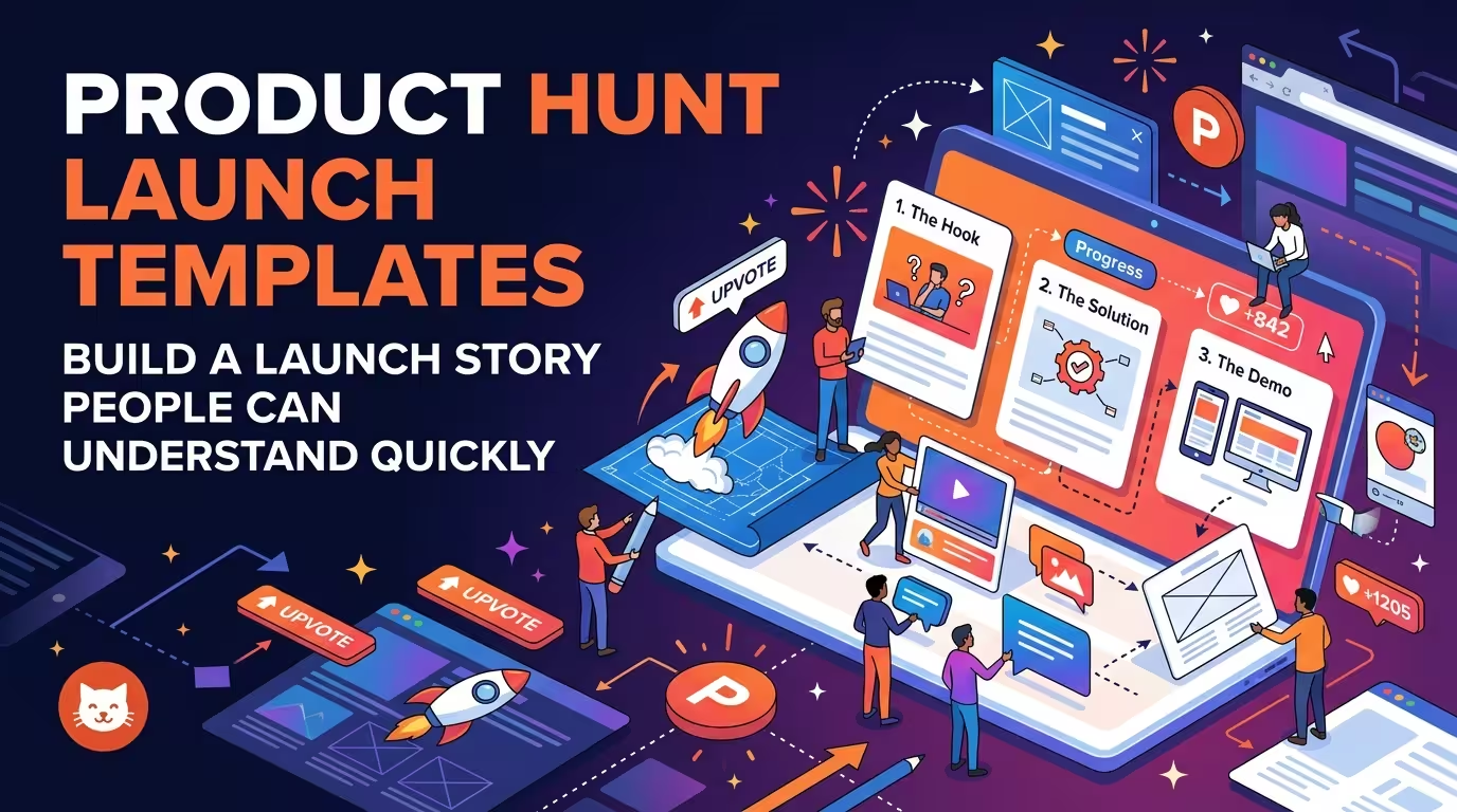
A Product Hunt launch can contain plenty of information and still leave a visitor unsure what the product actually does. The problem is rarely a lack of screenshots, features, or polished graphics. More often, the pieces arrive in the wrong order. Product Hunt launch templates are most useful when they help organize the product story before they organize the visuals.
This matters because Product Hunt visitors are not approaching a launch like someone reading a full product brief. Product Hunt describes its community as a mix of makers, early adopters, product people, entrepreneurs, investors, and technology enthusiasts, so the launch has to communicate quickly to people who may know nothing about the product beforehand.
The first slide has one job: make the product legible
When I review a launch presentation, the first question I ask is not whether the opening slide looks impressive. It is whether someone can explain the product after seeing it for a few seconds.
A common mistake is opening with a brand statement, a large product screenshot, and several small feature labels. Everything is technically present, but the viewer has to assemble the meaning themselves.
A stronger opening establishes three things in a simple relationship:
- What the product is.
- Who it is for.
- What problem or job it helps with.
The third point does not need to become a long problem statement. In many launches, one concrete situation is more useful than a paragraph of positioning language.
For example, a hypothetical productivity app might open with “Turn scattered meeting notes into assigned tasks” rather than “The future of intelligent productivity.” The first statement gives the viewer something they can picture. The second asks them to interpret a promise.
Don't turn the launch deck into a product manual
Product teams naturally want to show everything they have built. That instinct creates one of the hardest problems in launch presentations: the deck becomes a catalogue of capabilities instead of an explanation of value.
A launch story usually becomes easier to follow when features are introduced only after the viewer understands the problem they solve.
Think of the sequence as:
- Situation or friction
- Product response
- Important capability
- Visible result
- Reason to try it
The important detail is the word important. You do not need a slide for every feature. If five features all support the same outcome, showing all five with equal visual weight can make the product feel more complicated than it is.
One useful test is to hide the feature labels and look only at the screenshots. If the sequence still communicates what changes for the user, the story is probably doing real work. If the screenshots become meaningless without six captions, the deck is relying too heavily on annotation.
Use screenshots as evidence, not decoration
A large interface screenshot can look convincing while explaining almost nothing.
This happens when the entire application is shown at once: navigation, settings, secondary controls, empty states, account information, and the feature that actually matters. The viewer sees the product, but not the product's point.
Instead, crop screenshots around the action or result that supports the current part of the story.
For a hypothetical analytics product, one slide might show the initial dashboard, while the next isolates the moment where a user identifies an unexpected change. The second screenshot is not simply another product image. It is evidence for the claim made by the slide.
This is where a good PowerPoint template library can save time. The useful part is not the decorative theme. It is having established layouts for image-and-text relationships, comparisons, process sequences, and focused callouts, so the designer can spend more time deciding what deserves to be shown.
Build the story around decisions, not features
There is a subtle difference between explaining a product and explaining why someone should care about it.
Feature-led structure sounds like this:
- AI assistant
- Automated reports
- Team dashboard
- Integrations
A decision-led structure asks different questions:
- What problem brought the user here?
- What does the product change?
- What does the user see after using it?
- What makes the approach different from the obvious alternative?
- What should the visitor do next?
The distinction becomes particularly important when a product has many capabilities. A feature list makes the viewer remember individual functions. A sequence of decisions helps them understand whether the product is relevant to them.
Product Hunt's own launch preparation guidance emphasizes telling a compelling product story and showing what the product looks and feels like through a demo. That is a useful distinction: the interface is part of the story, but it should not become the story by itself.
Make the middle of the presentation do the convincing
The opening tells people what they are looking at. The middle should answer the questions that naturally appear next.
For most product launches, those questions are practical:
- How does it work?
- What does the experience look like?
- What is different about it?
- Where does it fit into an existing workflow?
This is where launch presentations often become visually repetitive. Slide after slide uses the same large screenshot with a headline above it. The information changes, but the visual grammar does not.
Instead, change the layout when the type of evidence changes.
Use a focused interface view when demonstrating an interaction. Use a comparison when explaining a difference. Use a process when the product involves several steps. Use a single large result when the outcome matters more than the mechanism.
ImagineLayout's broader presentation template collection includes different presentation formats rather than forcing every message into one slide structure. That variety is useful here because a product story naturally contains different kinds of evidence.
The final slide should remove friction, not repeat the pitch
By the end of the story, repeating the product name and slogan rarely adds much.
The better question is: what does the interested visitor need to do now?
If the next step is trying the product, make that action visually obvious. If the product requires signing up, testing a demo, joining a waitlist, or visiting a landing page, the final slide should support that specific action rather than introducing another feature.
This also prevents an easy mistake: ending the presentation at the moment when the viewer finally understands the product. Understanding is not the same as knowing what to do next.
Product Hunt's official guidance also treats the launch as more than a single piece of promotional material: makers prepare product information, demos, makers, shoutouts, pricing, and other launch content around the submission. A presentation should therefore fit into the wider launch system rather than trying to carry every message by itself.
What a Product Hunt launch template should actually give you
A useful template is not simply a collection of attractive slides with a startup aesthetic. For this type of launch, the most valuable layouts are the ones that reduce the mechanical work between an idea and a readable story.
Look for layouts that can handle:
- A concise product introduction
- Problem-to-solution relationships
- Large product screenshots with focused annotations
- Feature comparisons without giving every feature equal weight
- Step-by-step product flows
- Before-and-after states
- Key outcomes or proof points
- A clear final call to action
That is also why I would not start by choosing a template based on its cover slide. Start with the hardest slide in your story — usually the one where you need to explain a complicated workflow or product difference. If the template can handle that slide without excessive editing, the rest of the deck is much easier to build.
For broader presentation work, presentation design tutorials and articles can also help when the problem shifts from finding a layout to deciding how information should be structured.
The strongest Product Hunt launch presentation is rarely the one with the most slides or the most elaborate visual effects. It is the one where each visual answers the question the viewer is most likely to have at that exact moment. A template can make that process faster, but it cannot decide the story for you. Start with the sequence of understanding — what it is, why it matters, how it works, and what to do next — and let the visual system support that sequence.
Comments (0)