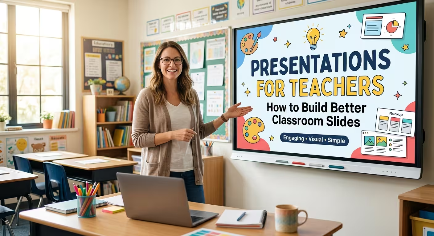
A classroom presentation can be technically perfect and still make a lesson harder to teach. The problem is usually not the colors, fonts, or animations. It is that the slides were designed to be looked at rather than used as part of a lesson.
Good presentations for teachers have a different job. They help the teacher explain an idea, control the pace of the lesson, direct attention, introduce an activity, and bring students back to the main point. Once you design around those jobs, the presentation becomes much easier to build — and much easier to teach from.
A Teacher Presentation Is Not a Lesson Plan on a Screen
A lesson plan answers a teacher's question: What am I going to teach and in what order? A presentation answers a different question: What should students see at this exact moment?
That distinction matters more than it first appears.
A teacher may have a complete explanation in their notes, but students do not need every sentence projected onto the screen. Conversely, an activity instruction that seems obvious in the teacher's notes may need to be highly visible because students have to act on it without repeatedly asking what to do.
When building a presentation for a lesson, I find it useful to divide slides into several functional roles:
- Orientation: what are we learning and why does it matter?
- Explanation: what concept, process, example, or evidence should students understand?
- Attention: what should students examine, compare, predict, or notice?
- Activity: what should students do next?
- Check: how will the class test whether the idea has been understood?
- Return: what should students remember before moving on?
Not every lesson needs all six. The useful part is recognizing that a slide explaining a concept should not look or behave like a slide giving instructions for group work.
Start With the Moment in the Lesson, Not the Template
Imagine a teacher preparing a 40-minute science lesson. The first instinct might be to choose an attractive education template and start replacing the sample text.
That reverses the process.
Before choosing layouts, identify the moments where students actually need something on screen. For example:
- the opening question that starts the lesson;
- a diagram that explains a process better than spoken words;
- a short example students need to inspect;
- instructions for a five-minute activity;
- a comparison students need to discuss;
- a final prompt that checks what they understood.
Everything else can remain in the teacher's notes or be explained verbally.
This approach also prevents a common problem with classroom decks: producing 30 slides for a lesson simply because the template contains 30 attractive layouts. Slide count is not a teaching objective. If one diagram can support a three-minute explanation, there is little value in splitting it into four decorative slides.
For teachers who need a starting structure, an education-focused template can be useful precisely because the visual work has already been organized. For example, the Engaging Lesson Plans PowerPoint Template is built around lesson-planning and educational presentation use rather than a generic corporate sequence.
The Most Important Slide May Be the One Students Act On
Teachers often spend the most design effort on explanation slides. But classroom presentations have another category that deserves equal attention: action slides.
Consider the difference between these two instructions:
Weak: “Discuss the causes of the Industrial Revolution with your partner.”
More useful: “With your partner, choose the two causes you think had the greatest impact. Be ready to defend your choice.”
The second version gives students a decision to make. The slide is no longer just displaying information; it is controlling the next classroom action.
This is where presentation design for teachers differs from many professional presentation formats. In a business meeting, the audience usually follows the speaker's narrative. In a classroom, the audience may need to stop listening and start doing something.
For activity slides, make the task itself visually dominant. Put supporting information around the action rather than giving every sentence equal emphasis.
A useful test is simple: if the teacher stopped speaking for 20 seconds, would students still know what they are supposed to do?
Use Diagrams When the Relationship Matters More Than the Definition
A paragraph can define a concept. A diagram can show how its parts relate.
That difference makes diagrams particularly useful in presentations for teachers.
For example, a history teacher explaining a sequence of events may need a timeline. A science teacher may need a process diagram. A mathematics teacher may need a visual relationship between quantities. A literature teacher may need a comparison structure rather than another paragraph of analysis.
The important question is not “Can I turn this text into an infographic?” It is “Is the relationship between these elements something students need to see?”
If the answer is yes, a visual structure can carry part of the explanation that would otherwise have to be spoken or written.
ImagineLayout's Education Keynote Diagrams Template for Teachers and Students is one example of a resource built around educational diagrams rather than only conventional title-and-content slides.
There is also a practical limit. A diagram should not become a puzzle that students have to decode before they can understand the lesson. If the teacher has to spend more time explaining how to read the graphic than explaining the underlying concept, the visual has stopped doing its job.
Subject-Specific Presentations Need Different Visual Logic
There is no single “teacher presentation style” that works equally well for every subject.
A mathematics lesson often depends on sequences, formulas, worked examples, and comparisons. A history lesson may depend on chronology, maps, causes, consequences, and evidence. A language lesson may need examples, vocabulary, exercises, and progressive correction.
That means the strongest template is not necessarily the one that looks most educational. It is the one that already contains structures close to the way the subject is taught.
For mathematics, for instance, a subject-specific resource such as the Math Lessons Keynote Template for Teachers can provide a more appropriate starting point than a generic classroom theme because the visual language is closer to the actual material being presented.
The same principle works in the opposite direction: a highly specific template can become restrictive when a teacher needs to cover an unusual topic. In that case, a more neutral education template may be easier to adapt.
Design Slides for the Classroom Distance
A slide that looks excellent on a laptop can fail when projected at the back of a classroom.
The issue is not simply font size. Students may be looking at the board from different distances, while the teacher is simultaneously speaking, moving around the room, pointing to parts of the screen, or asking questions.
This changes how much information a slide can realistically carry.
One practical test is to remove the teacher's voice from the scenario. Look at the slide and ask:
- What should students notice first?
- Can they identify the task without reading the entire slide?
- Is the important example visually distinct from supporting material?
- Would the slide still make sense if students looked away for 20 seconds and then looked back?
The last question is particularly useful. Classroom slides are rarely viewed continuously. Students look at the teacher, their notes, classmates, a worksheet, or an experiment and then return to the screen.
A good slide therefore needs to remain legible as an anchor, not demand uninterrupted reading.
Do Not Animate the Lesson Just Because You Can
Animation can be useful when it controls the order in which information appears. It becomes distracting when every object has its own entrance effect.
Consider a diagram explaining a four-stage process. Revealing the stages one at a time may help the teacher explain the process without students reading ahead. That is a functional use of animation.
Animating a decorative icon because the software makes it easy adds nothing to the teaching sequence.
The same principle applies to transitions. If the transition helps students understand that the lesson has moved from explanation to activity, it has a reason to exist. If it merely makes the presentation feel more dynamic, it is probably competing with the lesson rather than supporting it.
Build a Reusable Teaching System Instead of Starting From Zero
The real time saving for teachers does not come from making one presentation faster. It comes from creating a small collection of structures that can be reused across lessons.
A practical personal library might contain:
- an opening question slide;
- a learning-objective slide;
- a concept explanation layout;
- a comparison layout;
- a process or timeline;
- an example-and-analysis slide;
- an activity instruction slide;
- a discussion prompt;
- a knowledge-check slide;
- a final recap.
Once these structures exist, a new lesson becomes a content problem rather than a design problem.
This is also where presentation templates become genuinely useful. A teacher should not have to solve typography, alignment, diagram construction, and slide composition every time a new lesson is prepared. A reusable template can take those repetitive decisions out of the process while leaving the teacher in control of the actual content.
The Study Program PowerPoint Template for Educators is another example of a presentation resource that can be adapted for academic and teaching contexts when the lesson requires a more structured educational format.
The Best Classroom Presentation Leaves Room for the Teacher
There is a final trap that is easy to miss: designing a presentation so completely that the teacher has nothing left to do except advance the slides.
That is not necessarily a better lesson.
The teacher's explanation, questions, reactions to students, demonstrations, corrections, and changes of pace are not flaws in the presentation. They are part of the teaching process.
The presentation should support those moments rather than attempt to replace them.
That is why I would not recommend building every lesson as a perfectly scripted sequence of polished slides. Some slides should be deliberately simple because the important information is going to come from the teacher. Others should carry more visual weight because students need to inspect something independently.
The strongest presentations for teachers are therefore not the ones with the most elaborate design. They are the ones where every visible element has a reason to be there at that particular moment in the lesson.
Before finishing a classroom deck, take each slide out of presentation mode and ask one question: “What does this slide allow me to do as a teacher that I could not do as clearly without it?”
If the answer is obvious, keep the slide. If the answer is only “it looks nice,” the slide probably needs another job.
Comments (0)