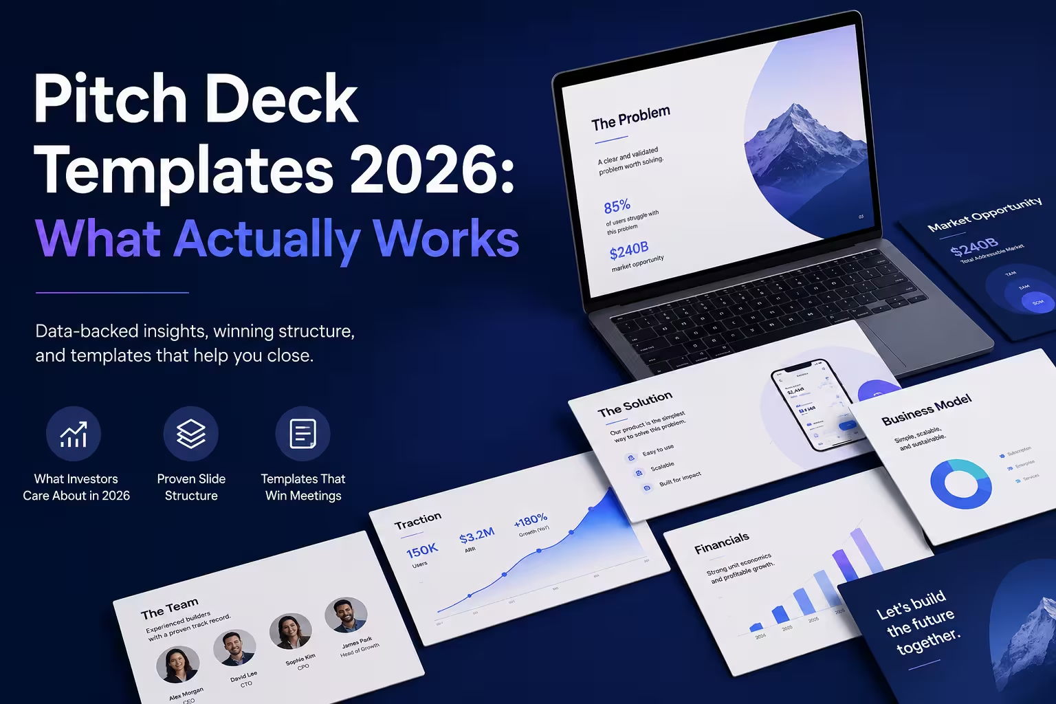
I've rebuilt more pitch decks than I can count, and almost every founder starts the conversation the same way: "Can you send me a template?" I usually push back a little before answering, because a template without context is just a set of empty boxes. The decks that actually raise money aren't the ones with the prettiest layout — they're the ones where the structure disappears and the story takes over.
That said, templates are a reasonable starting point, especially in 2026, when investors skim decks faster than ever and design quality is treated as a signal of how seriously a founder takes the business. So let's talk about what a good 2026-style template looks like, and what we can still learn from a handful of famous, publicly available decks.
Why the Template Question Matters More Now
A few years ago, a cluttered deck with ten fonts wasn't ideal, but it wasn't disqualifying either. That's changed. Investors now see hundreds of decks a month, many pre-filtered through data rooms and AI-assisted screening tools before a human even opens the file. In that environment, a clean, scannable structure isn't cosmetic — it's what gets you to slide three instead of the trash folder.
One thing people overlook: a template's job isn't to make the deck look impressive. It's to make the reasoning easy to follow at a glance, even if someone only spends 30 seconds on each slide.
What Separates a Template From a Real Deck
A template gives you slide order and visual hierarchy. It does not give you:
- A sharp, specific problem statement
- Believable, sourced numbers
- A narrative arc that builds tension and resolves it
- Proof points that are actually yours
I wouldn't recommend filling a template top to bottom before you've written the story in plain text first — a Google Doc, even bullet points on paper. Design should follow narrative, not the other way around. Founders who start with the visual template often end up rearranging slides for hours because the story doesn't actually flow in that order.
What We Can Still Learn From Famous Public Decks
A handful of early-stage pitch decks became public over the years — largely because journalists or the founders themselves shared them later, once the companies were already successful. It's worth being honest here: these are old artifacts from a different funding climate, and copying their exact slide count or wording won't replicate their outcome. But the structural instincts still hold up.
Airbnb's early seed deck is probably the most cited example in startup circles. It's frequently referenced for its restraint — a small number of slides, a simple problem/solution framing, and minimal text per page. What made it work wasn't polish; it was clarity about a genuinely odd idea (strangers renting out air mattresses in their apartments) explained in a way that didn't require the reader to squint.
Uber's early deck is another one that circulated publicly and is often discussed for how directly it tied the business model to a simple unit-economics story, rather than burying the mechanics in later appendix slides.
Buffer's deck, shared publicly by its founder as a transparency exercise, is a useful counterexample — less about explosive growth claims and more about founder credibility and a clear, modest ask.
I bring these up not because 2026 founders should imitate their layouts slide-for-slide (some of these decks are over a decade old and reflect funding norms that no longer apply), but because the underlying discipline — say less, prove more, don't hide the business model — hasn't gone out of style.
What's Actually Shifting in 2026 Deck Design
A few practical trends I've noticed working with founders and design teams recently:
- Shorter decks, denser appendices. The core narrative deck is shrinking, while a much longer backup section handles due-diligence questions. Nobody wants to sit through twenty slides live, but everyone wants the option to dig in later.
- Data visualization over data volume. One clear chart beats three tables. Investors increasingly expect a single visual to carry the weight of a paragraph of numbers.
- Dark, high-contrast themes have become more common outside of extremely conservative sectors, partly because most decks are now viewed on laptop or tablet screens rather than printed.
- AI-generated first drafts, human-edited final decks. More founders are using AI tools to get a rough structure fast, then spending their real time on the narrative and the numbers — which, honestly, is the right allocation of effort.
Common Mistakes I Still See
Even with better templates available, the same problems keep showing up: too much text per slide, a "team" slide that reads like a LinkedIn dump instead of a case for why this specific group can execute, and a market-size slide built on a huge top-down number that has no clear path back to the actual go-to-market plan. None of these are template problems. They're narrative problems that a nice template can accidentally disguise for the first thirty seconds — until an investor starts asking questions.
A Practical Structure Worth Starting From
If you want a starting skeleton rather than a rigid formula: problem, solution, why now, market size (bottom-up, not just top-down), product, business model, traction, competition, team, ask. Ten to twelve slides for the core story, with everything else pushed to an appendix. It's not original — it's close to what most of the decks above eventually converge on — but it's a reasonable frame to build from before you customize it to your own story.
If you're picking a template for 2026, don't judge it by how it looks in a stock preview. Load it up with your actual numbers and your actual weaknesses, and see if it still makes sense on slide four. That's the real test.
Comments (0)