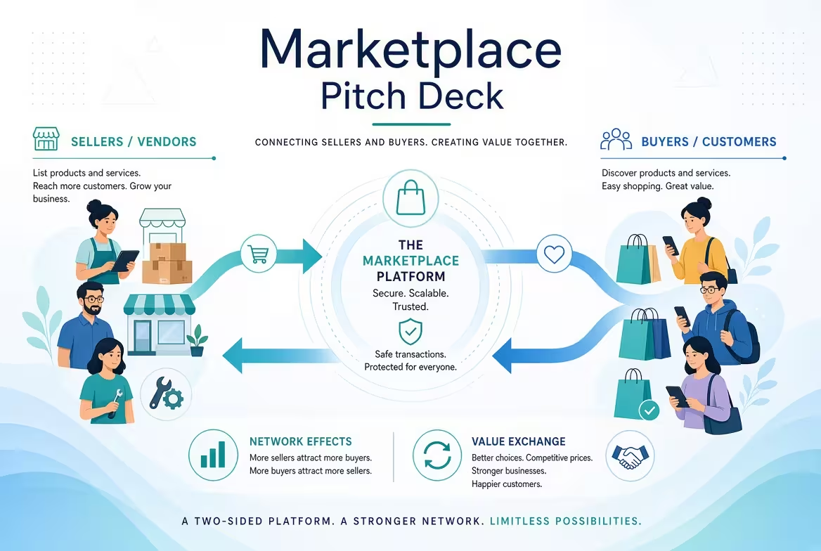
A founder pitching a two-sided marketplace usually opens with the same slide: a big circle labeled "buyers," a big circle labeled "sellers," and an arrow connecting them. Investors have seen that circle at least forty times this quarter. It's not wrong — it's just not information. The chicken-and-egg problem is real, but a diagram that only names it doesn't tell an investor whether you've actually solved it, or whether you're hoping the deck's confidence will substitute for a plan.
That gap — between naming the problem and showing you've engineered around it — is where most marketplace decks lose the room. It's also where a handful of specific slides, built the right way, do more work than the rest of the deck combined.
The supply-demand slide needs to show sequencing, not just a relationship
I've built dozens of these, and the instinct is always to draw supply and demand as two equal circles. In practice, almost every working marketplace launches lopsided on purpose — you seed one side first, subsidize it, and let the imbalance pull the other side in. A ride-hailing platform recruits drivers before it markets to riders. A freelance marketplace floods a category with vetted talent before it opens signups to clients. The slide that actually earns credibility shows which side you're seeding, why, and what specific mechanism (referral incentive, manual outreach, a seed inventory you built yourself) gets the first hundred transactions moving before network effects exist to carry the weight.
This is where a hub-and-spoke or node-based layout does more than a generic two-circle diagram — it lets you show the sequencing and the connecting mechanism instead of just the end state. ImagineLayout's relationship chart templates are built around exactly this kind of entity-and-connection structure, which maps more honestly onto a flywheel than a symmetric Venn diagram does.
Vanity metrics get flagged fast — liquidity metrics get remembered
Total signups is the easiest number to put on a slide and the first one an experienced marketplace investor discounts. What they're actually checking is liquidity: of the listings or providers on your platform, what percentage got a transaction within a set window? A marketplace with 10,000 sellers and a 4% liquidity rate is weaker than one with 800 sellers and 60% liquidity — the second one has proven that supply meets demand reliably, which is the entire bet behind a two-sided business.
Here's the part that complicates the "just show growth" instinct: early liquidity numbers are almost always small and a little embarrassing next to a signup count. Founders resist putting them on a slide for exactly that reason. But an investor who's reviewed marketplace decks before will ask for it anyway, and showing it unprompted — even at a modest percentage — signals you understand what actually predicts survival. If the number's trending up month over month, a simple funnel visualization showing where the drop-off happens (browsed, contacted, transacted) does more convincing than a bar chart of cumulative users ever will.
A phased launch roadmap, not a market-domination timeline
According to DocSend's 2026 research on how investors actually review decks, the average seed-stage deck gets about three minutes and forty-four seconds of attention, and only 58% of decks get read through to the final slide. That's a narrow window to make a roadmap slide land, and most marketplace roadmaps waste it by trying to show expansion into five verticals and twelve cities at once — which reads as unfocused rather than ambitious.
The roadmap that holds up under scrutiny picks one geography or one vertical, shows the specific supply-seeding tactic for that first market, and only then shows the expansion sequence as a second phase, once liquidity in market one is proven. A milestone-based timeline layout — the kind built for showing phased dependencies rather than a flat calendar — carries this argument better than a generic Gantt bar, because it lets each phase visibly gate the next one instead of implying they're all running in parallel. ImagineLayout's timeline templates are built for that phase-gate structure specifically, which is a better fit here than a project-management-style Gantt chart pulled from a general template pack.
Take rate deserves its own slide — and its own trade-off
One thing people overlook: take rate isn't just a revenue number, it's a lever that fights against your liquidity number. Push take rate too high early and you slow adoption on whichever side is more price-sensitive; keep it too low and you can't demonstrate a path to margin an investor will fund. A slide that states your take rate without acknowledging that tension reads as unexamined — as though the number was picked because it's what comparable marketplaces charge, not because you tested it against your specific supply side's tolerance.
I wouldn't recommend hiding this trade-off in a footnote. State it directly: what you charge now, why it's lower or higher than category norm, and what triggers you to move it. That single sentence usually does more to build investor trust than three slides of TAM math.
What a template actually saves you, and what it doesn't
A pre-built slide layout solves the part of deck-building that's pure friction — aligning icons, choosing a palette that doesn't clash, getting a diagram to look intentional instead of assembled from default PowerPoint shapes at midnight. What it can't do is decide your seeding strategy, calculate your real liquidity rate, or pick which market you launch first. Those are the parts of a marketplace deck that separate a founder who's thought hard about the chicken-and-egg problem from one who's drawn a nice circle around it.
If there's one slide to rebuild before your next investor meeting, it's not the market-size slide everyone obsesses over — it's the one showing exactly how you get the first hundred transactions to happen without both sides already being there.
Comments (0)