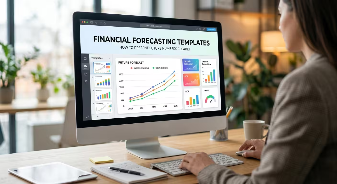
A financial forecast can be mathematically sound and still fail in the meeting. The problem is usually not the numbers themselves, but the way those numbers are arranged, compared, and explained.
That is why financial forecasting templates are useful beyond simply making a presentation look professional. The right structure helps an audience understand what is expected to happen, why the forecast changes, where the risks are, and which decisions may need to follow.
For finance teams, analysts, consultants, founders, and business managers, the goal is not to put an entire financial model on slides. It is to turn the model into a visual argument that can be understood without opening the spreadsheet behind it.
A Financial Forecast Is Not the Same Thing as a Financial Presentation
A spreadsheet and a presentation solve different problems. A spreadsheet needs to preserve detail, calculations, dependencies, and inputs. A presentation needs to make the important relationships visible quickly.
This distinction becomes particularly important when a forecast contains several connected elements: revenue, operating expenses, margins, cash flow, headcount, capital expenditure, debt, or funding requirements. Showing every number with equal visual importance makes the audience do the analysis themselves.
A better financial forecast presentation usually answers four questions in sequence:
- Where are we starting? — the current or historical financial position.
- What are we expecting? — the main forecast and its time horizon.
- What drives the change? — revenue assumptions, costs, pricing, volume, headcount, or other operating factors.
- What could change the outcome? — scenarios, risks, sensitivities, or major assumptions.
The template should support that sequence rather than simply provide a collection of attractive chart layouts.
What Financial Forecasting Templates Should Actually Contain
Search for financial forecasting templates and you will find many variations: monthly forecasts, three-year projections, cash-flow models, startup projections, budget templates, and detailed financial models. Those formats are useful for calculations, but a presentation template needs a slightly different architecture.
A practical presentation-oriented structure can include:
- Forecast overview: the headline financial outlook and the period being discussed.
- Revenue projection: expected revenue by product, market, business unit, or another meaningful driver.
- Expense forecast: operating costs and the categories that materially affect the result.
- Profitability: gross profit, operating profit, net income, or another relevant profitability measure.
- Cash-flow outlook: expected inflows, outflows, and periods where liquidity becomes important.
- Budget versus forecast: a direct view of where the latest expectation differs from the original plan.
- Scenario analysis: base, upside, and downside cases when uncertainty materially affects the decision.
- Key assumptions: the inputs that have the greatest influence on the forecast.
The important part is not including every category. If a particular metric does not change the decision being discussed, giving it a dedicated slide may add volume without adding understanding.
The Most Useful Slide Is Often the One Explaining Why the Forecast Changed
Imagine that projected operating profit is lower than the previous forecast. A simple line chart can show the decline, but it does not explain it.
This is where a driver-based slide can be more useful than another chart. Instead of showing only the final number, break the movement into the factors responsible for the change: lower sales volume, pricing changes, additional staffing costs, higher supplier costs, or another material assumption.
This creates a much stronger connection between the financial model and the business story.
A useful structure is a bridge or waterfall-style visual:
- Previous forecast
- Revenue impact
- Cost impact
- Operational changes
- Other material adjustments
- Current forecast
The exact categories will depend on the business. The principle is more important: show the mechanism behind the forecast change, not just the resulting number.
This is one reason financial diagram and chart templates can be more useful than a generic collection of business slides. The visual structure already gives the audience a way to follow the movement from one financial position to another.
Do Not Mix Forecast Assumptions With Forecast Results
One of the easiest ways to make a forecast presentation difficult to evaluate is to put assumptions, outputs, and commentary into the same visual layer.
For example, projected revenue is an output. Customer growth, average selling price, conversion rate, or sales volume may be assumptions or drivers behind that output. They should not automatically receive the same visual treatment.
A cleaner structure separates them:
- Result: what the model predicts.
- Driver: what causes the result to move.
- Assumption: what the model currently expects to be true.
- Risk: what could make that assumption unreliable.
This separation is particularly useful when presenting forecasts to people who did not build the underlying model. They can see both the conclusion and the conditions behind it without having to interpret a spreadsheet full of formulas.
For broader financial analysis presentations, a template such as Financial Analysis PowerPoint Template can provide a visual starting point for combining financial diagrams, trends, and analytical slides.
Scenario Slides Should Show Decisions, Not Just Three Numbers
A common forecast presentation contains three columns labelled “Best Case,” “Base Case,” and “Worst Case.” That is easy to build, but it often stops one step too early.
The audience usually wants to know what changes between the scenarios and what management would do about it.
Instead of presenting only three revenue or profit figures, connect each scenario to its key drivers. For example, a hypothetical business might model different sales volumes, pricing assumptions, hiring levels, or marketing spend. The slide can then show how those changes affect profitability or cash requirements.
The useful question becomes less “Which scenario is highest?” and more “Which assumptions cause the scenarios to separate?”
That distinction matters because a forecast is rarely valuable simply because it predicts one future number. Its value often comes from showing how sensitive the business is to a small number of variables.
Budget Forecasting Needs a Different Visual Treatment From Investor Forecasting
Not every financial forecast belongs in an investor deck.
A department budget review may concentrate on planned versus actual spending, variance, staffing costs, operating expenses, and approval requirements. An investor presentation may care more about revenue growth, margins, cash runway, unit economics, and the assumptions behind future performance.
The underlying financial model can overlap, but the presentation hierarchy should change.
For budget and planning discussions, a template such as Department Budget Analysis PowerPoint Template is relevant because its structure is oriented toward budgeting, variance analysis, KPI views, forecasting, and planning.
For startup or fundraising situations, the story may need to connect the forecast with the business model, funding requirements, unit economics, cash flow, and growth assumptions. A dedicated Startup Financial Model PowerPoint Template is better aligned with that type of presentation.
The practical lesson is simple: choose the template according to the decision being made, not only according to the type of financial data you have.
How to Choose the Right Financial Forecasting Template
Before selecting a template, identify what the audience needs to do after seeing the forecast. That single question can eliminate many unsuitable options.
- Need to approve a budget? Prioritize variance, allocation, spending categories, and decision summaries.
- Need to explain future profitability? Prioritize revenue drivers, cost structure, margins, and profit bridges.
- Need to explain cash requirements? Prioritize cash inflows, outflows, runway, funding needs, and timing.
- Need to support an investor discussion? Prioritize projections, assumptions, growth drivers, scenarios, and the relationship between operating activity and financial outcomes.
- Need to present a long-range plan? Use a structure that can show several periods without turning every year into a separate disconnected slide.
There is also a practical test that is easy to overlook: what happens when your real numbers replace the sample content?
A template can look excellent with short placeholder labels and perfectly balanced numbers. Once you insert longer business-unit names, several KPIs, additional assumptions, or a second scenario, the layout may become difficult to maintain. A good financial presentation template should have enough structural flexibility for the content to change without requiring a redesign of every slide.
Use Templates for Structure, Not for the Forecast Itself
A presentation template should never become a substitute for financial modelling.
The calculations should come from the appropriate financial model, planning process, or accounting data. The presentation layer has a different job: translate the important outputs into a format that makes relationships visible.
This also makes templates easier to reuse. You can update the forecast without rebuilding the visual language of the presentation from scratch. The numbers change, the assumptions change, and the scenario changes — but the structure remains familiar to the audience.
That is particularly valuable for recurring monthly, quarterly, or annual reporting. When the audience already understands where the forecast, variance, drivers, and risks appear, more attention can go toward the financial changes themselves.
The best financial forecasting template is therefore not the one with the most charts. It is the one that reduces the distance between financial model → explanation → decision.
When those three layers are aligned, a forecast stops looking like a spreadsheet copied into PowerPoint. It becomes a clear visual explanation of what the business expects, what is driving that expectation, and what could change it.
Comments (0)