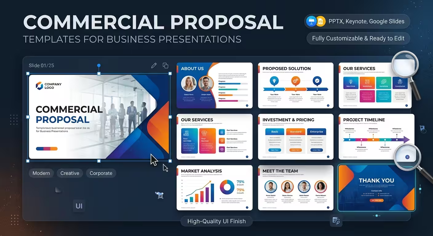
A commercial proposal can contain all the right information and still make the buying decision harder than it needs to be. The problem is often not the offer itself, but the way the offer is arranged on the page or slide.
Commercial proposal templates are useful when they give that information a deliberate visual structure: what the client needs, what you are proposing, what is included, what it costs, and what happens next. The goal is not to make a proposal look impressive for its own sake. It is to make the important parts of the offer easier to understand, compare, and approve.
A commercial proposal is a decision document, not just a company presentation
One of the easiest mistakes is to build a proposal like a corporate introduction. The first slides become a long description of the company, its history, team, values, and capabilities. By the time the actual offer appears, the client has already had to work through several screens of information that do not answer the immediate question: What exactly are you proposing for my situation?
A stronger commercial proposal gives the offer more weight than the biography of the supplier.
A practical structure might move through:
- the client's situation or business need;
- the proposed approach;
- the scope and key deliverables;
- the process, timeline, or implementation stages;
- relevant capabilities or supporting evidence;
- commercial terms and pricing;
- the next action required from the client.
The order can change depending on the type of sale. A complex consulting engagement may need more explanation before pricing, while a straightforward service package may benefit from showing the offer much earlier.
That is why a useful template should be treated as a starting structure rather than a fixed script.
Choose the template around the offer you are selling
Imagine two proposals: one is for a consulting engagement and another is for a construction project. Both may need a scope, timeline, price, and next step, but the visual logic between those sections is very different.
A consulting proposal may need diagrams for methodology, strategic frameworks, workstreams, and outcomes. A project-based proposal may need phases, resource allocation, milestones, cost breakdowns, and implementation diagrams.
This is where template selection becomes more important than simply choosing the most attractive design.
For example, ImagineLayout has a consulting proposal PowerPoint template built around proposal-oriented diagrams and presentation layouts. It is a more natural starting point for a service or consulting offer than a generic corporate presentation because the visual vocabulary is already closer to the problem being solved.
For a broader business-planning proposal, a template such as Pen Business Planning PowerPoint Template can provide structures for explaining plans, priorities, timelines, and strategic elements.
The important question is therefore not “Which template looks best?” but “Which template already contains the visual structures my proposal actually needs?”
The most important slides are usually not the first ones
Proposal design often gets judged by the opening slide, but commercial decisions frequently depend on much less glamorous sections: scope, assumptions, pricing, deliverables, and implementation.
A visually polished cover cannot compensate for a pricing page that makes three packages difficult to compare.
When adapting a commercial proposal template, inspect the slides that carry decision-critical information first. Ask whether the layout gives enough room for:
- specific deliverables rather than vague service descriptions;
- clear distinctions between included and excluded work;
- pricing that can be scanned without decoding a dense paragraph;
- dependencies, milestones, or implementation stages where they matter;
- terms that could change the client's interpretation of the offer.
One useful design test is to temporarily remove the decorative elements and read only the headings, numbers, deliverables, and calls to action. If the commercial logic still makes sense, the template is doing useful structural work. If the proposal becomes confusing, the visual design may be hiding a weak information hierarchy rather than solving it.
Pricing needs a different visual treatment from the rest of the proposal
Pricing is often treated as just another content block. It isn't.
Once a client reaches the commercial section, they are no longer primarily asking what your company does. They are evaluating the relationship between price, scope, risk, and expected value.
That changes how the slide should be constructed.
If there are several packages, make the differences visible. If the price depends on assumptions, put those assumptions close enough to the relevant figure that they cannot easily be separated from it. If the proposal contains optional services, distinguish them from the committed scope instead of presenting everything as one undifferentiated list.
This is one reason editable proposal templates are more useful than static proposal graphics. Commercial details rarely remain unchanged between clients. The structure needs to survive changes in currency, package names, quantities, milestones, and deliverables without forcing the entire slide to be rebuilt.
Use diagrams when the client needs to understand a relationship
A diagram earns its place in a proposal when the relationship between elements matters.
For example, a process diagram can explain how an engagement moves from discovery to implementation. A timeline can show when deliverables appear. A matrix can distinguish service packages. A layered diagram can explain how several components of an offering fit together.
But a diagram should not replace straightforward text when the relationship is already obvious.
This distinction matters because proposal templates often contain more diagrams than a particular offer actually needs. The right approach is to select only the visual structures that reduce explanation time.
Imagine a hypothetical digital-marketing proposal with four service areas. A decorative four-column graphic adds little if each column simply contains a service name. A matrix showing which service applies to which business objective can be much more useful because it communicates a relationship that would otherwise require several sentences.
A template should accelerate customization, not dictate the proposal
The danger of using a ready-made template is becoming too faithful to it.
If the original template contains ten sections and your proposal needs six, deleting four sections is usually better than inventing content just to fill the layout. Likewise, if your scope requires an additional comparison or pricing slide, add one rather than forcing the information into a layout designed for something else.
In practice, the best workflow is:
- define the commercial argument first;
- map the required information to slide types;
- remove layouts that do not serve the proposal;
- adapt typography, colors, imagery, and diagrams to the brand;
- check the final document as if you were the buyer rather than the designer.
That last step is particularly useful. A designer naturally notices alignment and visual consistency. A client is more likely to notice whether the scope is understandable, whether the price is justified, and whether the next step is obvious.
When a ready-made template is the right choice
Commercial proposals vary too much for one universal layout to work perfectly. Sometimes a ready-made template is enough; sometimes the proposal is important enough to justify a custom document.
A template makes sense when the offer follows a repeatable structure, your team prepares proposals regularly, or the main challenge is turning existing content into a professional visual document quickly.
Custom design becomes more valuable when the proposal has unusual information architecture, strict brand requirements, or a high-stakes sales process where every section needs to be built around one specific audience.
ImagineLayout also offers custom document templates for proposals, reports, and one-pagers, which is a different route when an off-the-shelf presentation structure does not match the way a company actually sells its services.
The choice does not have to be ideological. A repeatable sales proposal can benefit from a reusable template, while a complex strategic engagement may deserve a custom structure.
What makes a commercial proposal template genuinely useful?
The strongest template is rarely the one with the most decorative slides. It is the one that reduces the amount of structural work required before the proposal becomes client-ready.
Before choosing one, look for three things: decision-oriented layouts, enough flexibility to represent your actual scope, and editable elements that can accommodate changes without damaging the composition.
A good template should disappear behind the proposal. The client should notice the clarity of the offer, not the fact that a template was used to build it.
That is the real value of commercial proposal templates: not replacing the thinking behind the offer, but giving that thinking a structure that can be understood quickly and acted on confidently.
Comments (0)