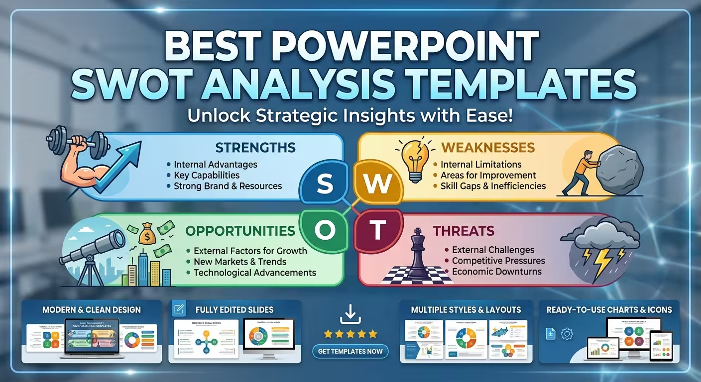
A SWOT slide can look perfectly professional and still be the wrong tool for the meeting. A four-quadrant matrix is excellent when the audience needs the whole picture in seconds; it becomes much less useful when a strategy team needs to unpack why several factors matter and what they imply. This guide looks at the best PowerPoint SWOT analysis templates on ImagineLayout from that practical perspective.
The goal is not to declare one template universally best. It is to help you choose the structure that fits the amount of information, the meeting format, and the decision your SWOT analysis needs to support.
Start with the job your SWOT slide has to do
The most common mistake is choosing a SWOT template by appearance first. Two designs may both contain Strengths, Weaknesses, Opportunities, and Threats, but they can behave very differently once real content is added.
If you have four or five high-priority findings and need an executive to understand them immediately, a compact matrix makes sense. If your team is comparing several factors, connecting internal capabilities with external opportunities, or discussing priorities during a workshop, you need more visual room and more than one way to structure the information.
I often approach the choice with three questions:
- How much information needs to appear on screen? A short management update and a strategy workshop have very different density requirements.
- Is the SWOT the final message or part of a larger analysis? A standalone matrix can be enough for the former; a broader chart library is more useful for the latter.
- Does the audience need to compare factors or act on them? If the slide is supposed to lead toward priorities, relationships, or strategic actions, a decorative four-box layout can become restrictive.
That distinction is more useful than simply looking for the most colorful or modern SWOT design.
For a focused executive slide: Professional SWOT Analysis PowerPoint Charts
When the presentation needs to get to the point quickly, the Professional SWOT Analysis PowerPoint Charts Template is the type of option worth considering.
Its relatively compact structure makes it better suited to a presentation where SWOT is one component rather than the entire story. ImagineLayout lists 12 unique layouts, so the template can support more than simply placing four text blocks on one slide.
The practical advantage of a compact template is not that it contains fewer slides. It is that you are less likely to turn a five-minute strategic update into a separate presentation about the SWOT itself.
Use this type of template when:
- the SWOT is supporting a larger business or strategy deck;
- the audience already understands the business context;
- you need a concise visual summary rather than a workshop canvas;
- the analysis needs to remain readable when projected in a meeting room.
The limitation is equally important: if your analysis contains several layers of evidence, forcing everything into a compact structure can make the slide look tidy while hiding the actual reasoning.
For deeper strategic analysis: Method SWOT Analysis
Sometimes the problem is not finding a SWOT matrix. It is finding enough visual structures to explain what the matrix actually means.
The Method SWOT Analysis PowerPoint Charts Template for Strategy takes a broader approach, with 30 unique layouts. ImagineLayout describes the set as covering matrices, graphs, prioritized lists, icons, and flow-oriented storytelling elements.
That makes a difference when the presentation needs to move beyond:
“Here are our strengths and weaknesses.”
and toward:
“These are the factors, this is how they relate, and this is where the strategic discussion should go next.”
A larger template library is particularly useful when SWOT is being built into a strategy workshop or a consulting-style presentation. You can use one slide for the high-level matrix, another to expand a particularly important quadrant, and another visual to show relationships or priorities.
There is a trade-off. More layouts create more choice, and more choice can slow down the person building the deck. I would not use a 30-slide template simply because it contains more slides. Use the additional layouts when the analysis genuinely needs different visual treatments.
When the analysis needs more visual variety
A conventional SWOT matrix answers one question: what are the four categories? It does not automatically answer which factors matter most or how they connect.
The SWOT Analysis PowerPoint Charts: Pro Templates is designed around a broader collection of visual treatments. ImagineLayout lists 13 unique layouts and describes elements including quadrant matrices, comparative charts, puzzle-style diagrams, and editable graphs.
This kind of structure can be useful when the presentation needs to alternate between overview and explanation. For example, a strategist might use a matrix to establish the four categories, then use a comparison visual to examine a smaller set of factors.
The important design decision is to avoid using a visual metaphor simply because it exists. A puzzle graphic can suggest relationships, but it should not replace an explicit relationship that the audience actually needs to understand. Likewise, a graph belongs in the presentation when there is quantitative information worth comparing, not merely because a chart makes the slide look more sophisticated.
The real difference between a good SWOT slide and a useful one
A SWOT presentation becomes more valuable when the visual hierarchy reflects the strategic importance of the information.
Consider a hypothetical company with six strengths, three weaknesses, two opportunities, and seven threats. A standard four-box layout gives every category a similar amount of visual territory. But equal space does not mean equal importance.
If only two of those thirteen factors materially affect the decision being discussed, they should not disappear among eleven supporting observations.
This is where a template should be treated as a starting system rather than a finished answer. You can adapt the layout so the most consequential factors receive more visual emphasis, while supporting details remain available without competing with the main message.
For presentation designers, this is one of the most useful distinctions: the purpose of a SWOT template is not to make every factor look equally important; it is to make the structure of the analysis understandable.
How to choose the right SWOT template for your presentation
Instead of asking which template looks best in the preview, match the template to the presentation situation.
- Executive update: choose a compact layout that communicates the four categories quickly and leaves room for the decision or recommendation.
- Strategy workshop: use a larger collection with multiple matrices, comparisons, and supporting diagrams so the analysis can develop during the discussion.
- Consulting or client presentation: choose a system with enough visual variety to move from diagnosis to supporting evidence without rebuilding every slide.
- Competitive analysis: prioritize layouts that can accommodate comparisons and relationships between factors rather than relying on one static matrix.
- Academic or teaching presentation: a more visual template can help explain how the four categories interact, provided the graphics remain subordinate to the analytical content.
For a broader strategic presentation, you can also pair a SWOT section with a dedicated Business Strategy PowerPoint Template. That is useful when SWOT is not the destination but one analytical step inside a larger strategy story.
What to edit before presenting a SWOT template
Even a professionally designed template should not be treated as presentation-ready content. The design system solves the geometry; it does not decide which findings deserve attention.
Before presenting, I would check four things.
- Remove observations that do not affect the decision. A long SWOT list can create the appearance of analysis without helping the audience decide anything.
- Separate internal from external factors carefully. Strengths and weaknesses describe internal conditions; opportunities and threats describe external conditions. Mixing them weakens the logic of the matrix.
- Prioritize instead of decorating. If every item has the same size, weight, and visual treatment, the audience has to perform the prioritization themselves.
- Connect the SWOT to the next slide. If the following section discusses strategy, make it clear which SWOT findings feed that discussion. Otherwise the matrix can feel like a mandatory slide rather than part of the argument.
This is also where a template earns its value. When the basic alignment, typography, diagram construction, and chart styling are already solved, more of the editing time can go into the actual strategic logic.
Which PowerPoint SWOT template should you use?
There is no single SWOT layout that fits every presentation. The better choice depends on how much analysis you need to show and what the audience should do with it afterward.
For a concise SWOT section inside a larger deck, start with a compact chart set. For a strategy workshop or a detailed analysis, a 30-layout system gives you more room to expand the argument. When the presentation needs a mixture of matrices, comparisons, and visual metaphors, a broader chart collection can make the transition between different analytical views easier.
The useful test is simple: open the template and imagine your actual SWOT findings inside it. If the design makes the important relationship harder to see, it is not the right template—even if the preview looks impressive.
A strong SWOT presentation should leave the audience with more than four categories. They should understand which factors matter, why they matter, and what the analysis changes about the decision in front of them.
Comments (0)