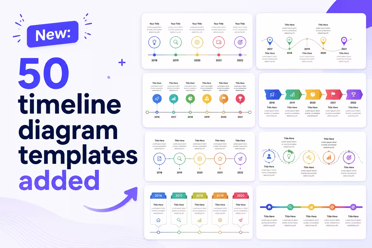
Timelines are one of those slide types that everyone needs and almost nobody enjoys building. You know the drill: you've got five milestones, a launch date, maybe a couple of dependencies to show, and somehow it still takes forty minutes of nudging boxes around before it looks presentable.
That's the gap we just tried to close. We've added 50 new timeline diagram templates to the library, covering PowerPoint, Keynote, and Google Slides.
What's actually in the batch
This isn't one timeline style copy-pasted fifty times with different colors — that's the kind of padding I'd actively warn a client away from. The set spans several distinct layouts:
- Horizontal linear timelines for straightforward chronological milestones
- Vertical timelines, useful when you're presenting on a narrower format or embedding a slide into a document
- Roadmap-style timelines with swimlanes, for teams tracking parallel workstreams
- Milestone-and-phase timelines, where you need to show both a date and a stage of completion
- Comparison timelines, for showing two plans or two histories side by side
Each layout comes with a handful of color and density variations, since a founder walking investors through a five-year history needs a very different visual weight than someone summarizing a six-week sprint plan.
Why timelines specifically
One thing people overlook when building a deck: a timeline slide is doing double duty. It's not just showing dates — it's implicitly telling the audience how much progress has been made and how much is left. A cluttered, uneven timeline undercuts that message even when the underlying plan is solid. I've seen otherwise strong project updates lose the room because the timeline slide looked improvised.
The practical fix isn't more information on the slide — it's consistent spacing, a clear anchor point (today, launch, a key milestone), and enough restraint to leave dead time visually flat instead of implying activity that isn't there.
Where these fit
If you're building a product roadmap deck, a project kickoff, a historical retrospective, or even a personal timeline for a portfolio presentation, this batch is meant to save you the layout work so you can spend your time on the content instead.
They're all fully editable — swap dates, add or remove milestones, adjust the color scheme to match your brand. Compatible across PowerPoint, Keynote, and Google Slides, so switching software mid-project won't force you to rebuild from scratch.
Worth trying if...
If your last few timeline slides felt like they were fighting you — text overlapping the line, milestones bunched together, or a layout that only worked for exactly the number of items you happened to have that week — it's worth taking a look at this batch. Start with the horizontal linear set if you're not sure where to begin; it's the most broadly useful of the five layouts and adapts well to most business contexts.
What kind of timeline are you usually stuck rebuilding — project plans, product roadmaps, or something else? That's useful for us to know as we plan the next batch.
Comments (0)