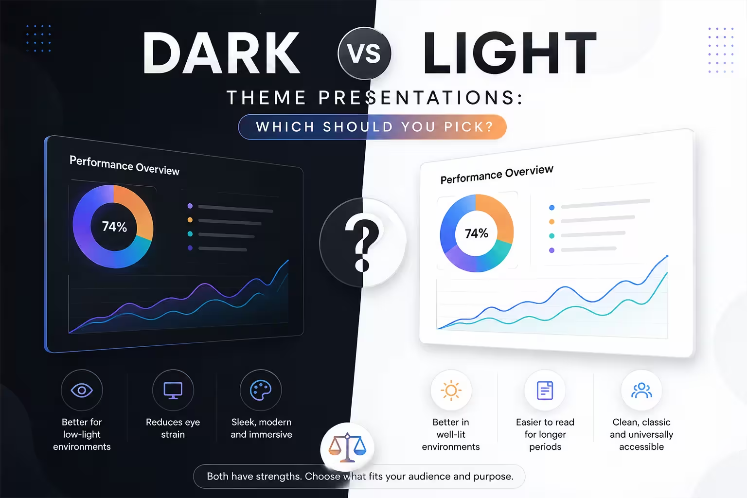
Someone asked me last week whether their pitch deck "looked dated" simply because it used a white background. That question sat with me for a while, because the honest answer is: it depends entirely on where and how that deck gets shown.
There's a persistent idea in design circles that dark mode is modern and light mode is old-fashioned. I don't think that's true. Both themes solve different problems, and picking one over the other because it trends better on design blogs is how decks end up unreadable in the one room that matters — the actual meeting room.
Where Each Theme Actually Wins
Light themes still dominate business and corporate contexts, and there's a reason beyond habit. Printed handouts, PDF exports, and projected slides in bright conference rooms all favor high-contrast dark text on a light background. If your audience is going to print the deck, annotate it, or view it on a cheap projector with the lights half-on, light backgrounds are more forgiving.
Dark themes tend to perform better in a narrower but growing set of contexts: product demos, tech and SaaS pitches, evening events, and anything shown on a large screen in a dim room. They also read well on video calls, since most laptop and monitor displays render dark UI cleanly, and dark slides create less glare during long virtual sessions.
I wouldn't recommend picking a theme purely based on brand aesthetics without checking the delivery environment first. A beautifully designed dark deck can become nearly unreadable the moment it's projected through an old conference room projector with washed-out contrast.
Readability Is the Real Deciding Factor
In my experience, most theme complaints aren't actually about "dark vs light" — they're about contrast and typography choices within whichever theme was picked. A poorly executed light theme (thin gray text on white) is harder to read than a well-executed dark theme, and vice versa.
A few things matter more than the base color:
- Text-to-background contrast ratio, not just color choice
- Font weight — dark backgrounds often need slightly heavier weights to avoid text looking thin
- Image and chart backgrounds — a white chart dropped onto a dark slide without adjustment looks like an obvious oversight
- Consistency across every slide, since switching themes mid-deck reads as unfinished
One thing people overlook is that data visualizations behave differently on each theme. Bright, saturated colors that look clean on white can feel harsh or almost neon on black. Muted, desaturated palettes usually translate better to dark backgrounds.
Audience and Context Still Decide More Than Trend
Investor and board presentations still lean light in most industries I've seen work in, partly because it signals a certain formality and partly because these are often reviewed later as static documents, not just watched live. Creative, product, and tech-forward audiences tend to respond well to dark themes, especially in product launches or conference keynotes where the goal is visual impact rather than document reuse.
If you're not sure which side your audience falls on, a hypothetical scenario helps clarify the trade-off: imagine presenting the same financial forecast slide to a bank's investment committee versus a startup demo day audience. The content might be identical, but the expected visual register is not. One rewards restraint and clarity; the other rewards energy and contrast.
What Happens When You Get It Wrong
I've seen decks that switched between dark and light sections without a clear reason, and the effect is subtle but real — audiences read it as inconsistency, even if they can't articulate why. I've also seen the opposite mistake: forcing an entire deck into dark mode because it's currently fashionable, then losing all pattern from screenshots being pasted in with white backgrounds, breaking the visual rhythm slide after slide.
Neither theme is inherently more "professional." What signals professionalism is consistency, deliberate contrast choices, and matching the theme to how the deck will actually be viewed — live, printed, screen-shared, or archived.
A Practical Way to Decide
If you're stuck between the two, ask three questions before touching the design:
- Will this be printed or exported as a static document? Lean light.
- Will this be shown live on a large screen in a dim room, or shared mostly through video calls? Dark holds up well here.
- Does your existing brand system already lean strongly one way? Consistency with brand usually wins over personal preference.
None of this rules out mixing approaches deliberately — some of the strongest decks I've reviewed use a dark theme for a few high-impact "hero" slides (a big number, a striking visual) inside an otherwise light deck. That contrast, used sparingly, can be more effective than committing fully to either extreme.
The real question isn't which theme looks better in isolation. It's which theme survives contact with the room you're actually presenting in.
Comments (0)